Flagship case · Prepared for the Meta hiring team
WSJ Vertical Video
Lead UX Architect · Dow Jones, The Wall Street Journal · February to November 2024
An adaptive vertical video experience for The Wall Street Journal, immersive on the phone yet unmistakably WSJ. I owned the interaction and sound model and the Vertical Player component, now live in the WSJ mobile app.

- Problem
- 70%+ of WSJ readers were on mobile, but video broke editorial flow and felt detached from the story.
- Role
- Lead UX Architect: UX architecture, flows, functional specs, and the Vertical Player component.
- Team
- Partnered with editorial, product, and engineering, February to November 2024.
- Constraints
- WSJ's premium voice, an NDA, and one responsive system from a 16u desktop layout to a 4u mobile stack.
- Outcome
- Shipped live in the WSJ mobile app; documented as a reusable component in the design system, across Dow Jones brands.
70%+
Of WSJ readers on mobile, the format's starting point
4 states
Default, Playing, Paused, and Ended, fully documented
Live in app
Shipped in the WSJ Mobile App; web in progress
Why this leads my Meta application
Mobile-first vertical video for a newsroom: the gesture and sound model, muted autoplay with captions, and a player built as a reusable system rather than one feature.
The product in action
A working implementation of the documented interaction model, footage abstracted since the client work is under NDA. Muted autoplay in view, one tap for sound, controls that retire after five quiet seconds, and pause-and-reset on scroll.
The tension at the center of every decision
More than seventy percent of WSJ readers were on mobile, but video modules disrupted editorial flow, loaded inconsistently, or felt detached from the article. The job was to bring the immediacy of vertical video to WSJ journalism without spending the authority, clarity, and trust that define the brand.
Immersion that still reads as journalism, never a social feed, became the north star. I ran a structured audit of TikTok, Instagram Reels, and YouTube Shorts, then split the findings into what a newsroom should adopt and what it should deliberately refuse.
Worth adopting
- A full-bleed 9:16 frame that treats the video as the surface, not a thumbnail in a card.
- Muted autoplay with captions, so a story starts the instant it is in view.
- Sound on a single, obvious tap, keeping control with the reader.
- A vertical swipe between stories, with a light progress affordance.
Deliberately refused
- Algorithmic pacing that optimizes for watch time over the story's own rhythm.
- Infinite, bottomless feeds that pull readers away from the journalism.
- Social vanity metrics and reaction mechanics that undercut editorial authority.
The interaction and motion model
The model was written as a set of explicit, testable rules in the functional specification, not left to interpretation. Every behavior exists to keep the reader in control. The rules that matter most:
Muted autoplay, captions on
A video begins the instant it scrolls into view, always muted at first, with captions on so the story starts without hijacking sound.
One tap earns sound
A single Tap for Sound at the top, shown once at the start. After it is tapped it never returns, and only then is the title revealed.
Controls retire after 5 seconds
Controls appear on intent and auto-hide after five quiet seconds, three on touch, so the frame stays cinematic. Captions lift so text never collides with the scrubber.
Swipe to the next story
A vertical swipe moves between stories, paced by editors rather than an algorithm, with a light progress affordance so readers know where they are.
The control set, documented
Volume: on-screen, alongside the device's physical buttons.
Time scrub: drag the timeline to any point in the story.
Share: send the story through social or other channels.
Expand: grow in place, capped at 6 columns or 460px on wide layouts.
More: a menu holding Closed Captions and Save, one level down.
Alt text: every video carries a descriptive text alternative.
Four documented states
Every placement of the player resolves to one of four documented states. Each defines exactly what is visible, what the reader can do, and how the component behaves, which gave engineering an unambiguous contract and editors a predictable format.
Default
The poster frame shows, video is muted, captions are ready, and the sound affordance is visible. The headline carries the top zone so the story reads before playback begins.
Playing
The video autoplays muted with captions on. The progress affordance advances, secondary controls recede so the frame stays cinematic, and sound stays within reach.
Paused
A tap pauses playback and brings the controls and scrubber forward. The reader can scrub within the story, resume, or move on, with the frame held steady.
Ended
Playback resolves into a replay prompt and a clear affordance to continue to the next story, so momentum is never lost at the end of a clip.
One component, every surface
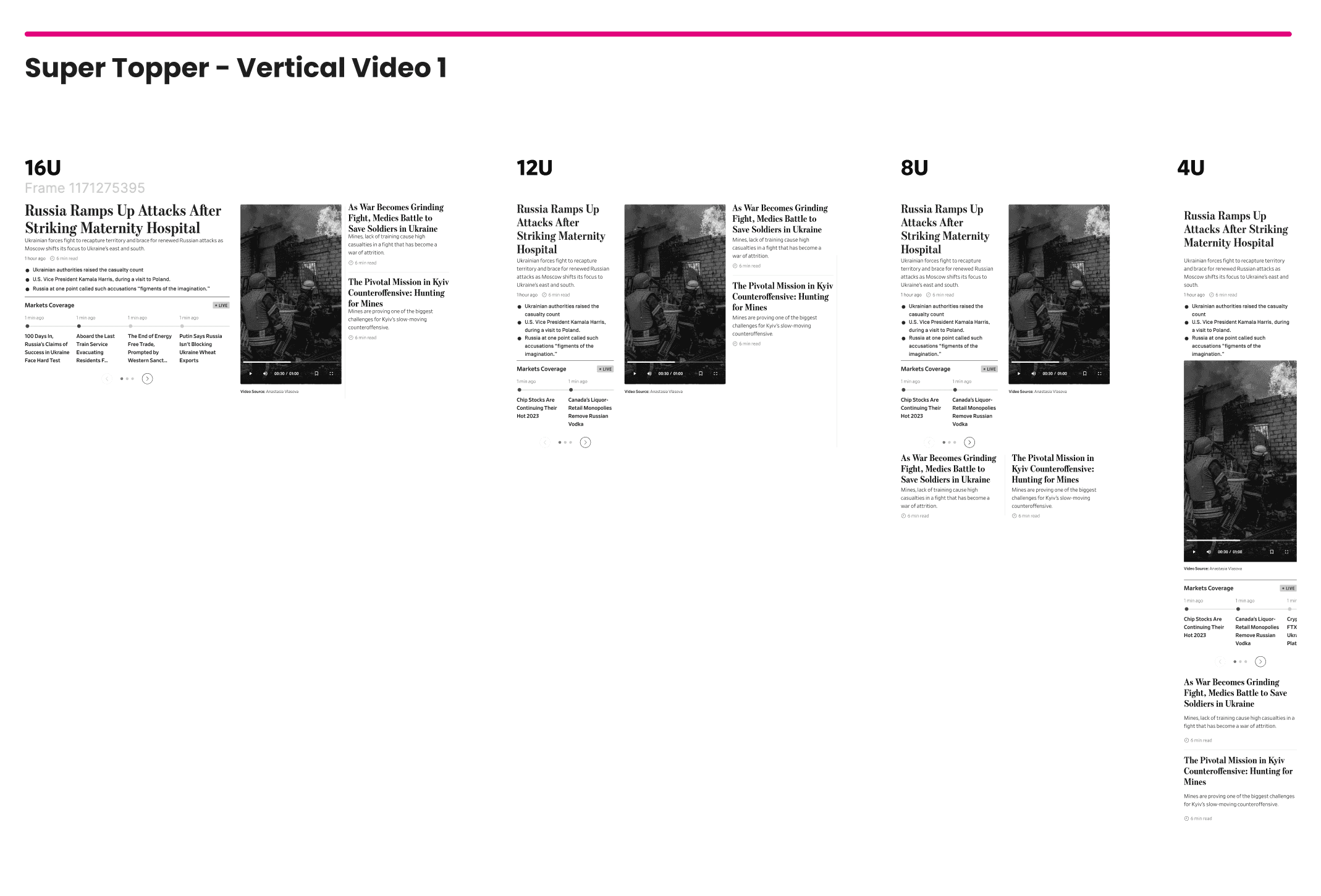
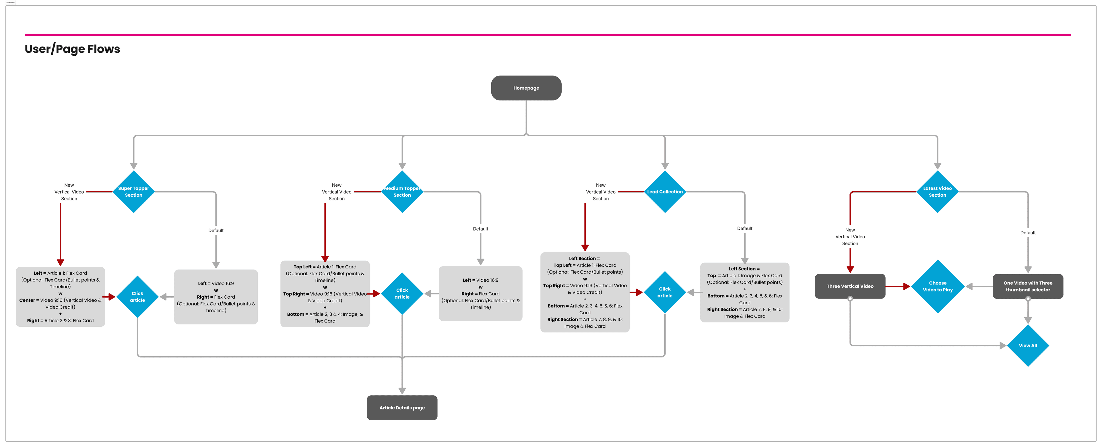
The Vertical Player is one component, documented from anatomy to behavior, that every surface reuses. It behaves consistently across the homepage, live coverage, section fronts, and the video center, and the same player powers a family of editorial modules, each a different weight of placement: the Super Topper, Medium Topper, Lead Collection, and latest-video section.
Accessibility as an input, not a review
Because the format is immersive and motion-heavy, the accessibility work mattered more, not less. It was part of the component contract, not a pass afterward.
Captions on by default, with sound reaching the reader only on intent.
Reduced-motion support that quiets transitions for readers who opt out.
Sufficient contrast for text and controls rendered over live video.
Touch targets sized for a thumb in motion, where the hand already is.
Clear labels for every control so assistive technology can operate the player.
No meaning carried by color alone, so state is always communicated more than one way.
Live in the app
The system is live in the WSJ Mobile App, embedded within article templates and home modules, governed by tokens and variants rather than one-off screens. It added a documented component library to WSJ's design system, reusable for other Dow Jones brands, and the lessons directly shaped later multi-brand design-system work.

Vertical video at WSJ had to feel immersive without ever feeling like a social feed. Documenting it as a component with defined states and specs, not an isolated screen, let the format serve the story and become a cross-platform standard across the Journal.
