
04 · Prepared for the Netflix hiring team
The WSJ homepage and section fronts were re-platformed onto a modern, component-driven foundation. I defined the front-page composition system, turning hand-tuned editorial layouts into reusable modules and story-card compositions that snap together and carry their own responsive behaviour from desktop to mobile. Each module encodes WSJ's density and hierarchy, so editors compose within guardrails and editorial freedom cannot break the brand.
Why this piece is in my application
This version opens without a password. It was prepared for the Netflix hiring team as part of my application for a Staff Product Designer role.
2
Replatformed: homepage and section fronts
Re-platforming the WSJ homepage and section fronts onto a modern, component-driven composition system across desktop and mobile.
A front page is a system, not a layout. Give editors freedom without breaking the WSJ brand.
Overview
The WSJ homepage and section fronts were being re-platformed onto a modern, component-driven foundation. The design challenge was to turn a hand-tuned editorial front page into a flexible system of reusable compositions, one that editors could arrange freely while preserving the hierarchy, density, and authority readers expect from the Journal.

I contributed across UX architecture and UX design, defining the front-page composition system and producing handoff for desktop and mobile, including the next-generation section fronts.
The project
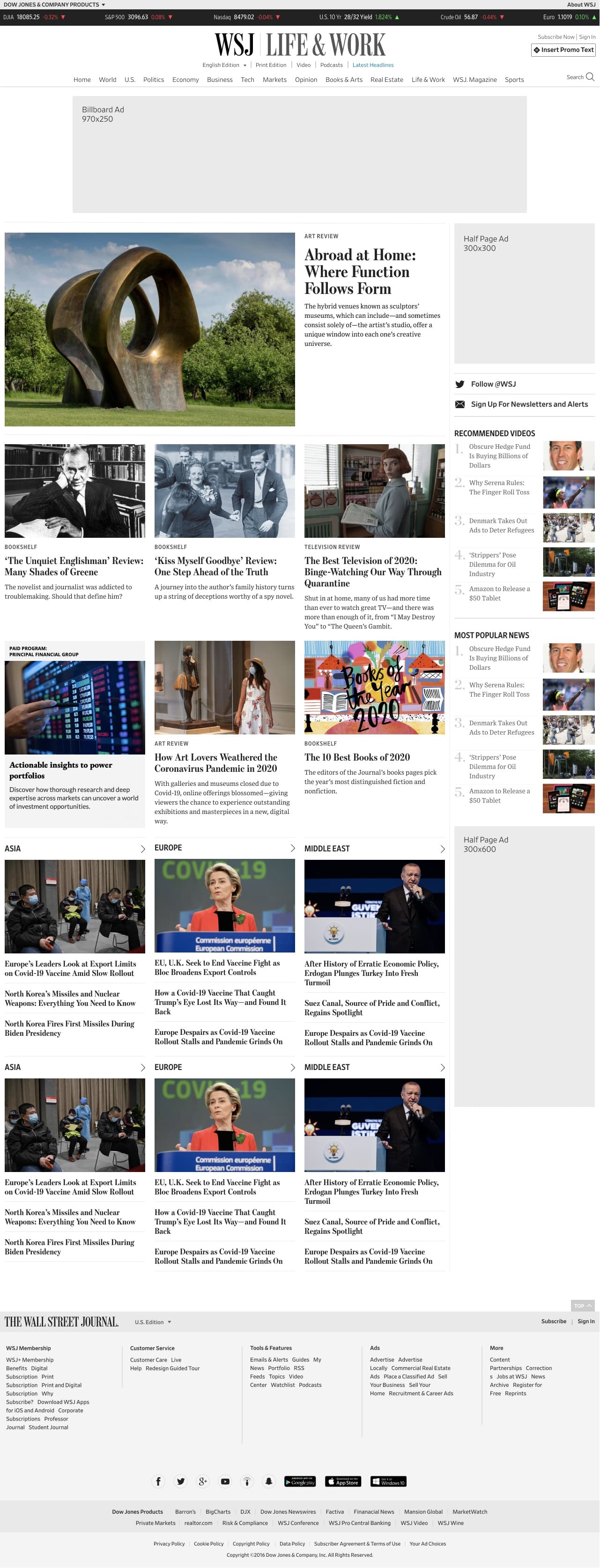
Replatform the homepage and section fronts onto a reusable composition system that is responsive by default, consistent across the homepage and every section, and flexible enough for daily editorial control.
I worked across UXA and UXD to define the front-page modules and story-card compositions, specify their responsive behaviour, and hand off desktop and mobile fronts including the next-generation section fronts.
A composition library that replaces bespoke layouts with reusable, responsive modules, giving editors freedom while keeping every front coherent and on-brand.
The challenge of a flagship front
Designing a composition library
A set of front-page modules and story-card compositions that snap together predictably, replacing bespoke layouts with reusable parts.
Each module encodes WSJ's density and emphasis, so editorial freedom cannot break the brand. The system carries the hierarchy rather than relying on every editor to recreate it.
Modules carry their own responsive behaviour, so a front built once adapts from desktop to mobile, and the same building blocks power the homepage and every section front.
Delivery and handoff
Section fronts were brought onto the same system and pushed forward in a next-generation design, then specified for engineering, covering module behaviour, responsive rules, and editorial composition patterns.
The composition library was framed so editors compose within guardrails, keeping fronts coherent at scale rather than drifting over time.
A system that lasts
Re-platforming a flagship front page is as much governance as visual design. The lasting value was not a prettier homepage, it was a system that lets editors move fast for years while keeping every front unmistakably WSJ.

The replatform was as much about the moments the front page has to rise to - elections, live events, archives - as the everyday layout. This is the detailed walkthrough of the special surfaces behind the public summary.
Special-event ribbons
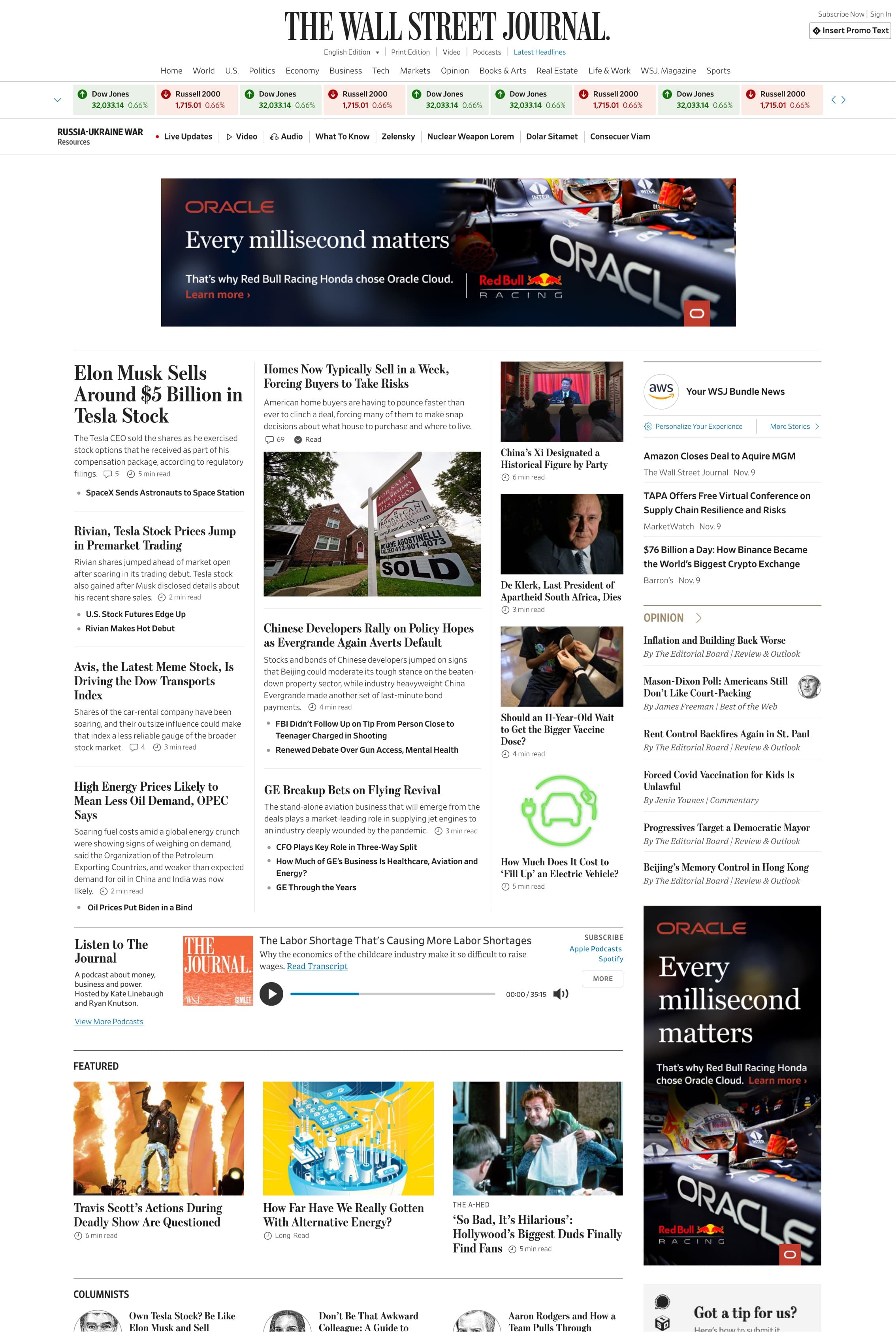
For elections and breaking events, a ribbon module takes over the top of the page - live results and coverage woven into the homepage without breaking its grid or replacing it with a one-off page.
Live coverage states
The ribbon was designed for the full lifecycle of an event - before, during, and after - so the page communicates the right state of live coverage at every moment.

The archive landing
The replatform also reached the WSJ archive - a landing experience that brings the same component language to historical coverage, so the whole of WSJ feels like one product.

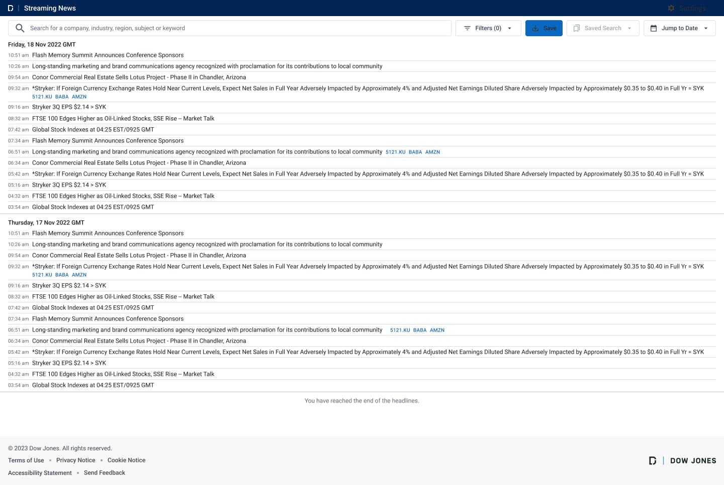
Next · A real-time news feed designed for repeated, glanceable scanning, with a personalized view that filters a firehose down to what matters to each user.