[ Case study ]
Dow Jones Risk Journal: Dashboard & Workspace
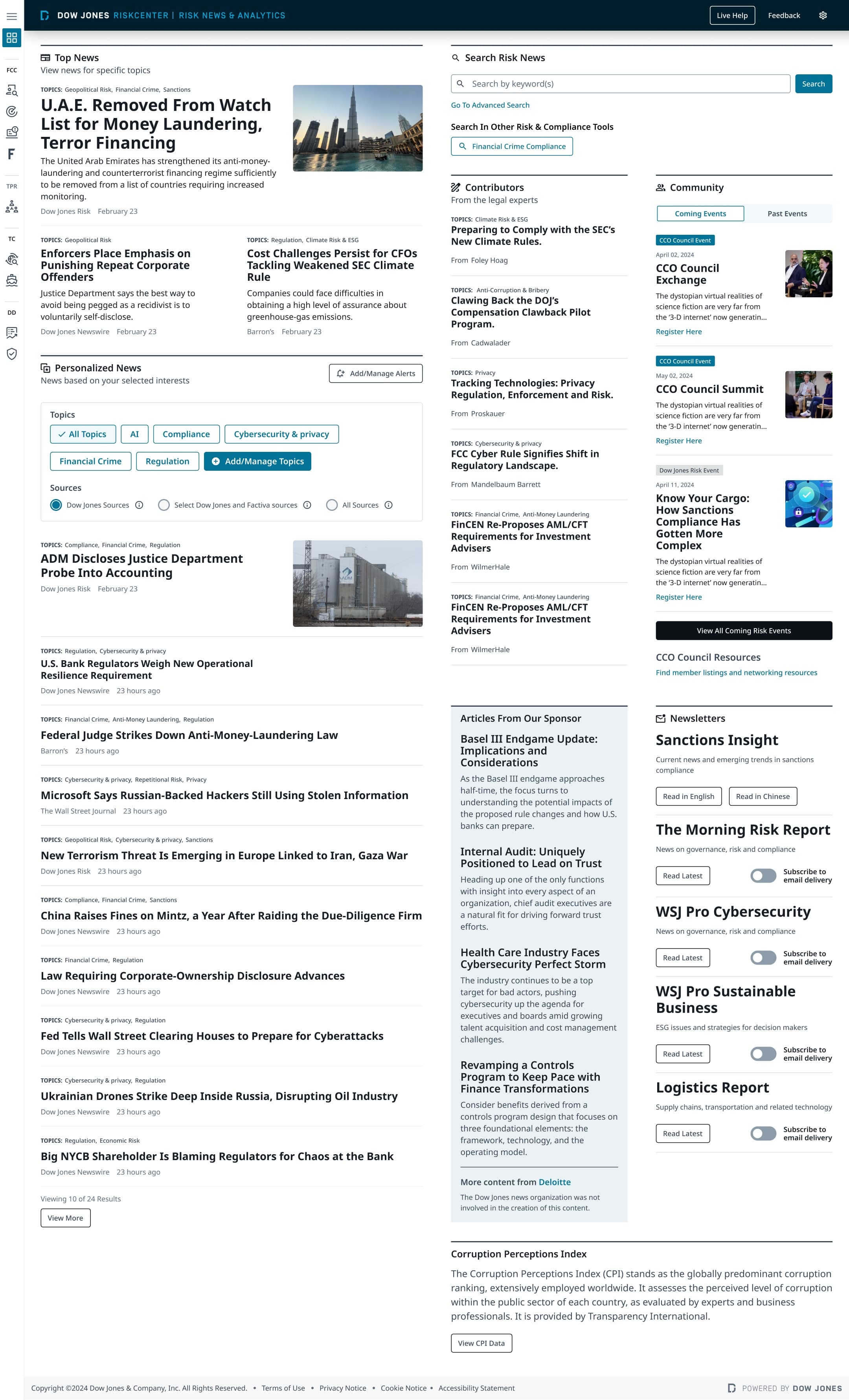
Dow Jones Risk Journal curates risk insights, compliance resources, and third-party analysis into one centralized dashboard for a senior, time-poor audience of C-suite executives, policymakers, and compliance managers. I led UX architecture through Phase I: onboarding-first personalization where topic selection immediately shapes the feed, a sectioned dashboard a busy leader can orient in within seconds, and a Year-End Summary built to boost retention. It rolled out in phases to C-suite and customers through Q1 2025.
- Client
- Dow Jones - Risk Journal
- Role
- UX Architect
- Year
- 2025
- Disciplines
- Enterprise UX, Risk & Compliance, Data Visualization, Design Systems, Responsive, Research
[ Impact ]
3
Surfaces: dashboard, workspace, and alerts
[ Information architecture ]
Dashboard
- Risk overview
- Signals
Workspace
- Saved views
- Watchlists
Alerts
- Notifications
- Subscriptions
Confidentiality notice
This work spans active platform strategy, shared AI capabilities, and multiple product surfaces. To respect that, this case study stays intentionally high-level, focusing on the cross-brand design problem, platform principles, and reusable outcomes rather than brand-specific implementation details.
A centralized risk-and-compliance dashboard for C-suite leaders, policymakers, and compliance professionals, designed to earn a daily visit from the busiest people in the room.
One trusted home for risk intelligence: curated, personalized, and built to keep senior leaders coming back.
Overview
Dow Jones Risk Journal (DJRJ) is a tailored, centralized platform for senior stakeholders: C-suite executives, policymakers, and mid-level managers in risk and compliance. It curates risk insights, compliance resources, industry research, and third-party analysis into a one-stop dashboard, and integrates the CCO Council to strengthen the RiskCenter community.
The project
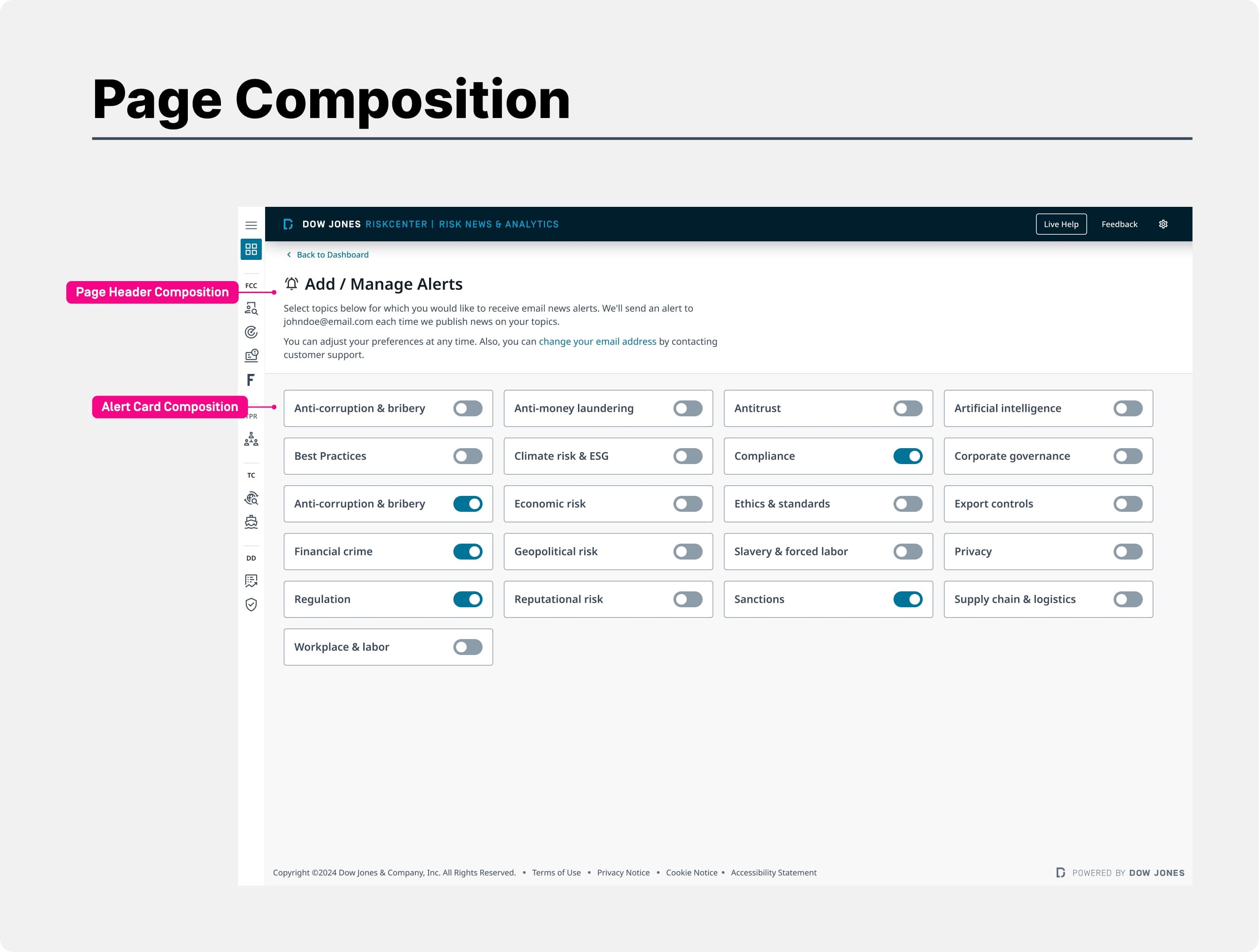
Increase engagement, retention, and usability for senior stakeholders by providing personalized, data-driven risk insights in a centralized platform: curated content that earns time, a seamless experience that brings leaders back, and a structured layout that makes critical information reachable without friction.
I led UX architecture for the dashboard and workspace through Phase I. I designed the onboarding personalization, the sectioned dashboard, the surrounding workspace, and stakeholder-facing prototypes, and produced the handoff and launch materials.
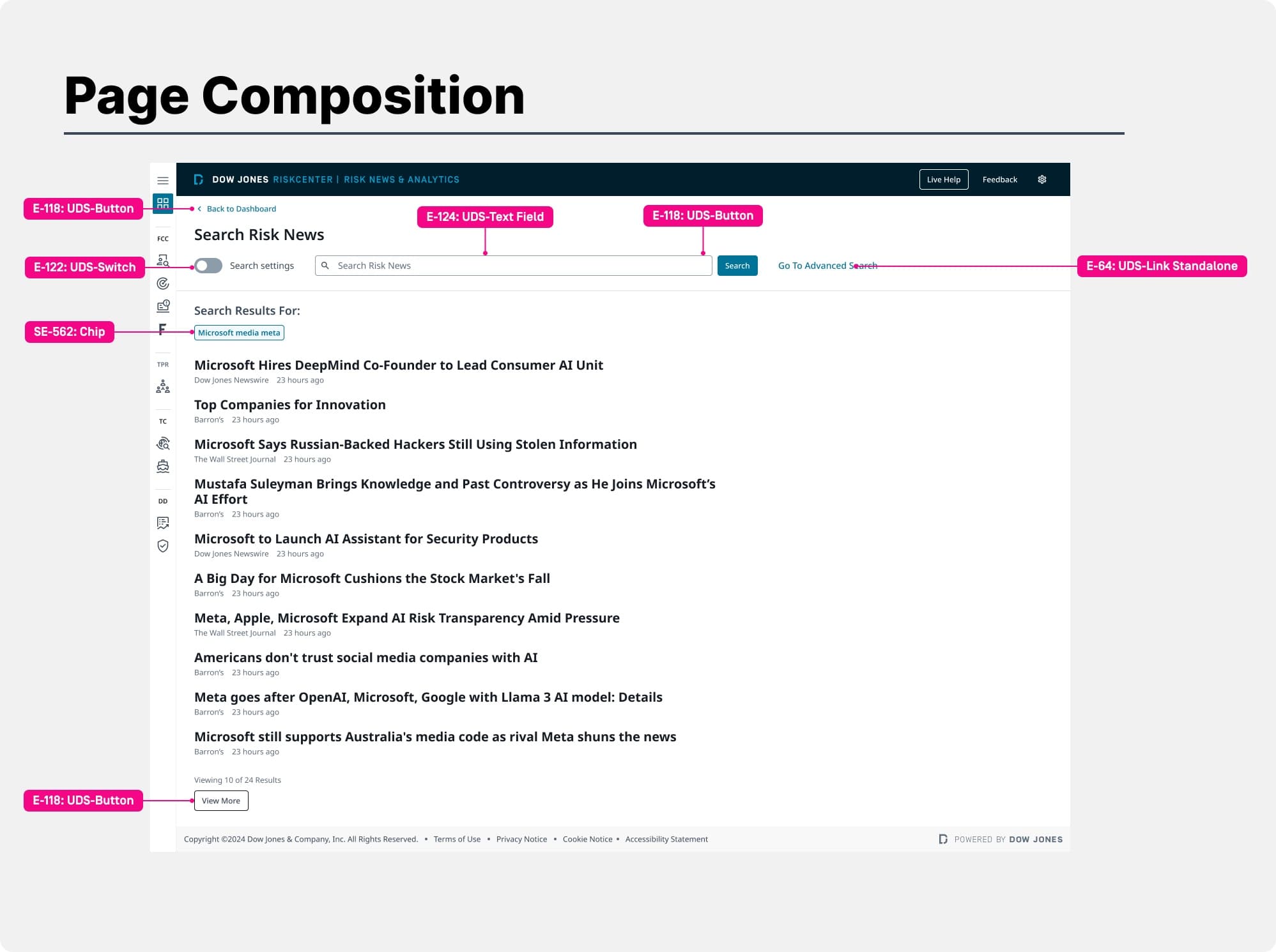
A launched Phase I dashboard that gives risk and compliance leaders a personalized, centralized home, rolled out in phases to C-suite and customers in early 2025.
The challenge of designing for the C-suite
The audience is senior, time-poor, and discerning. Risk intelligence was scattered across sources, and a generic feed would not earn a place in a C-suite leader's day. The dashboard had to curate relevance, prove value quickly, and make critical information digestible at a glance.
Designing the dashboard
Because relevance drives everything for this audience, the experience opens with onboarding: users select topics of interest, at least one to proceed, which immediately shapes the news feed. Personalization is not a buried setting, it is the first thing that happens.
The dashboard is the central hub, organized into clear, scannable sections so a busy leader orients in seconds.
Newsletters and sponsored insight, including partner content such as Deloitte and the Corruption Perceptions Index, add depth without cluttering the core scan.
Workspace, prototypes, and launch
Beyond the dashboard I designed the surrounding workspace and produced stakeholder-facing prototypes and presentations tailored to specific user types, CCO and analyst, plus an article audit and email-template handoff to keep the experience consistent end to end.
DJRJ rolled out in phases: internal and beta, soft launch to C-suite and sales, then customer availability, through Q1 2025.
A personalized Year-End Summary, an end-of-year wrap-up showcasing the value a subscriber received over the year, was designed specifically to boost retention.
Responsive across breakpoints
The dashboard was specified across breakpoints - a wide 16U layout down to a 12U tablet - so the workspace holds its density and hierarchy on every screen.
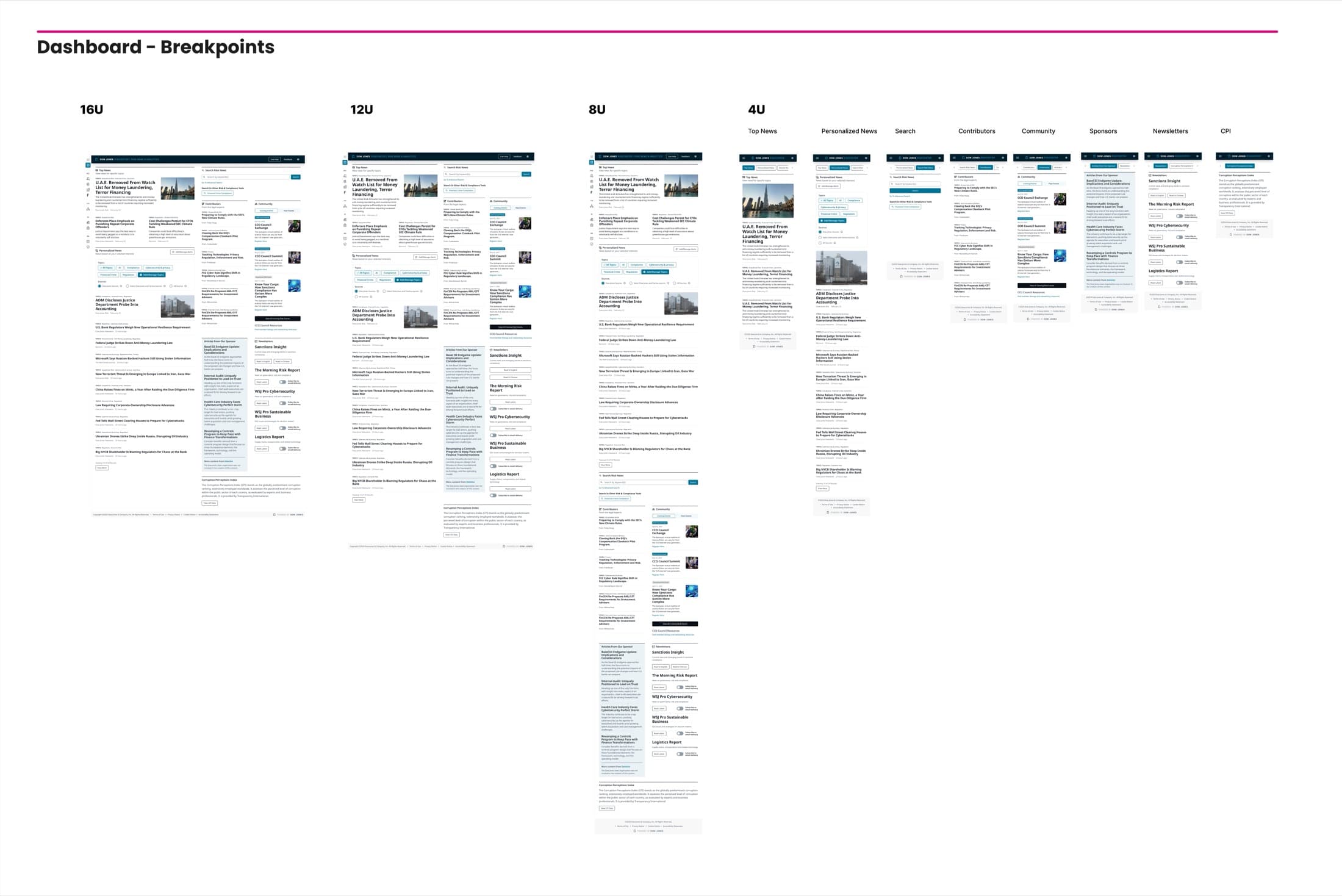
Designed for every state
[ Protected layer ]
The full case study is available on request.
High-fidelity screens, information architecture and the detailed process for this enterprise project are shared under NDA. Enter the access password, or request access and I will share the full walkthrough.