[ Case study ]
Healthigo - Telemedicine UX
A telemedicine platform that gives doctors a patient's full medical history, presented visually and assessed with AI, so they can diagnose accurately in less time. I took it end to end: competitor analysis, surveys with 121 patients and 88 doctors, card sorting, and usability testing through to a tested, high-fidelity app. Visual, AI-driven patient-history tracking became the MVP differentiator no competitor offered.
- Client
- Healthigo
- Role
- UX Architect
- Year
- 2018
- Disciplines
- UX Research, Healthcare, Information Architecture, Visual Design, Usability
[ Impact ]
6
IA areas: Profile, Doctor, Clinic, Speciality, Labs, Payments
[ Information architecture ]
Profile
- Patient history
- Records
Doctor
- Search
- Consultation
Clinic
- Locations
- Booking
Speciality
- Categories
Labs
- Tests
- Results
Payments
- Billing
- Checkout
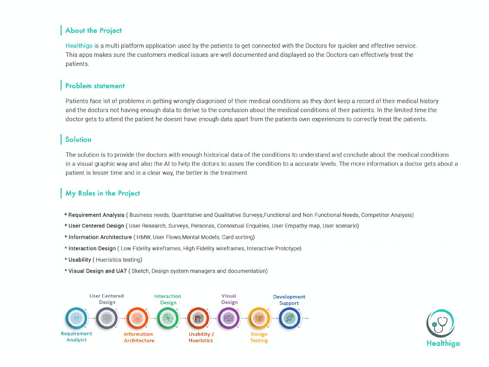
Healthigo is a multi-platform application that connects patients with doctors for quicker, more effective care. Its core idea is simple: make sure a patient's medical issues are well documented and easy to read, so doctors can treat them accurately. I led the end-to-end UX, from research through to a tested, high-fidelity product.
The problem
Patients were often diagnosed wrongly because doctors had no record of their medical history and not enough data to reach a confident conclusion. In a short consultation, a doctor simply doesn't have the patient's own history and experience in front of them to treat correctly.
The solution
Give doctors enough historical data to understand a condition - presented in a clear, visual way - and use AI to help assess that condition to accurate levels. The more a doctor knows about a patient, in less time and a clearer form, the better the treatment. Patient-history tracking, in AI and visual form, became the product's MVP differentiator - something no competitor offered.

Research and discovery
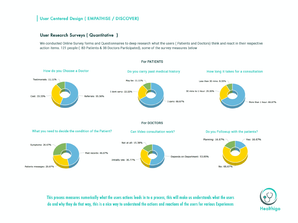
I grounded the work in requirement analysis and user-centred research: competitor analysis across three platforms, quantitative surveys with 121 patients and 88 doctors, qualitative contextual enquiries, personas, empathy maps, and user scenarios that traced how a real patient and doctor would move through the experience.
Information architecture
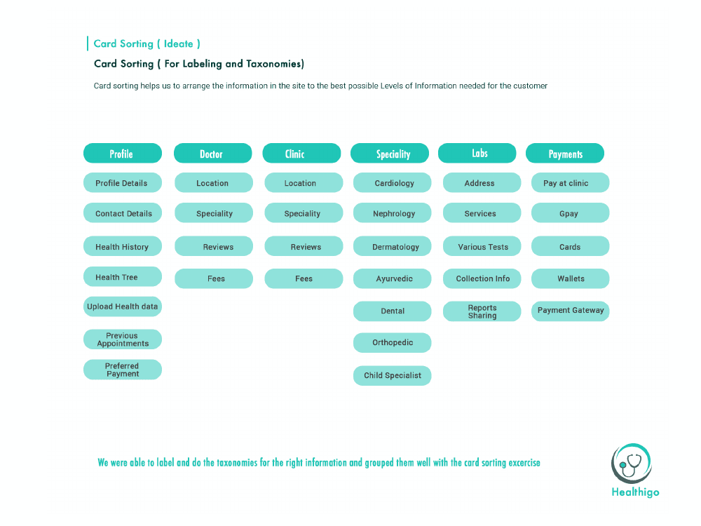
Card sorting turned the research into a clear structure - Profile, Doctor, Clinic, Speciality, Labs, and Payments - supported by user flows, mental models, and how-might-we framing, so the app's information was labelled and grouped the way patients actually think.
Design
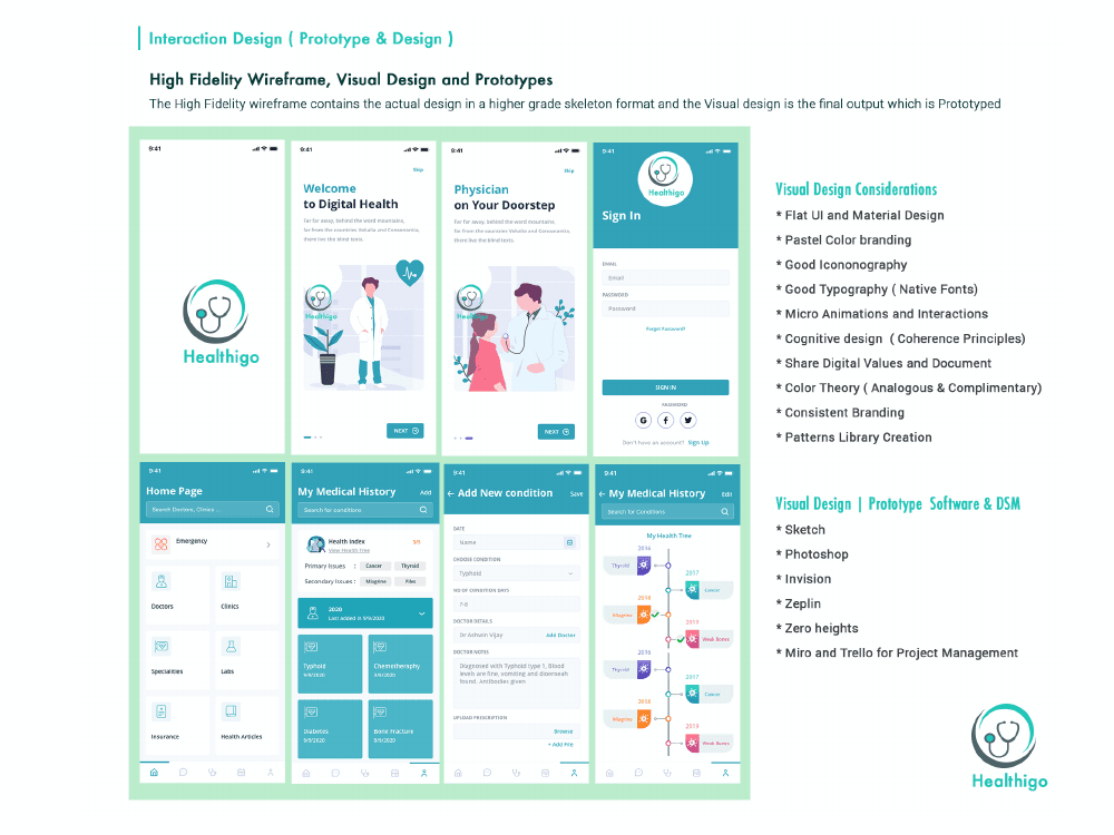
From low-fidelity wireframes I moved to a high-fidelity visual design and an interactive prototype - flat, material-led UI, pastel medical branding, clear iconography, micro-interactions, and a documented pattern library - keeping a clinical experience calm, legible, and reassuring.
Usability testing
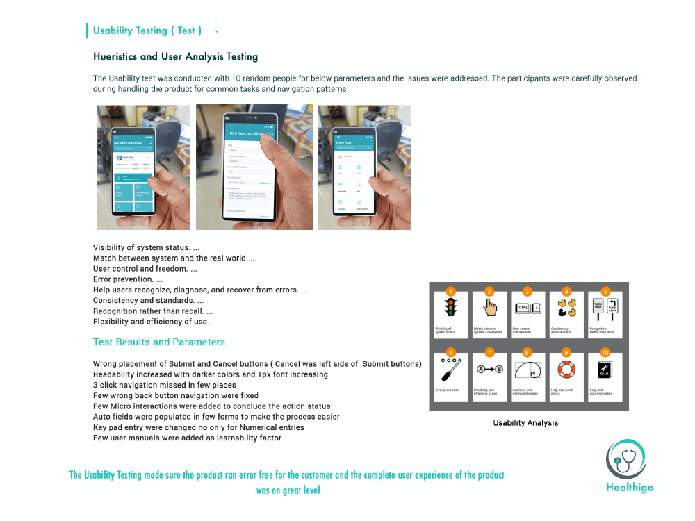
Heuristic evaluation and user testing with ten participants surfaced the issues that mattered - the wording of submit and cancel actions, navigation clarity, and error recovery - which I refined before the experience was considered done.
Outcome
A telemedicine experience built on real stakeholder and user needs, where a patient's history is finally legible to the doctor - making diagnosis faster, clearer, and more accurate.
The more a doctor knows about a patient, in less time and a clearer form, the better the treatment - that single insight shaped every screen in Healthigo.