01 · Prepared for the Netflix hiring team
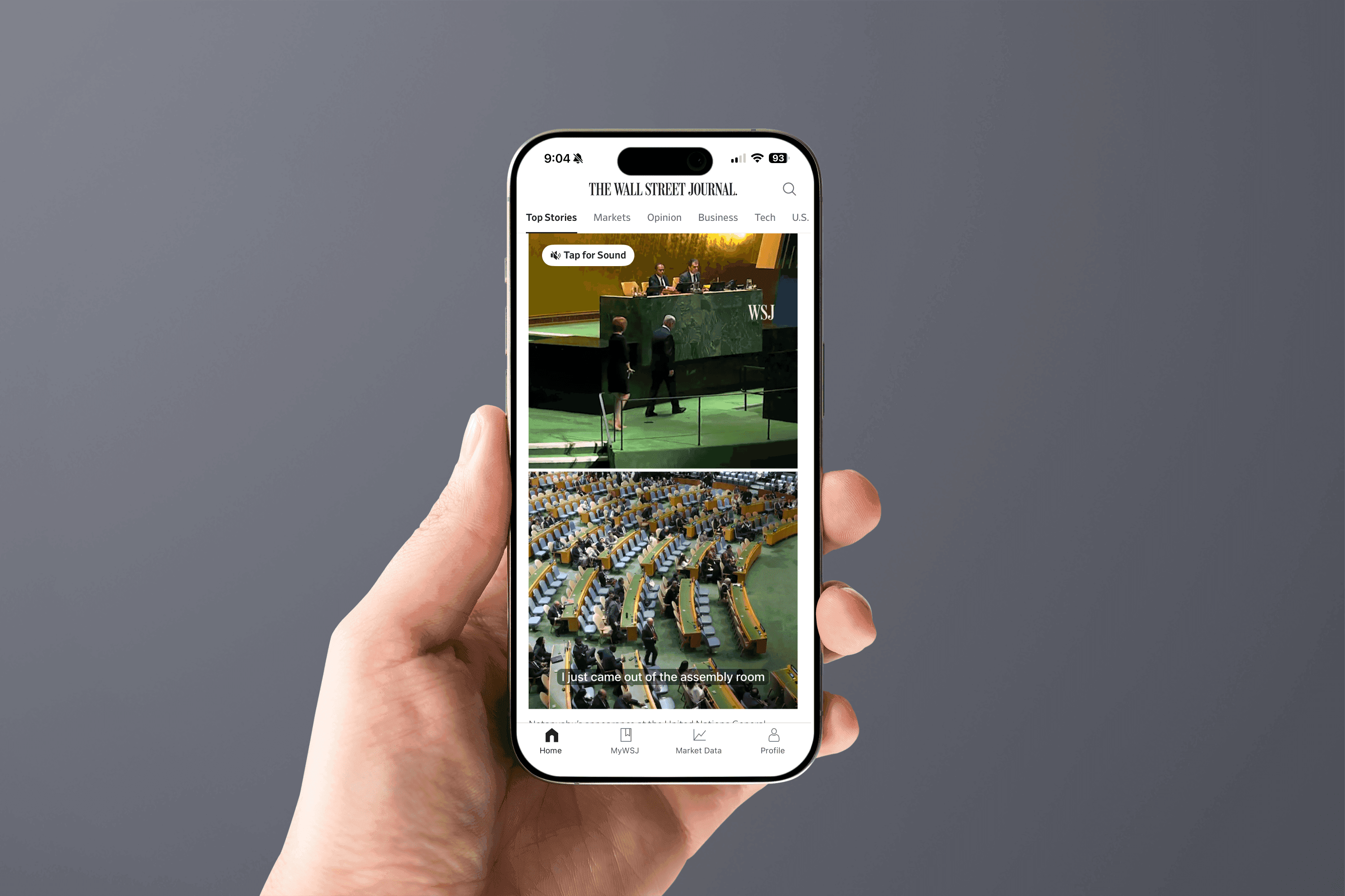
An adaptive vertical video experience for The Wall Street Journal that delivers cinematic news across mobile, tablet, and desktop. As Lead UX Architect from February to November 2024, I mapped the user journeys, designed and documented the Vertical Player component across its Default, Playing, Paused, and Ended states, and built a responsive system that reflows from a wide 16u layout down to a 4u mobile stack. It now ships live in the WSJ Mobile App.
Why this piece is in my application
This version opens without a password. It was prepared for the Netflix hiring team as part of my application for a Staff Product Designer role.
70%+
Of WSJ readers on mobile, the format's starting point
4 states
Default, Playing, Paused, and Ended, fully documented
Live in app
Shipped in the WSJ Mobile App; web in progress
WSJ Vertical Video redefined storytelling for The Wall Street Journal: an adaptive vertical video experience that delivers cinematic news across mobile, tablet, and desktop. This case study covers the full journey, from identifying the problem to designing the Vertical Player component, documenting its states and interactions, and scaling it into the editorial ecosystem, while staying true to WSJ's premium voice.

Overview
WSJ set out to modernize its video storytelling by introducing a vertical format that felt immersive, editorially authentic, and consistent with its premium brand. The vision was a responsive system that worked seamlessly across mobile, tablet, and desktop. As Lead UX Architect I led the initiative from February to November 2024, partnering with editorial, product, and engineering to map user journeys, prototype interaction flows, and refine responsive layouts into a scalable design system. What began as a response to mobile-first behavior grew into a cross-platform standard for WSJ.
The work spanned two connected files. The UX architecture file held the thinking: content massing, a content audit, user and page flows, user scenarios, wireframes for every surface the format touches, a component inventory, functional specifications for engineering, and the Vertical Player component with its full state set. The visual design file resolved that structure in high fidelity. What I delivered:
- Content massing and a content audit that defined how much each surface could hold before the design existed.
- End-to-end user and page flows across the homepage, live coverage, section fronts, and the video center.
- Wireframes for every surface the vertical format appears on, at every breakpoint.
- A component inventory and functional specifications precise enough for engineering to build against.
- The Vertical Player component, documented across its Default, Playing, Paused, and Ended states.
- High-fidelity visual design and a component library added to WSJ's design system.

The challenge of modern news consumption
Traditional horizontal video formats no longer matched how audiences consumed digital news. More than seventy percent of WSJ readers accessed content on mobile, but video modules often disrupted editorial flow, loaded inconsistently, or felt detached from the article experience. From the business side, WSJ needed to demonstrate leadership in immersive storytelling and strengthen video engagement. From the reader side, audiences wanted a cinematic, intuitive way to watch news across devices without compromising accessibility or editorial quality.
The design tension sat at the center of every decision: bring the immediacy of vertical video to WSJ journalism without spending the authority, clarity, and trust that define the brand. Immersion that still reads as journalism, never a social feed, became the north star.

Research and competitive audit
I ran a structured audit of vertical video across TikTok, Instagram Reels, and YouTube Shorts, mapping each experience from entry point to playback to the move between stories. The goal was to isolate the patterns that make vertical video feel effortless, and to name the ones a newsroom with WSJ's standards should deliberately refuse.
Patterns worth adopting
- A full-bleed 9:16 frame that treats the video as the surface, not a thumbnail in a card.
- Muted autoplay with captions, so a story starts the instant it is in view without hijacking sound.
- Sound on a single, obvious tap, keeping control with the reader.
- A vertical swipe to move between stories, with a light progress affordance so readers know where they are.
Patterns to refuse
- Algorithmic pacing that optimizes for watch time rather than the story's own rhythm.
- Infinite, bottomless feeds that pull readers away from the journalism.
- Social vanity metrics and reaction mechanics that undercut editorial authority.
That adopt-and-refuse list became the brief for the component: immersive and swipeable, but paced by editors and framed as reporting.
Information architecture and surfaces
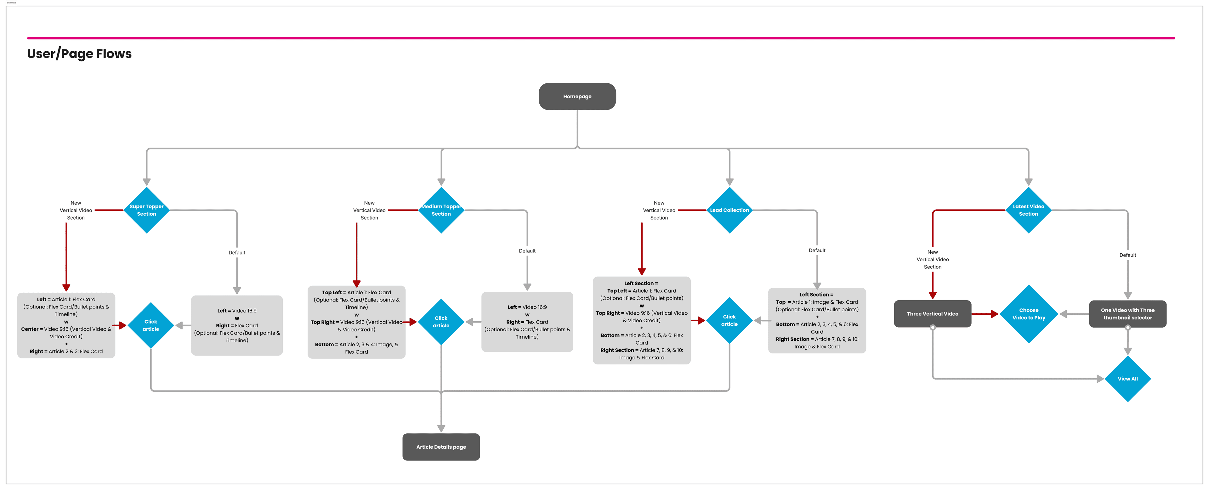
Before designing a single screen I mapped where vertical video should live across WSJ and how readers reach it. Defining these flows first gave the format a deliberate place in the experience rather than being bolted onto each surface. The player had to behave consistently across four distinct surfaces, each with its own reading context.
- Homepage: the format's most prominent home, appearing in the Super Topper, Medium Topper, Lead Collection, and the latest-video section, each a different weight of placement in the page's hierarchy.
- Live Coverage: vertical video embedded inside a developing story, sitting alongside the live updates rather than interrupting them.
- Section Front: video as an entry point into a topic, tuned so the format supports scanning rather than dominating it.
- Video Center: the destination surface where readers browse and move between stories in sequence.
Across all four, the flow resolves the same way: a reader discovers a story, orients to what it is, watches, and continues to the next one. I designed against those four verbs, discover, orient, watch, and continue, rather than against a generic video player.
The Vertical Player component
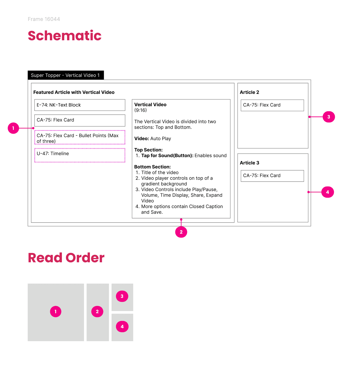
The Vertical Player is the heart of the system: one component, documented from anatomy to behavior, that every surface reuses. It is built on a 9:16 frame split into a clear read order so fifty stories from twelve desks still feel like one product.
Anatomy
- Top zone: the kicker or section label, the headline, and, where relevant, a live badge. This is what a reader reads first, before the video even resolves.
- Media layer: the full-bleed video itself, with a poster frame for the pre-play state and captions rendered over the lower third.
- Bottom zone: caption, byline or source, the progress affordance, and the controls, positioned within thumb reach on mobile.
- Sound affordance: a single, persistent, unmistakable control to bring sound on, since muted autoplay is the default.
The four states
Every placement of the player resolves to one of four documented states. Each state defines exactly what is visible, what the reader can do, and how the component behaves.
- Default: the poster frame is shown, video is muted, captions are ready, and the sound affordance is visible. The top zone carries the headline so the story reads even before playback begins.
- Playing: the video autoplays muted with captions on. The progress affordance advances, secondary controls recede so the frame stays cinematic, and the sound affordance remains within reach.
- Paused: a tap pauses playback and brings the controls and scrubber forward. The reader can scrub within the story, resume, or move on, with the current frame held steady.
- Ended: playback resolves into a replay prompt and a clear affordance to continue to the next story, so momentum is never lost at the end of a clip.
Documenting the states this way gave engineering an unambiguous contract and gave editors a predictable format: whatever surface a story lands on, its behavior is already defined.
Interaction and motion model
The interaction model was written as a set of explicit, testable rules in the functional specification, not left to interpretation. Every behavior below is documented, and every one exists to keep the reader in control. Try it: the player below is a working implementation of the documented model, with the footage abstracted since the client work is under NDA.
Playback rules
- Autoplay without sound: a video begins playing automatically as the reader scrolls it into view, always muted at first.
- Pause on scroll: when the reader scrolls away, the player stops and resets to the beginning, so a story never plays on unwatched.
- Play and pause: a tap on the frame toggles playback; a drag on the timeline scrubs to any point in the story.
Sound and title reveal
- Tap for Sound: a single button at the top of the video prompts the reader once, at the beginning of the interaction. Once tapped, sound is enabled and the button never displays again.
- Title display: the title is revealed only after the reader taps for sound. With no interaction, the title hides along with the player controls, keeping the frame cinematic.
Control visibility
- Controls appear on interaction and auto-hide after 5 seconds of inactivity; while the pointer is over the player they stay visible.
- On mobile, the revealed state clears after 3 seconds of no interaction.
- Captions shift up when the controls appear, so text never collides with the scrubber.
The control set
- Volume: on-screen control, alongside the device's physical volume buttons.
- Time scrub: drag the timeline indicator backward or forward to any point.
- Share: send the story through social or other channels.
- Expand: grow the video in place, to a maximum of 6 columns or 460px on the widest layouts, 4 columns on smaller ones, and full device width on mobile.
- More: a menu holding Closed Captions and Save, so secondary actions stay one level down and the primary frame stays quiet.
- Alt text: every video carries a descriptive text alternative.
Responsive system and editorial modules
The experience was not a phone feature bolted on. It is a system that reflows from a wide desktop layout down to a mobile stack, holding the same hierarchy and interaction model at every size. I defined the content massing first, how much each module could hold and how it should reflow, before resolving the same structure in high fidelity.
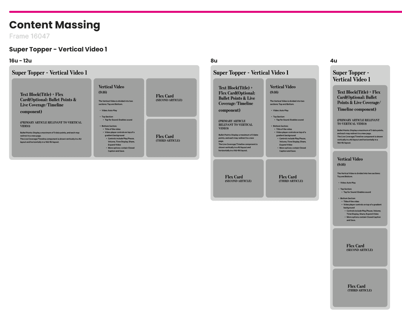
The same player powers a family of editorial modules, each a different weight of placement, and each documented so editors know exactly what they are choosing:
- Super Topper: the highest-impact placement, a large vertical frame that anchors the top of the page.
- Medium Topper: a mid-weight placement that gives video prominence without taking the whole viewport.
- Lead Collection: a grouped placement where several stories sit together and the reader moves between them.
- Latest-video section: a lighter, scannable placement that keeps recent video within reach further down the page.
Content massing defined how each module reflowed from a wide 16u layout, through 12u and 8u, down to a stacked 4u mobile layout. One structure, resolved at every breakpoint.
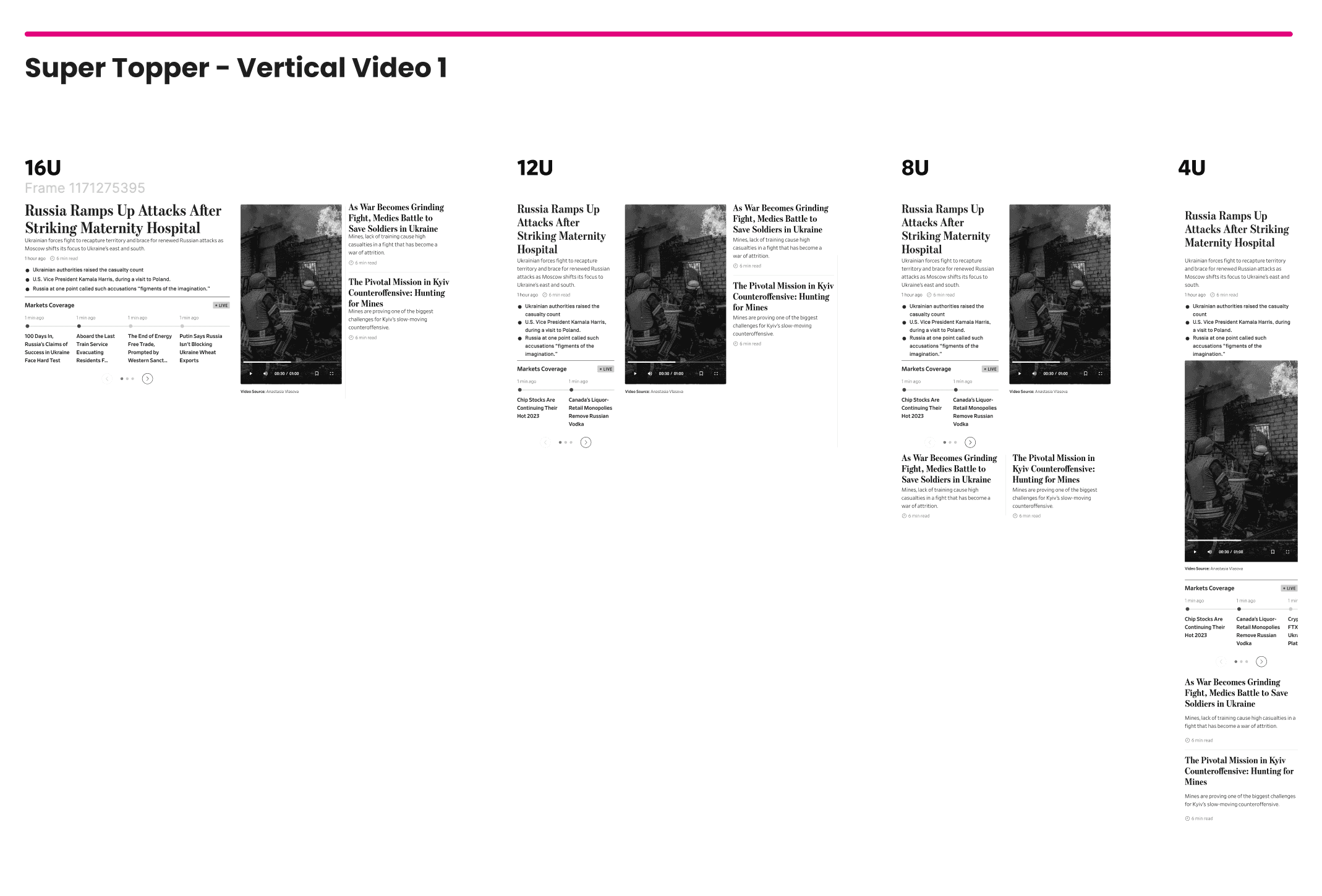
Anatomy of a surface: Live Coverage
Each surface got its own documented layout spec. Live Coverage, where vertical video sits inside a developing story, shows the level of rigor: every region has UX rules, a column allocation, and defined reflow behavior.
- Top section: the featured article's title and description, on an 8-column layout, grabbing attention and setting context for everything below.
- Left section (mid section on larger displays): the What to Know briefing on 6 columns with the Vertical Video beside it on 4, engaging readers with supplementary detail and multimedia tied to the featured story. On the narrowest layout the briefing moves above the video.
- Right section: a featured article paired with its own vertical video.
- Bottom section: the Timeline component on 8 columns, giving the ongoing story its chronology. On the widest layout it sits below the featured details showing at most 3 lines per update; on smaller layouts it takes 4 columns and allows 5 lines, truncating beyond that. Every update carries a timestamp.
The vertical video itself follows one invariant everywhere: a 9:16 ratio on a 4-column layout, at every viewport from 16u to 4u. Everything else on the page reflows around that constant.
Functional specifications
So the component could be built once and trusted everywhere, the functional specification documented every module on the page, its UX rules, and its mapping into WSJ's design system. Vertical Video was the single net-new component; everything around it reused documented, existing components.
- Each module's spec named the design-system component it maps to, its component ID in the library, and the viewports it supports, so engineering built against the system rather than against a picture.
- The headline, flex card, briefing card, and timeline all resolved to existing library components with documented IDs; only the player itself was net new.
- The player spec defined the full behavioral contract: autoplay, pause-and-reset on scroll, the one-time Tap for Sound, title reveal, the 5-second auto-hide, and every control from scrub to Save.
- Edge behavior was written down, not assumed: what happens on scroll-away mid-play, how the reveal state decays on mobile, and how expand resolves at each breakpoint.
- Alt text and captions were part of the component contract, not an accessibility pass afterward.
Accessibility
Accessibility was a design input, not a review at the end. Because the format is immersive and motion-heavy, the accessibility work mattered more, not less.
- Captions on by default, with sound reaching the reader only on intent.
- Reduced-motion support that quiets transitions for readers who opt out.
- Sufficient contrast for text and controls rendered over live video, including the overlays in the top and bottom zones.
- Touch targets sized for a thumb in motion, positioned where the hand already is.
- Clear labels for every control so assistive technology can operate the player.
- No meaning carried by color alone, so state is always communicated more than one way.
From prototype to a scalable editorial system
Scaling vertical video across WSJ required close collaboration with product managers, engineers, and editorial staff. Together we translated the design into modular components that embedded directly into the CMS, letting editors place the new format without extra steps. Each component was documented, with its states and specifications, and added to WSJ's design system, making it reusable for other Dow Jones brands such as MarketWatch, Barron's, and WSJ PRO.
The rollout included accessibility testing, responsive QA, and pilot feedback from editorial teams. Details such as autoplay timing, caption display, and video transitions were refined before launch. By release, vertical video was not a prototype but a fully integrated, enterprise-ready part of the design system, governed by tokens and variants rather than one-off screens.
Live implementation
The vertical video experience is now live in the WSJ Mobile App, embedded within article templates and home modules. This rollout confirmed the system could scale to production and integrate cleanly into the editorial workflow. Readers now experience immersive vertical video directly in the app, with the web experience in progress.

Impact and learnings
The WSJ Vertical Video system launched as more than a design refresh. It set a new standard for digital storytelling across the Journal's platforms: a documented component, a defined interaction model, and a responsive system that editors can reach for on any surface. The format was designed to deepen engagement through immersive, complete viewing while keeping the reader in control, and to give the newsroom a cinematic, interactive way to tell stories that still felt distinctly WSJ.
On a personal level, the project reinforced my belief that innovation in editorial design must balance audience expectations with brand integrity, and it underscored the value of building documented, scalable systems instead of isolated features. What began as a response to mobile-first behavior grew into a cross-platform storytelling standard, and the lessons directly shaped later multi-brand design-system work at Dow Jones.
Vertical video at WSJ had to feel immersive without ever feeling like a social feed. Documenting it as a component with defined states and specs, not an isolated screen, let the format serve the story and become a cross-platform standard across the Journal.
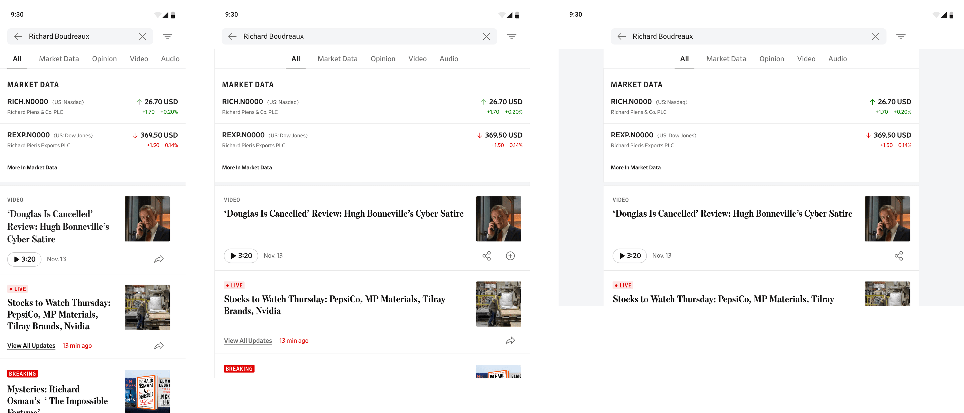
Next · Search reframed as discovery and navigation rather than a query box, on the surface where a large share of sessions actually begin.