02 · Prepared for the Netflix hiring team
I led the redesign that turned WSJ mobile search from a content-retrieval tool into a discovery and navigation platform for millions of subscribers. A tabbed architecture unifies five content types, news, market data, opinion, video, and audio, in one search session, while seven reusable components were contributed back to the WSJ Index Design System. Nineteen screen states were fully specified, with the filter and market-data patterns reused well beyond search.
Why this piece is in my application
This version opens without a password. It was prepared for the Netflix hiring team as part of my application for a Staff Product Designer role.
7
Reusable components added to the Index Design System
19
Screen states fully specified
5
Content types unified in one search
The Wall Street Journal mobile app serves millions of subscribers across news, markets, opinion, video, and podcasts. Search worked for retrieval, but stopped there - no path forward, no related context, no way to follow a topic. I led the redesign that transformed search from a content-retrieval tool into a discovery and navigation platform, built as an extension of the WSJ Index Design System.
Overview
Search was reframed as a primary navigation and discovery surface rather than a single-purpose results page. The work spanned product strategy, information architecture, UI and UX, component creation, and close engineering collaboration across iOS and Android.
Business goals
- Increase content engagement per session
- Improve subscription value perception
- Reduce navigation friction and surface premium content faster
- Enable multi-format discovery across news, markets, opinion, video, and audio
User goals
- Find relevant content in fewer steps
- Discover topics beyond a single query
- Return to followed stories, authors, and companies easily
- Access live market data alongside the news
The challenge
Search was optimized for retrieval. WSJ needed it to become a discovery and navigation platform serving three different reader intents at once.
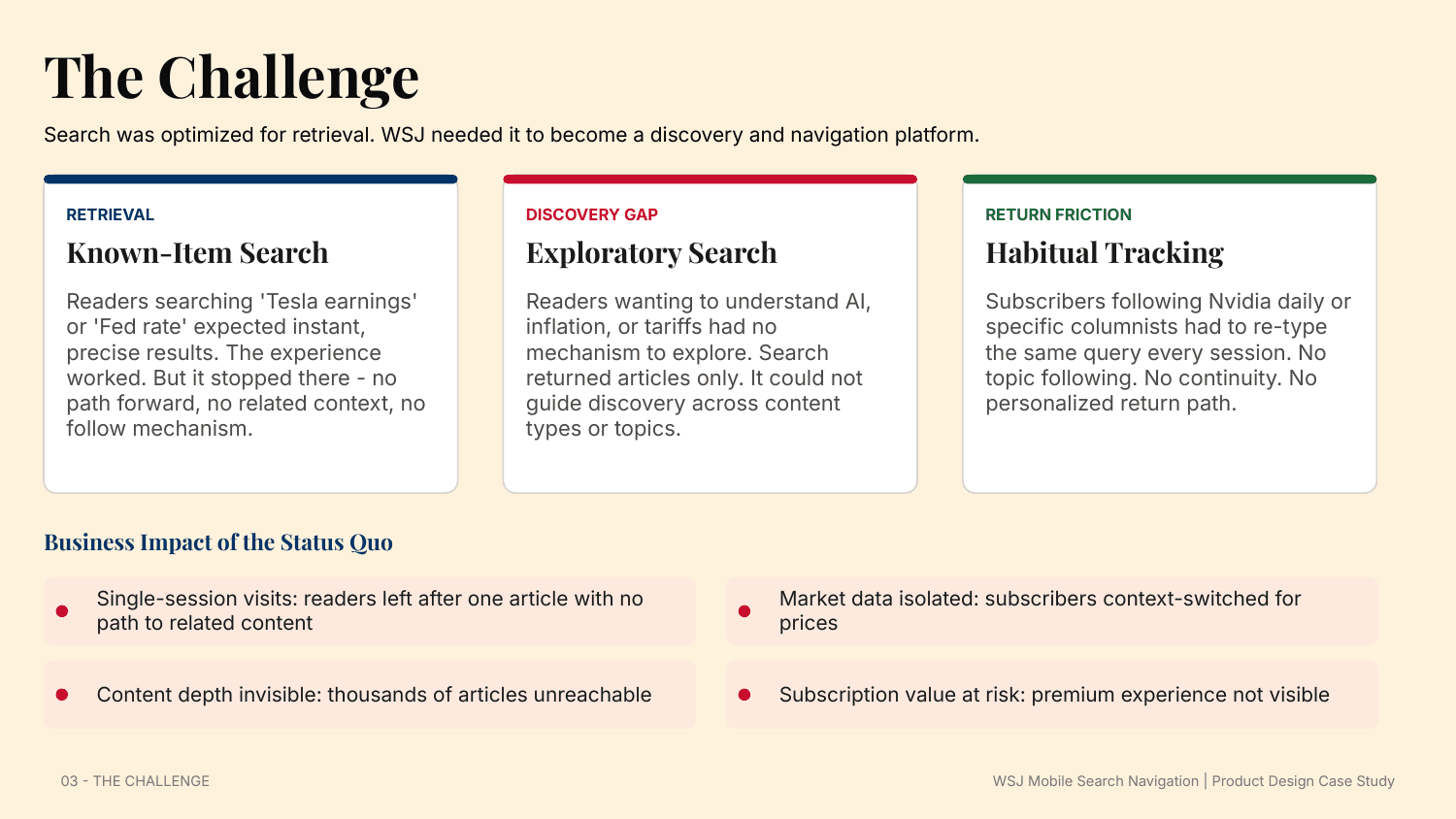
- Known-item search worked - 'Tesla earnings' or 'Fed rate' returned precise results - but it dead-ended with no path forward.
- Exploratory search had no mechanism: readers wanting to understand AI, inflation, or tariffs were returned articles only, with no way to explore across content types.
- Habitual tracking forced subscribers following Nvidia or a columnist to re-type the same query every session. No following, no continuity, no personalized return path.
Research and discovery
Four methods grounded the work: analytics review across 30 days of mobile usage, eight subscriber interview sessions, a competitive audit of Bloomberg, Reuters, NYT, and FT, and a heuristic evaluation against Nielsen heuristics and mobile search best practices.
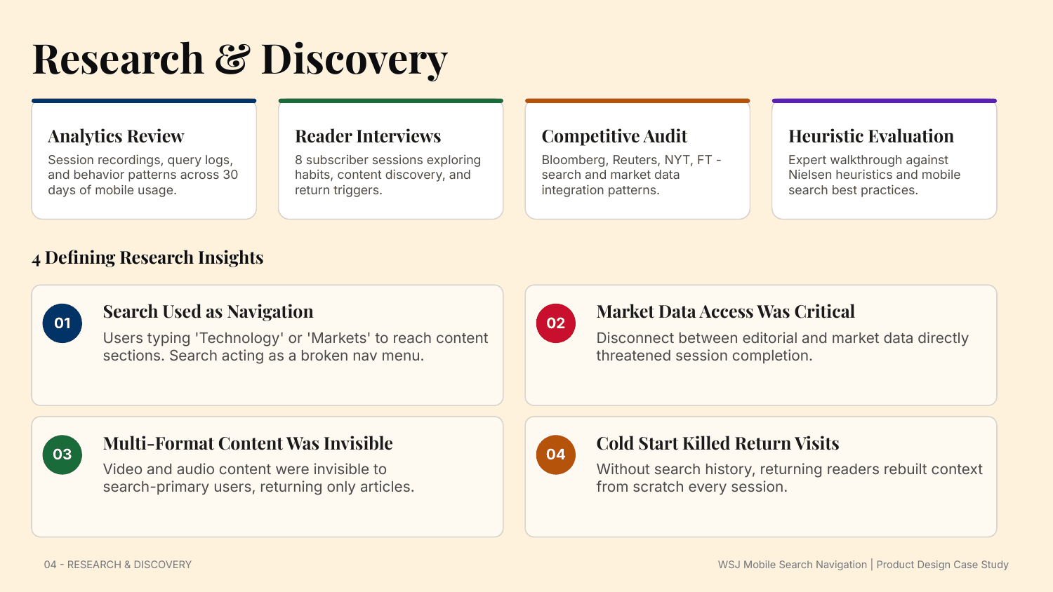
- Search was being used as navigation - readers typed 'Technology' or 'Markets' to reach sections, treating search as a broken nav menu.
- Market-data access was critical: the disconnect between editorial and market data directly threatened session completion.
- Multi-format content was invisible - video and audio never surfaced for search-primary users, who only ever saw articles.
- Cold start killed return visits: without history, returning readers rebuilt their context from scratch every session.
Design principles
Five principles governed every decision, from information architecture to component behavior to interaction detail.
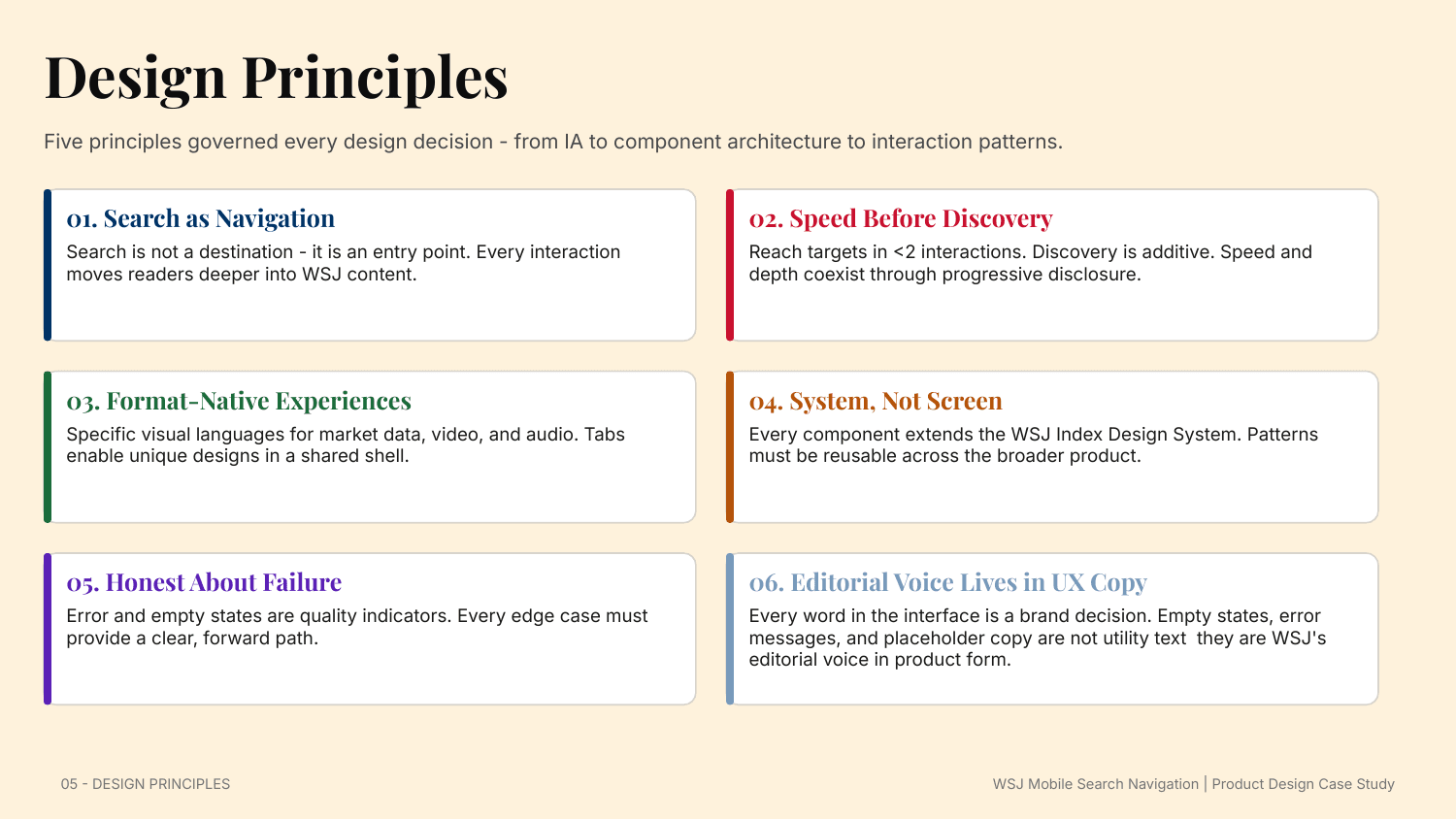
- Search as navigation: every interaction moves readers deeper into WSJ content.
- Speed before discovery: reach targets in under two interactions; discovery is additive through progressive disclosure.
- Format-native experiences: market data, video, and audio each get their own visual language inside a shared shell.
- System, not screen: every component extends the WSJ Index Design System and must be reusable across the product.
- Honest about failure: error and empty states are quality indicators, and the editorial voice lives in every word of UX copy.
Information architecture
The flat, article-only model became an ecosystem model: a tabbed architecture - All, Market Data, Opinion, Video, Audio - that separates content types while keeping discovery inside a single search session.
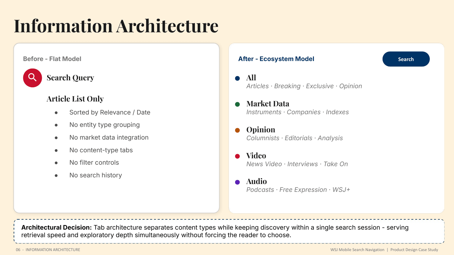
Tab architecture serves retrieval speed and exploratory depth simultaneously, without forcing the reader to choose between them.
A system, not a screen
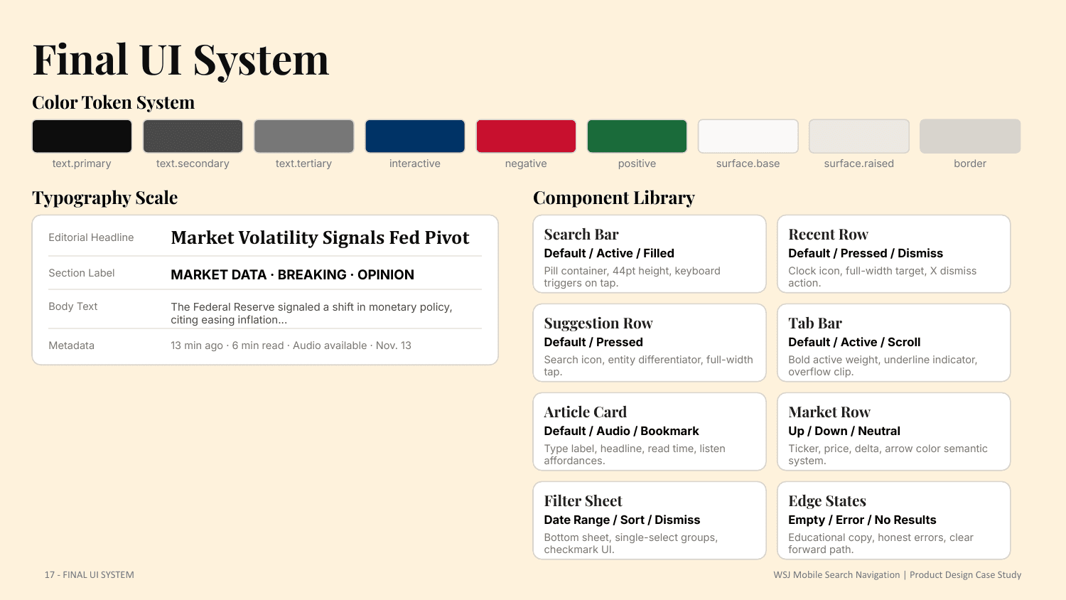
The experience was built as an extension of the WSJ Index Design System. Existing tokens for color, typography, and spacing were reused, and seven new search-specific components were contributed back to the system.
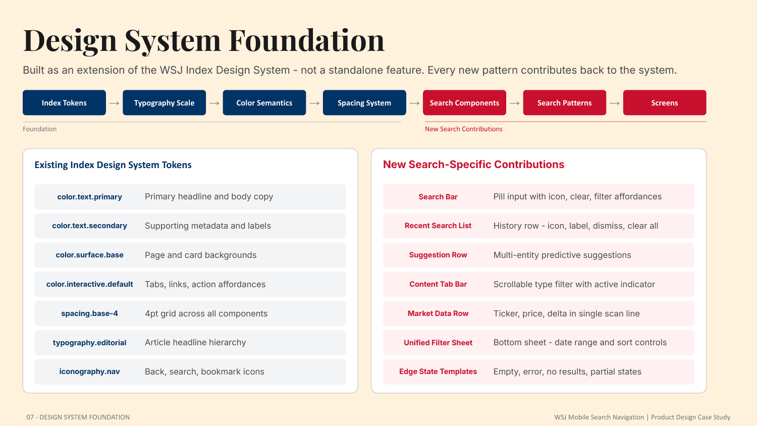
- Search bar, recent-search list, and multi-entity suggestion rows
- Content tab bar with an active-state indicator
- A single-scan market-data row, a unified filter sheet, and edge-state templates for empty, error, no-results, and partial states
Exploration and iteration
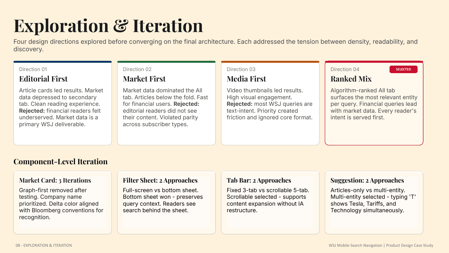
Four directions were explored - Editorial First, Market First, Media First, and Ranked Mix - each addressing the tension between density, readability, and discovery. Ranked Mix was selected: the All tab algorithmically surfaces the most relevant entity per query, so financial queries lead with market data and every reader's intent is served first.
The detailed walkthrough continues behind the gate - the full component system and every state, the responsive design across iPhone, Android, and iPad, and the complete end-to-end journey.
The search experience
Recent searches
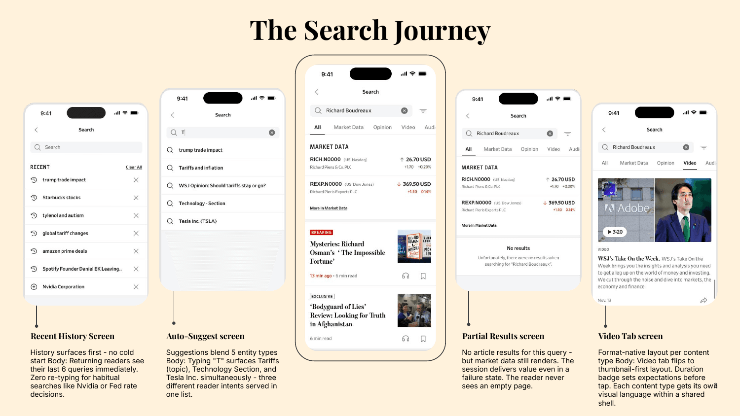
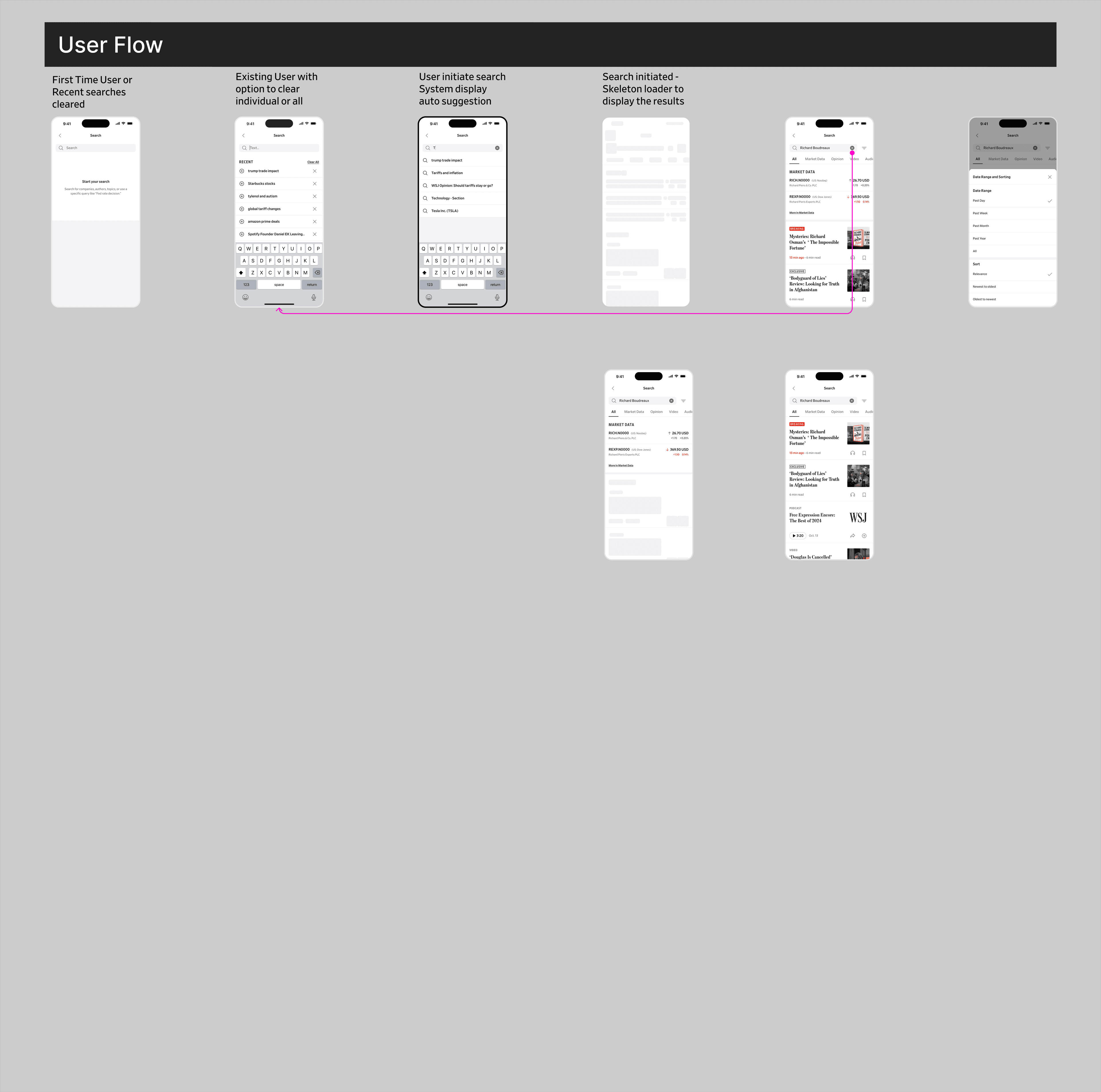
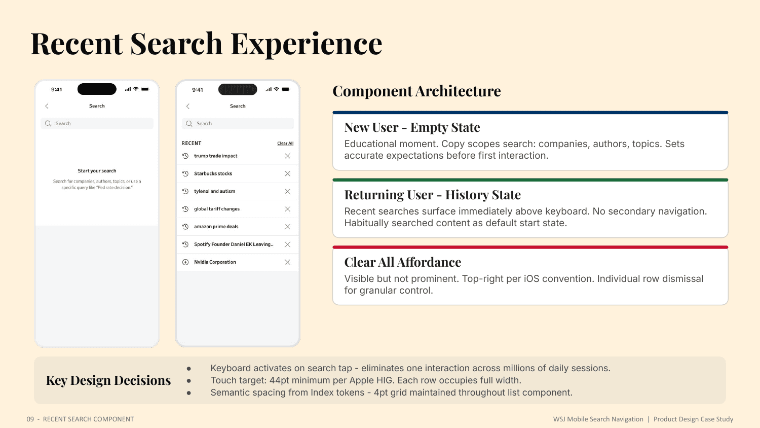
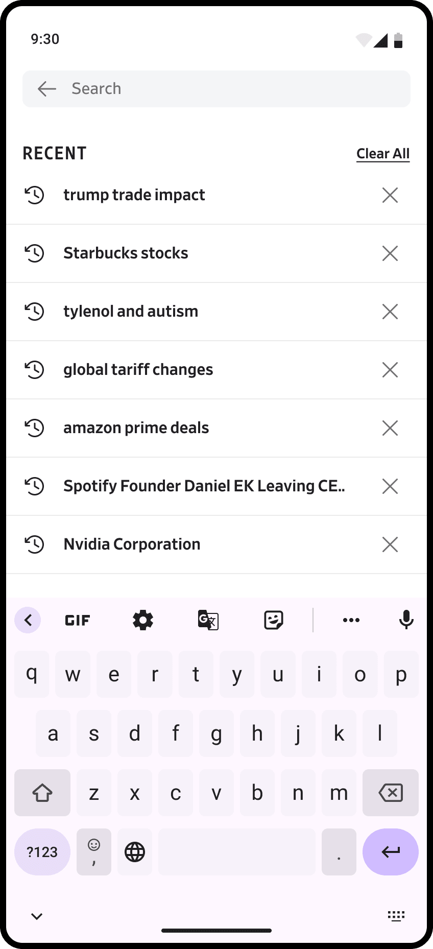
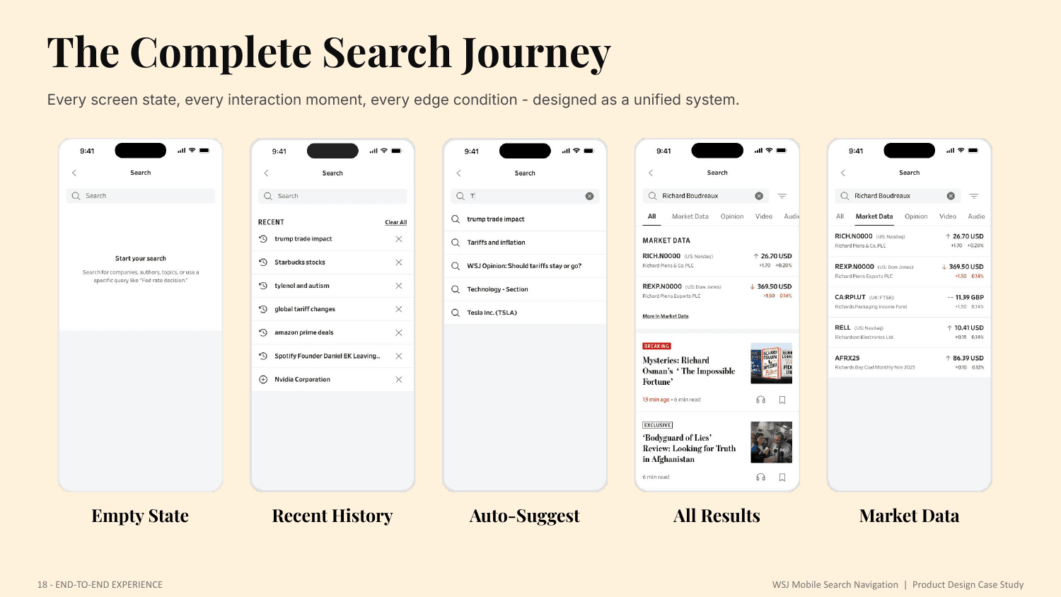
New users see an educational empty state that scopes what search can do - companies, authors, topics - setting accurate expectations. Returning users see their recent searches immediately above the keyboard, with a Clear All affordance and per-row dismissal. The keyboard activates on tap, eliminating one interaction across millions of daily sessions.
Suggested search
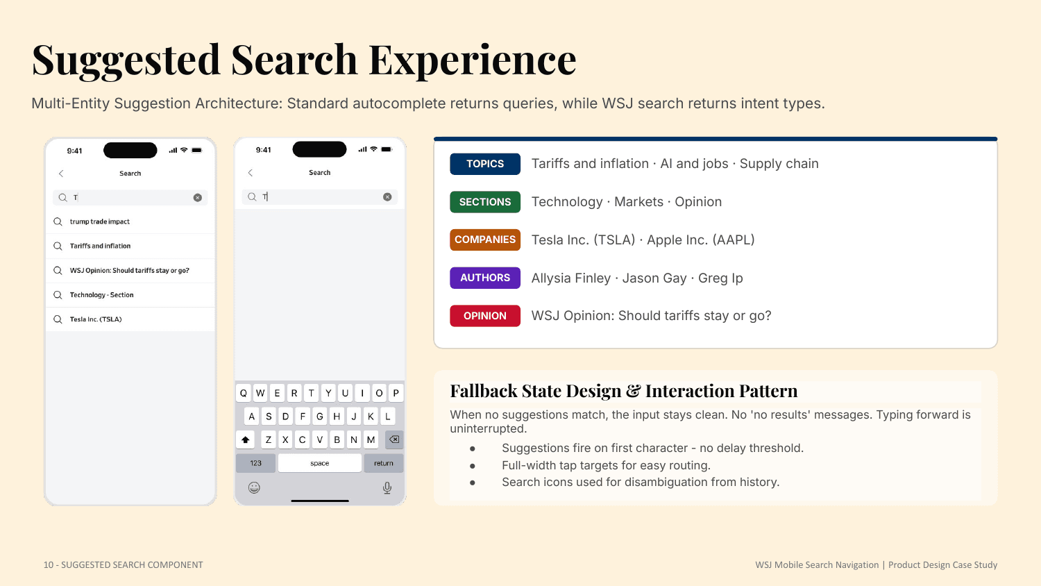
Where standard autocomplete returns queries, WSJ search returns intent types - topics, sections, companies, authors, and opinion - in one multi-entity list. Suggestions fire on the first character with no delay, and when nothing matches the input stays clean, with no 'no results' message interrupting the reader.

Search landing
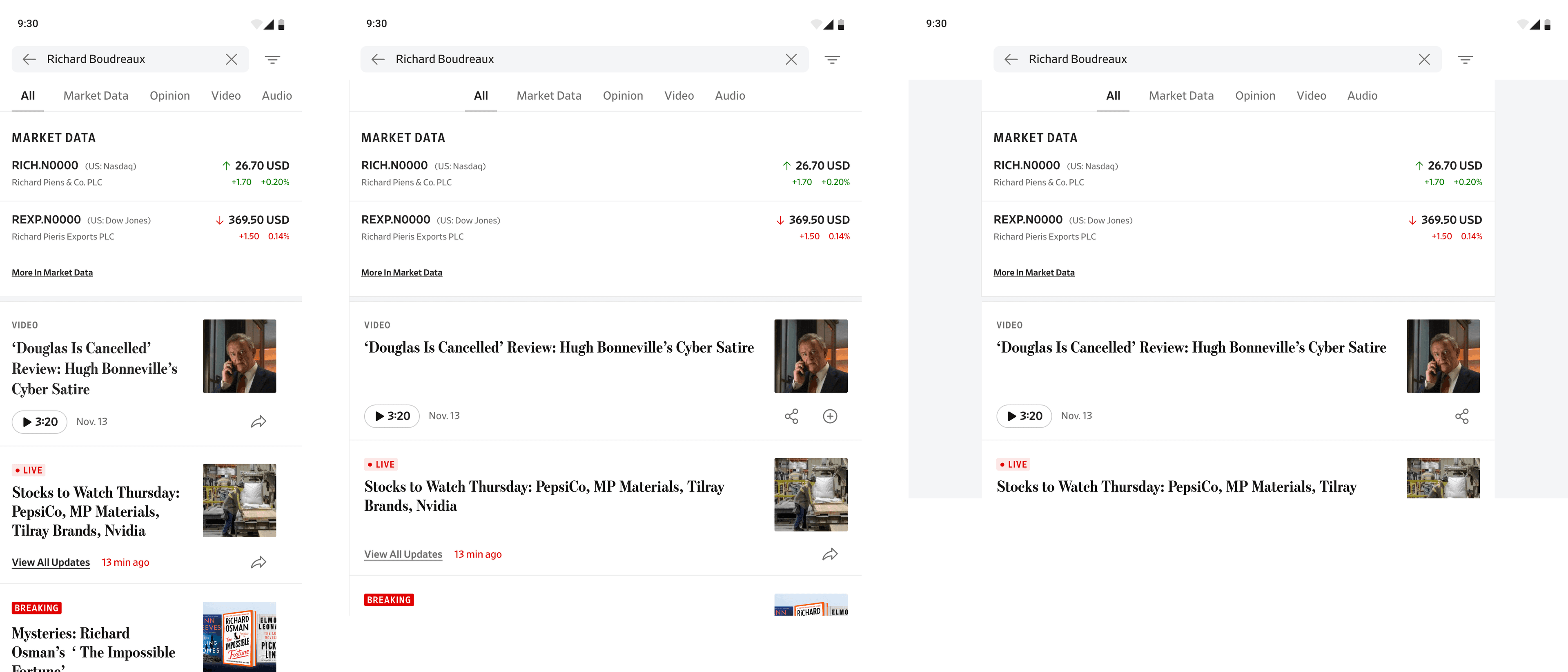
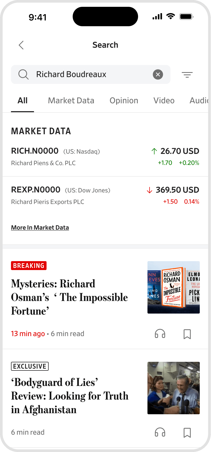
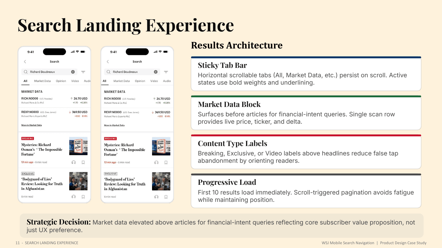
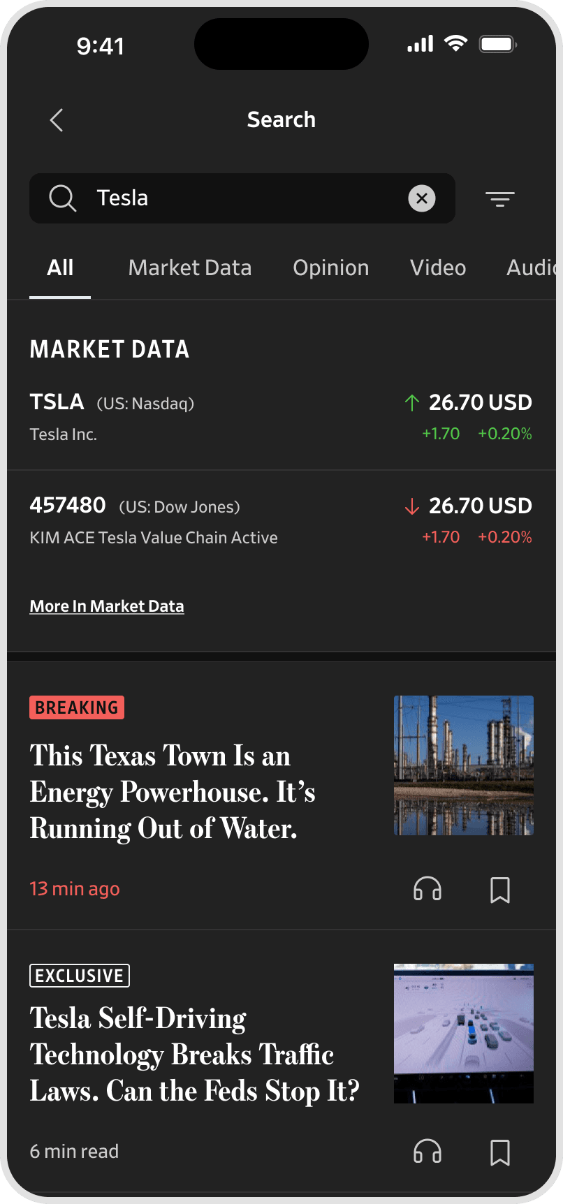
A sticky, horizontally scrollable tab bar persists on scroll. For financial-intent queries the market-data block surfaces before articles, providing live price, ticker, and delta in a single scan row. Content-type labels - Breaking, Exclusive, Video - orient readers and reduce false taps, while progressive loading keeps the first ten results instant.
Market data redesign
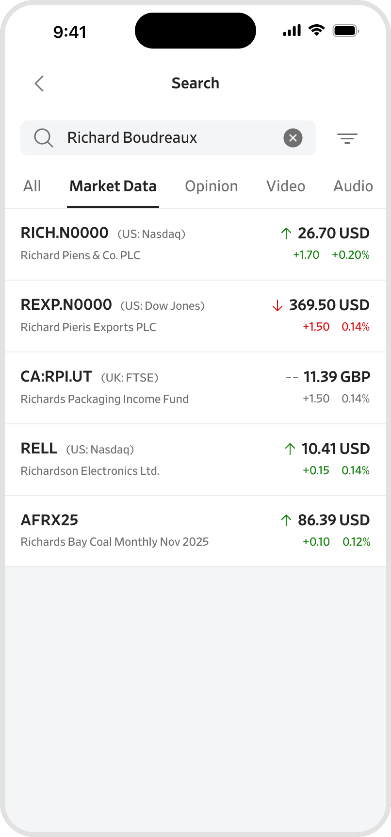
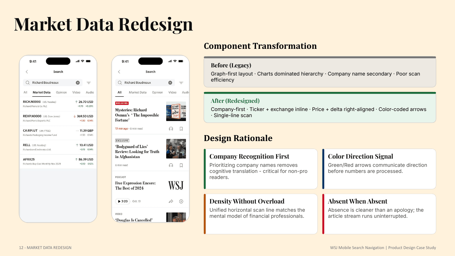
The legacy graph-first row became a company-first, single-line scan: ticker and exchange inline, price and delta right-aligned, with color-coded arrows that communicate direction before the numbers are read. Density without overload, and absent when there is nothing to show.
Unified filter
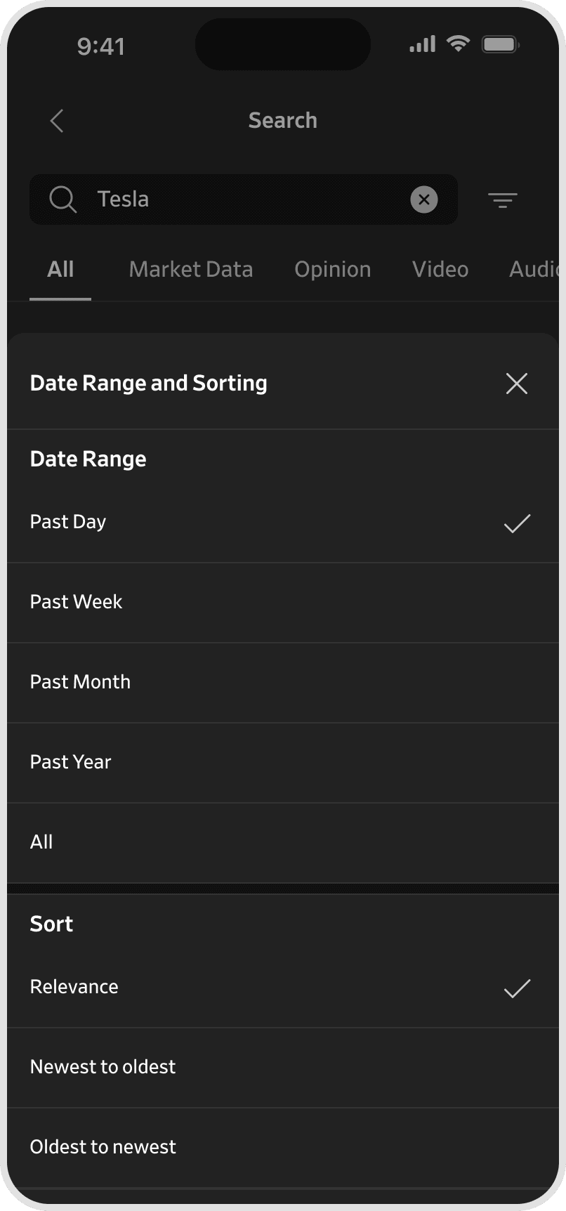
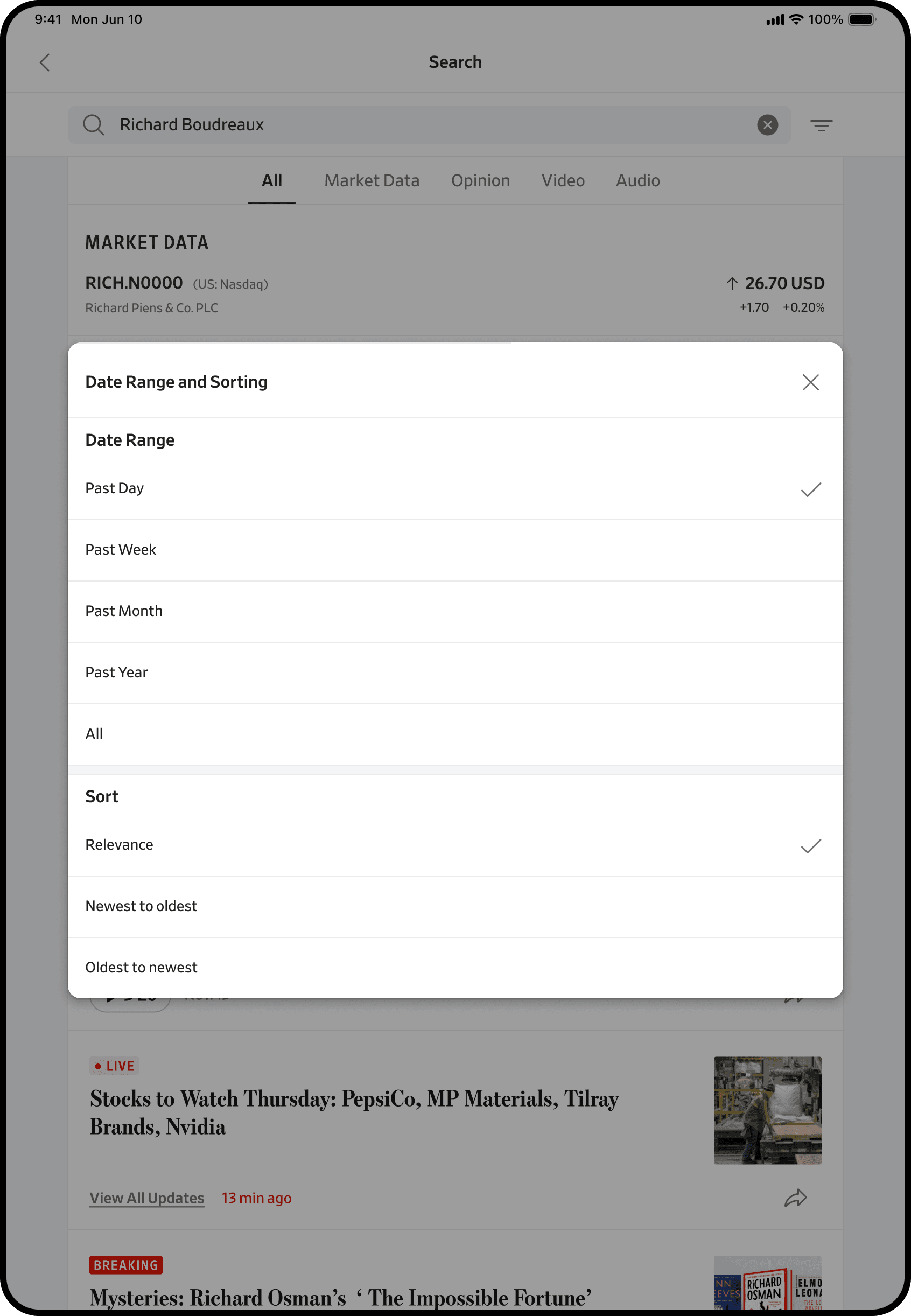
Filtering was built as a reusable system component, not a search-specific screen. A bottom-sheet pattern preserves query context, single-selection groups for range and sort apply immediately with no Apply button, and the shell is product-agnostic - architected to scale to article feeds, saved content, market watchlists, and video libraries.
Video discovery
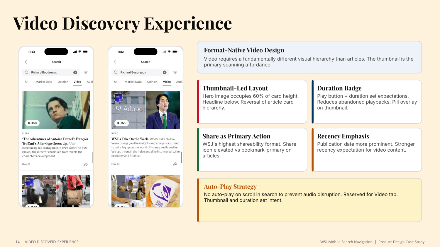
Video needs a fundamentally different hierarchy: a thumbnail-led layout where the hero image occupies sixty percent of the card, a duration badge that sets expectations, share elevated as the primary action, and stronger recency emphasis. Auto-play is reserved for the Video tab to prevent audio disruption while scrolling search.

Edge cases and accessibility
Every failure condition - empty, no suggestions, no results, no market data, and service error - was designed to provide a clear forward path rather than a dead end.
- WCAG AA contrast, with market-data color coding supplemented by icons
- 44pt minimum touch targets per Apple HIG across the search bar, tabs, and filters
- Dynamic Type support, with layouts that reflow gracefully without truncation
- VoiceOver annotations: content-type labels announced and market rows in semantic order
One experience, three platforms
The system was designed natively for iPhone, Android, and iPad - one experience, adapted to each platform's conventions rather than stretched across them.
iPhone leads in light and dark, with bottom-sheet filters, thumb-friendly navigation, and a keyboard-aware layout for one-handed commuter use.
Android follows Material conventions - its own navigation, controls, and keyboard - so the experience feels native to the platform rather than ported from iOS.
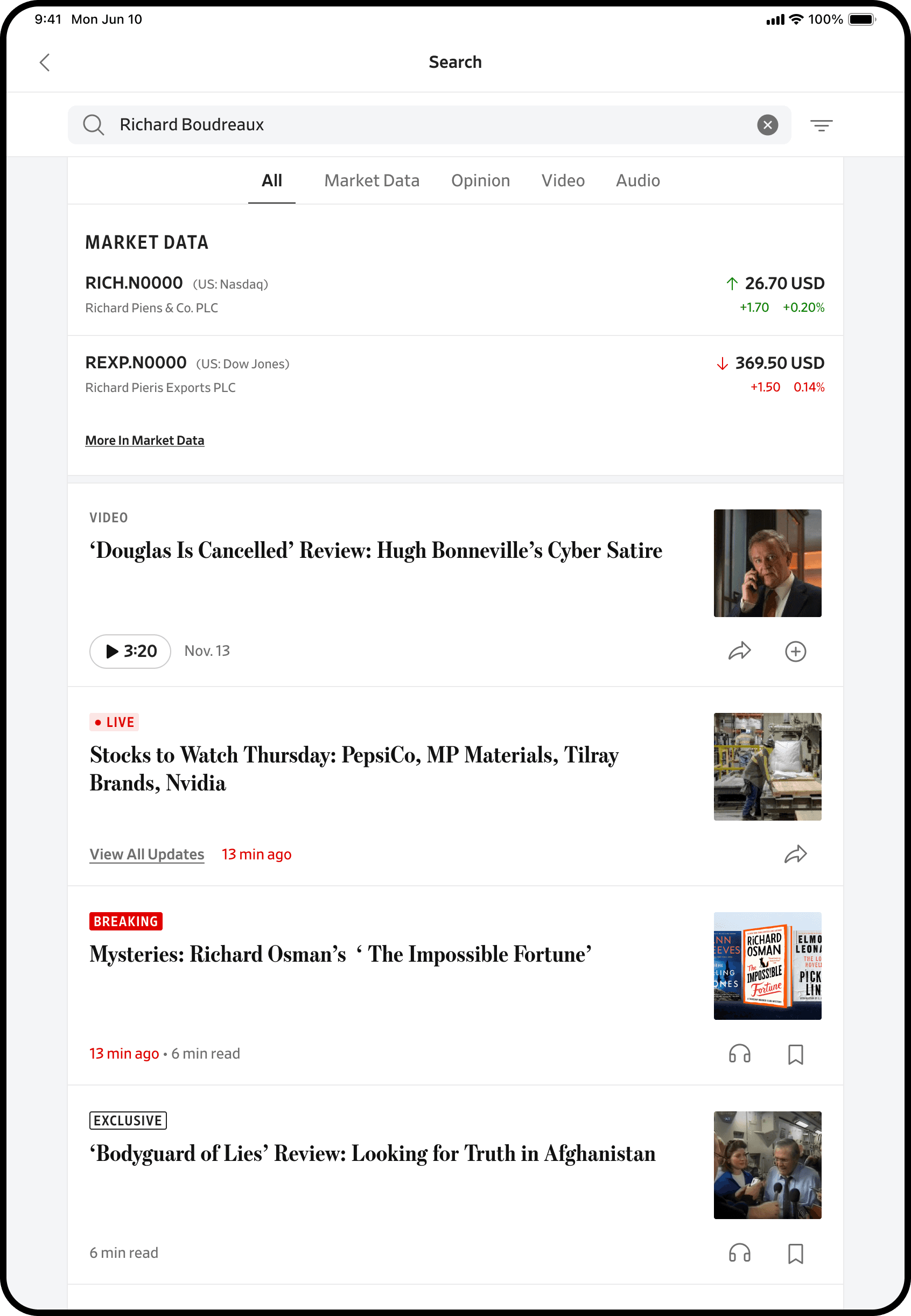
iPad uses the larger canvas - a centered filter modal, denser results, and room for split-view multitasking so search persists alongside the article.
The complete journey
Every screen state, every interaction moment, and every edge condition - designed as one unified system.
Outcomes and impact
Impact landed across four dimensions: user experience, product and business, design system, and engineering delivery.
- Reduced navigation friction - search-as-navigation validated by an observable behavior shift.
- Discovery improved - three content types previously invisible to search-primary readers now surface.
- Tab architecture enabled exploration within a single search entry, and subscribers reach live market data without leaving editorial context.
- Seven reusable components contributed back to the WSJ Index Design System, with the filter and market-data patterns reused beyond search.
- Nineteen screen states fully specified with component, state, interaction, and accessibility documentation, and no hardcoded values in any component handoff.
I led the redesign of WSJ mobile search by extending the Index Design System, creating seven new reusable search patterns, and unifying discovery across editorial, market, video, and audio content at scale.
What this project taught me
- Search can replace navigation - honoring user behavior made it a legitimate, scalable pattern for content-dense mobile products.
- Retrieval vs discovery: the tab architecture was a structural answer to the tension between searchers and explorers.
- Market data is content - integrating live data closed a product gap for high-value subscribers.
- Systems thinking and speed: designing every component as a system extension drove consistency and engineering velocity across nineteen states.
- Edge cases define quality, and positioning matters - this was a navigation platform, not just a redesign.

Next · A personalized feed for a brand with strong editorial opinions, where relevance had to serve the reader without dissolving the voice.