03 · Prepared for the Netflix hiring team
MyWSJ "For You" reimagines the WSJ app home as a personalized feed where every story is picked from the reader's follow history and chosen topics, not a single front page served to all. A unified system of 5+ card types carries breaking news, market data, opinion, and trending stories in one calm scroll, and two directions were explored side by side in dark and light themes. Throughout, the feed stays unmistakably WSJ in voice and typography.
Why this piece is in my application
This version opens without a password. It was prepared for the Netflix hiring team as part of my application for a Staff Product Designer role.
For You
feed driven by follow history and topics
2
directions explored, in dark and light
5+
card types in one unified content system
The WSJ app home looked the same for everyone. MyWSJ "For You" reimagines it as a feed that belongs to each reader - a personalized home where the stories surfaced reflect what that person actually follows and the topics they care about, rather than a single editorial front page served to all.
The challenge
Personalization only works if it feels editorial, not algorithmic-for-its-own-sake. The feed had to stay unmistakably WSJ in voice and typography while reorganizing around the individual, and it needed a content system flexible enough to carry breaking news, market data, opinion and trending stories in one scroll - without turning into visual noise.
- Make "For You" legible: show why a story is here (follows, topics)
- Let readers steer with topic chips and Saved / Shortlist
- Carry many content types in one calm, consistent card system
The exploration continues behind the gate - the feed in detail, the card system underneath it, and how dark and light were designed in parallel.
A feed that is clearly for you
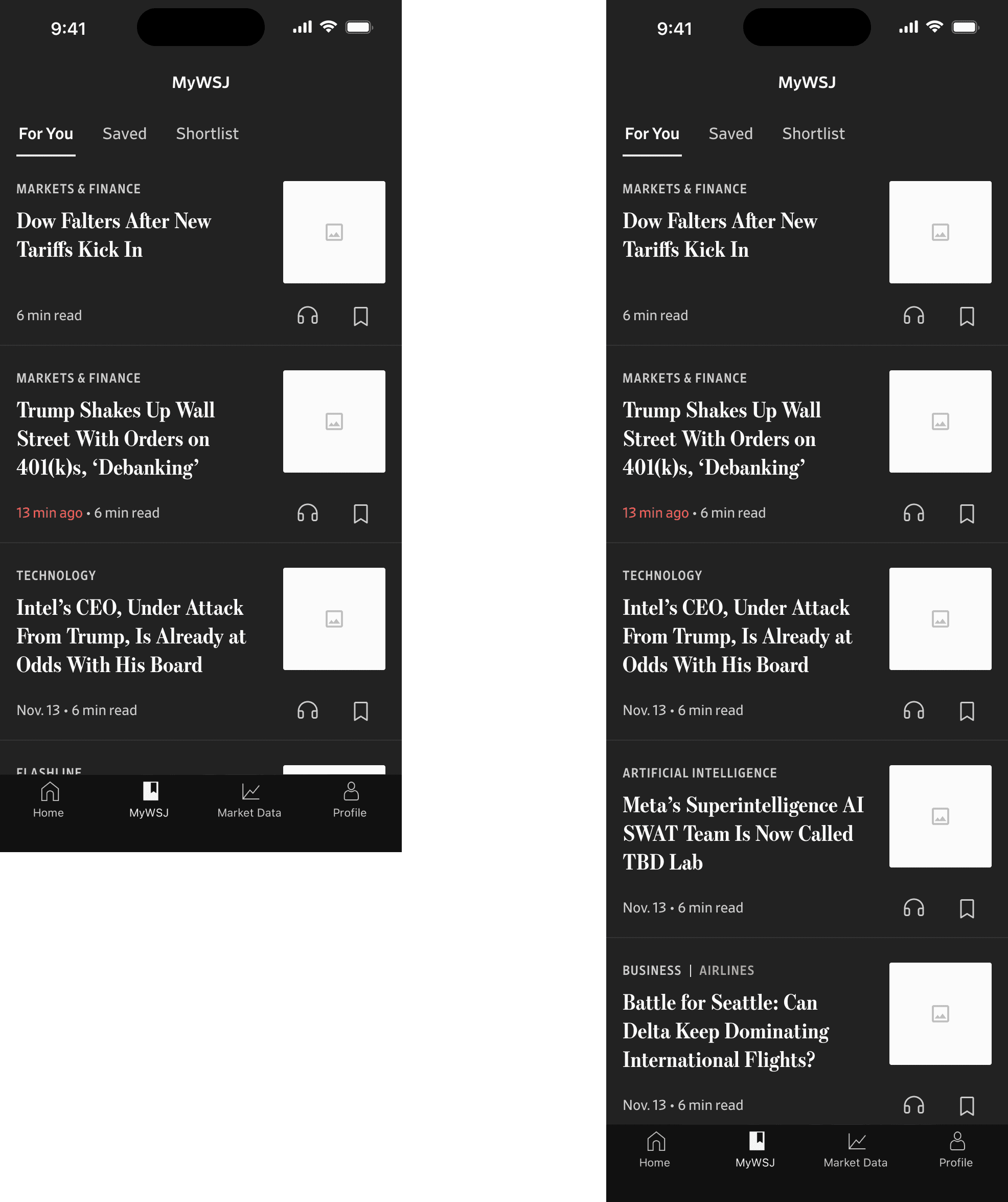
The header anchors the experience in MyWSJ, with For You, Saved and Shortlist as the reader's own spaces. Topic chips - Business, World, Lifestyle, Technology, U.S. - let readers tune the feed directly, and the "For You" section states its logic plainly: stories picked for you based on your follow history. Personalization is shown, not hidden.
One unified card system
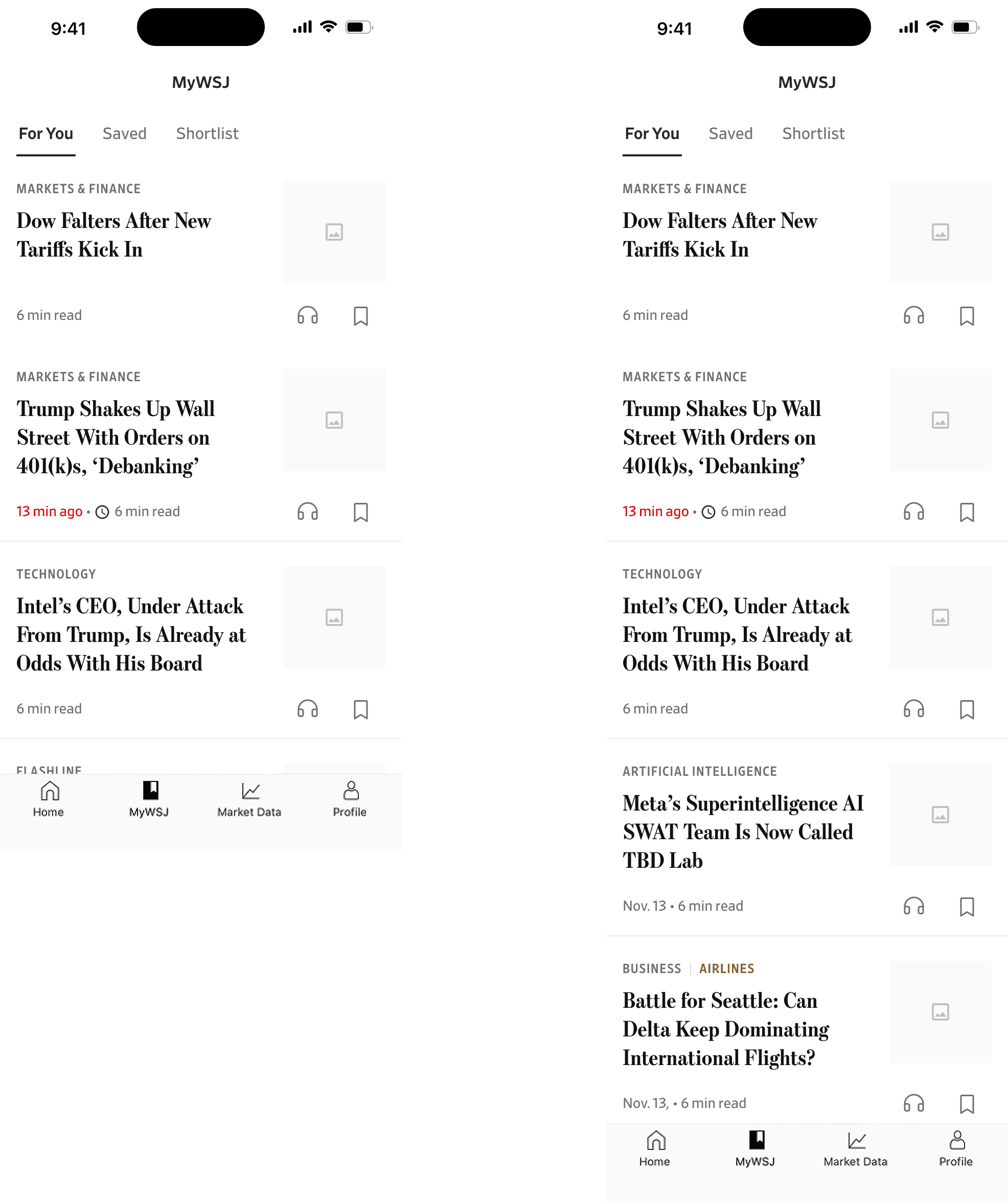
Underneath the feed is a small, deliberate set of cards: a Flashline lead for the top story, unified news-story cards for the body of the feed, and lighter treatments for Trending, Opinion and Editorial. Because every card draws from one system, the feed can mix breaking markets news, analysis and long reads in a single scroll and still feel composed.
Dark and light, designed in parallel
Both directions were built in dark and light themes side by side, so theming was a first-class constraint rather than an afterthought. Designing them together kept contrast, hierarchy and the WSJ typographic voice honest across modes - the feed reads the same whether someone prefers a bright or a dark surface.
Outcome
A personalized home for the WSJ app that stays editorial: a "For You" feed grounded in each reader's follows and topics, powered by a unified card system that scales across content types, and resolved across dark and light - directions ready to take into testing and build.
Good personalization feels like the WSJ already knows what you came for - without ever losing the paper's voice.

Next · The consumer homepage and section fronts rebuilt as a modular content system, so editors compose rather than request.