[ Case study ]
WSJ Vertical Video
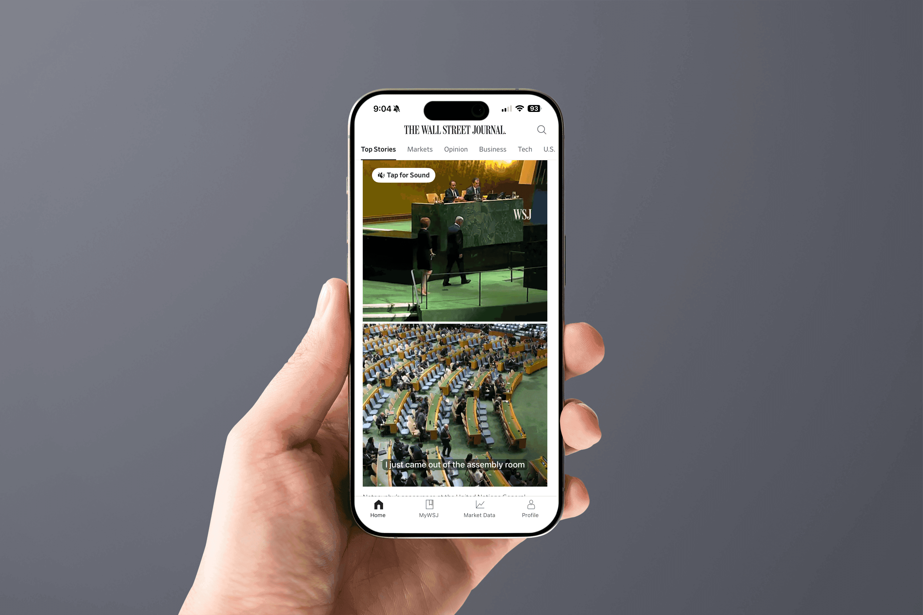
An adaptive vertical video experience for The Wall Street Journal that delivers cinematic news across mobile, tablet, and desktop. As Lead UX Architect from February to November 2024, I mapped the user journeys, designed and documented the Vertical Player component across its Default, Playing, Paused, and Ended states, and built a responsive system that reflows from a wide 16u layout down to a 4u mobile stack. It now ships live in the WSJ Mobile App.
- Client
- Dow Jones - The Wall Street Journal
- Role
- Lead UX Architect
- Year
- 2024
- Disciplines
- Product Design, Multimedia, Design Systems, Responsive, Mobile
[ Impact ]
70%+
Of WSJ readers on mobile, the format's starting point
4 states
Default, Playing, Paused, and Ended, fully documented
Live in app
Shipped in the WSJ Mobile App; web in progress
[ Information architecture ]
Discovery
- Home feed entry
- Section video rails
Player
- Vertical video
- Controls
- Captions
Engagement
- Save
- Share
- Related stories
Confidentiality notice
This work spans active platform strategy, shared AI capabilities, and multiple product surfaces. To respect that, this case study stays intentionally high-level, focusing on the cross-brand design problem, platform principles, and reusable outcomes rather than brand-specific implementation details.
WSJ Vertical Video redefined storytelling for The Wall Street Journal: an adaptive vertical video experience that delivers cinematic news across mobile, tablet, and desktop. This case study covers the full journey, from identifying the problem to designing the Vertical Player component, documenting its states and interactions, and scaling it into the editorial ecosystem, while staying true to WSJ's premium voice.

Overview
WSJ set out to modernize its video storytelling by introducing a vertical format that felt immersive, editorially authentic, and consistent with its premium brand. The vision was a responsive system that worked seamlessly across mobile, tablet, and desktop. As Lead UX Architect I led the initiative from February to November 2024, partnering with editorial, product, and engineering to map user journeys, prototype interaction flows, and refine responsive layouts into a scalable design system. What began as a response to mobile-first behavior grew into a cross-platform standard for WSJ.
The work spanned two connected files. The UX architecture file held the thinking: content massing, a content audit, user and page flows, user scenarios, wireframes for every surface the format touches, a component inventory, functional specifications for engineering, and the Vertical Player component with its full state set. The visual design file resolved that structure in high fidelity. What I delivered:
- Content massing and a content audit that defined how much each surface could hold before the design existed.
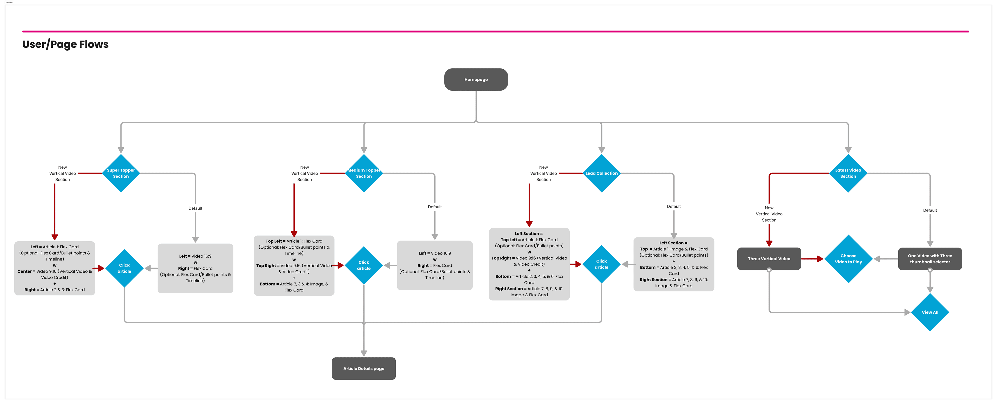
- End-to-end user and page flows across the homepage, live coverage, section fronts, and the video center.
- Wireframes for every surface the vertical format appears on, at every breakpoint.
- A component inventory and functional specifications precise enough for engineering to build against.
- The Vertical Player component, documented across its Default, Playing, Paused, and Ended states.
- High-fidelity visual design and a component library added to WSJ's design system.

The challenge of modern news consumption
Traditional horizontal video formats no longer matched how audiences consumed digital news. More than seventy percent of WSJ readers accessed content on mobile, but video modules often disrupted editorial flow, loaded inconsistently, or felt detached from the article experience. From the business side, WSJ needed to demonstrate leadership in immersive storytelling and strengthen video engagement. From the reader side, audiences wanted a cinematic, intuitive way to watch news across devices without compromising accessibility or editorial quality.
The design tension sat at the center of every decision: bring the immediacy of vertical video to WSJ journalism without spending the authority, clarity, and trust that define the brand. Immersion that still reads as journalism, never a social feed, became the north star.

Research and competitive audit
I ran a structured audit of vertical video across TikTok, Instagram Reels, and YouTube Shorts, mapping each experience from entry point to playback to the move between stories. The goal was to isolate the patterns that make vertical video feel effortless, and to name the ones a newsroom with WSJ's standards should deliberately refuse.
Patterns worth adopting
- A full-bleed 9:16 frame that treats the video as the surface, not a thumbnail in a card.
- Muted autoplay with captions, so a story starts the instant it is in view without hijacking sound.
- Sound on a single, obvious tap, keeping control with the reader.
- A vertical swipe to move between stories, with a light progress affordance so readers know where they are.
Patterns to refuse
- Algorithmic pacing that optimizes for watch time rather than the story's own rhythm.
- Infinite, bottomless feeds that pull readers away from the journalism.
- Social vanity metrics and reaction mechanics that undercut editorial authority.
That adopt-and-refuse list became the brief for the component: immersive and swipeable, but paced by editors and framed as reporting.
Information architecture and surfaces
Before designing a single screen I mapped where vertical video should live across WSJ and how readers reach it. Defining these flows first gave the format a deliberate place in the experience rather than being bolted onto each surface. The player had to behave consistently across four distinct surfaces, each with its own reading context.
- Homepage: the format's most prominent home, appearing in the Super Topper, Medium Topper, Lead Collection, and the latest-video section, each a different weight of placement in the page's hierarchy.
- Live Coverage: vertical video embedded inside a developing story, sitting alongside the live updates rather than interrupting them.
- Section Front: video as an entry point into a topic, tuned so the format supports scanning rather than dominating it.
- Video Center: the destination surface where readers browse and move between stories in sequence.
Across all four, the flow resolves the same way: a reader discovers a story, orients to what it is, watches, and continues to the next one. I designed against those four verbs, discover, orient, watch, and continue, rather than against a generic video player.
The Vertical Player component
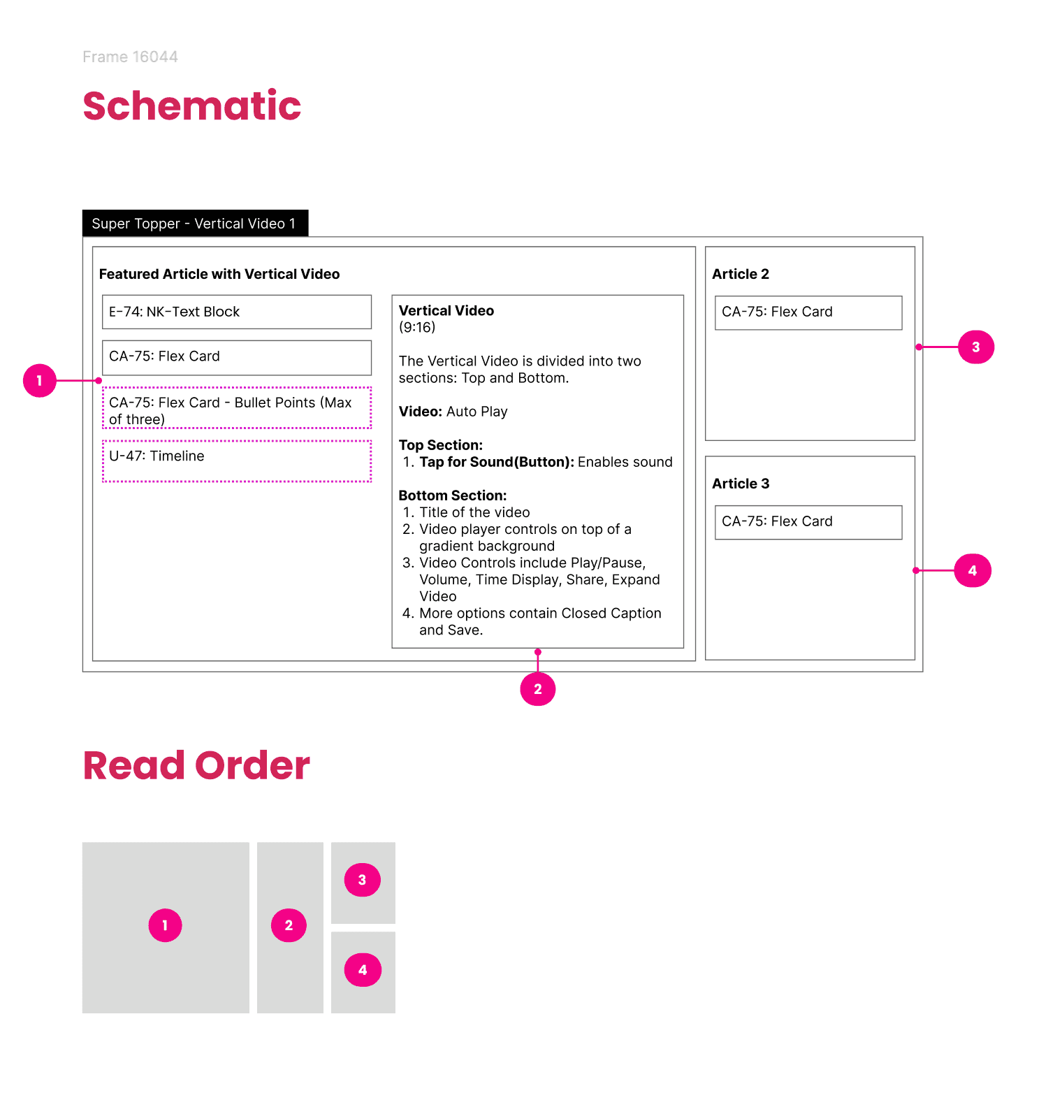
The Vertical Player is the heart of the system: one component, documented from anatomy to behavior, that every surface reuses. It is built on a 9:16 frame split into a clear read order so fifty stories from twelve desks still feel like one product.
Anatomy
- Top zone: the kicker or section label, the headline, and, where relevant, a live badge. This is what a reader reads first, before the video even resolves.
- Media layer: the full-bleed video itself, with a poster frame for the pre-play state and captions rendered over the lower third.
- Bottom zone: caption, byline or source, the progress affordance, and the controls, positioned within thumb reach on mobile.
- Sound affordance: a single, persistent, unmistakable control to bring sound on, since muted autoplay is the default.
The four states
Every placement of the player resolves to one of four documented states. Each state defines exactly what is visible, what the reader can do, and how the component behaves.
- Default: the poster frame is shown, video is muted, captions are ready, and the sound affordance is visible. The top zone carries the headline so the story reads even before playback begins.
- Playing: the video autoplays muted with captions on. The progress affordance advances, secondary controls recede so the frame stays cinematic, and the sound affordance remains within reach.
- Paused: a tap pauses playback and brings the controls and scrubber forward. The reader can scrub within the story, resume, or move on, with the current frame held steady.
- Ended: playback resolves into a replay prompt and a clear affordance to continue to the next story, so momentum is never lost at the end of a clip.
Documenting the states this way gave engineering an unambiguous contract and gave editors a predictable format: whatever surface a story lands on, its behavior is already defined.
Interaction and motion model
[ Protected layer ]
The full case study is available on request.
High-fidelity screens, information architecture and the detailed process for this enterprise project are shared under NDA. Enter the access password, or request access and I will share the full walkthrough.