[ Case study ]
Reimagining WSJ Search & Navigation
I led the redesign that turned WSJ mobile search from a content-retrieval tool into a discovery and navigation platform for millions of subscribers. A tabbed architecture unifies five content types, news, market data, opinion, video, and audio, in one search session, while seven reusable components were contributed back to the WSJ Index Design System. Nineteen screen states were fully specified, with the filter and market-data patterns reused well beyond search.
- Client
- Dow Jones - The Wall Street Journal
- Role
- Product Design Lead
- Year
- 2025
- Disciplines
- Product Design, Design Systems, Mobile, Search & Discovery, Accessibility
[ Impact ]
7
Reusable components added to the Index Design System
19
Screen states fully specified
5
Content types unified in one search
[ Information architecture ]
Search
- Entry
- Auto-suggest
- Recent & saved
Results
- Articles
- Filters
- Sections
Navigation
- Global nav
- Section fronts
Confidentiality notice
This work spans active platform strategy, shared AI capabilities, and multiple product surfaces. To respect that, this case study stays intentionally high-level, focusing on the cross-brand design problem, platform principles, and reusable outcomes rather than brand-specific implementation details.
The Wall Street Journal mobile app serves millions of subscribers across news, markets, opinion, video, and podcasts. Search worked for retrieval, but stopped there - no path forward, no related context, no way to follow a topic. I led the redesign that transformed search from a content-retrieval tool into a discovery and navigation platform, built as an extension of the WSJ Index Design System.
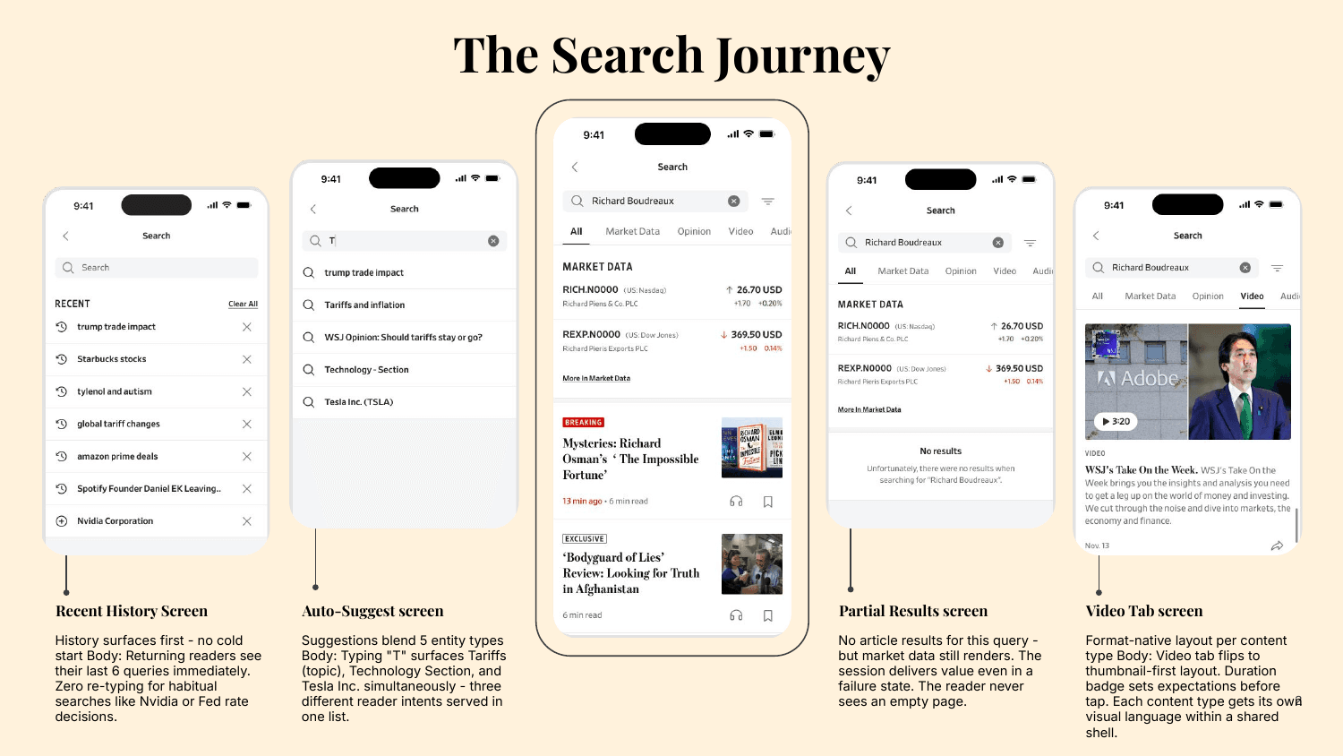
Overview
Search was reframed as a primary navigation and discovery surface rather than a single-purpose results page. The work spanned product strategy, information architecture, UI and UX, component creation, and close engineering collaboration across iOS and Android.
Business goals
- Increase content engagement per session
- Improve subscription value perception
- Reduce navigation friction and surface premium content faster
- Enable multi-format discovery across news, markets, opinion, video, and audio
User goals
- Find relevant content in fewer steps
- Discover topics beyond a single query
- Return to followed stories, authors, and companies easily
- Access live market data alongside the news
The challenge
Search was optimized for retrieval. WSJ needed it to become a discovery and navigation platform serving three different reader intents at once.
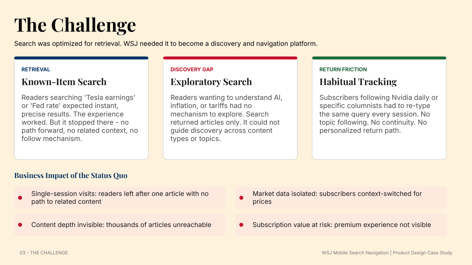
- Known-item search worked - 'Tesla earnings' or 'Fed rate' returned precise results - but it dead-ended with no path forward.
- Exploratory search had no mechanism: readers wanting to understand AI, inflation, or tariffs were returned articles only, with no way to explore across content types.
- Habitual tracking forced subscribers following Nvidia or a columnist to re-type the same query every session. No following, no continuity, no personalized return path.
Research and discovery
Four methods grounded the work: analytics review across 30 days of mobile usage, eight subscriber interview sessions, a competitive audit of Bloomberg, Reuters, NYT, and FT, and a heuristic evaluation against Nielsen heuristics and mobile search best practices.
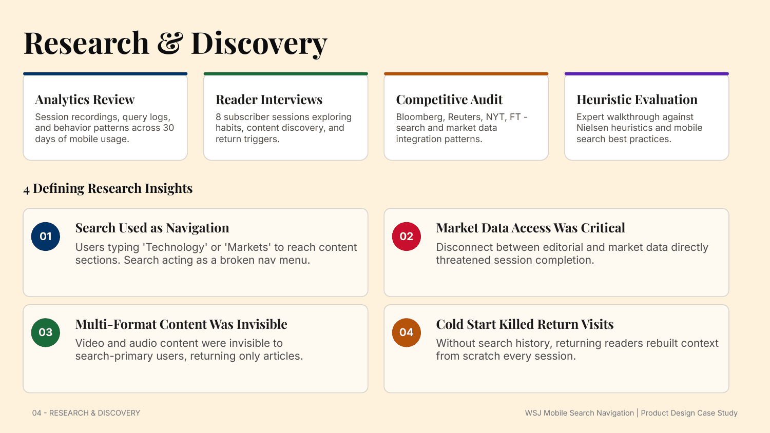
- Search was being used as navigation - readers typed 'Technology' or 'Markets' to reach sections, treating search as a broken nav menu.
- Market-data access was critical: the disconnect between editorial and market data directly threatened session completion.
- Multi-format content was invisible - video and audio never surfaced for search-primary users, who only ever saw articles.
- Cold start killed return visits: without history, returning readers rebuilt their context from scratch every session.
Design principles
Five principles governed every decision, from information architecture to component behavior to interaction detail.
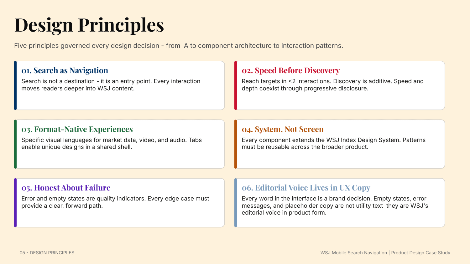
- Search as navigation: every interaction moves readers deeper into WSJ content.
- Speed before discovery: reach targets in under two interactions; discovery is additive through progressive disclosure.
- Format-native experiences: market data, video, and audio each get their own visual language inside a shared shell.
- System, not screen: every component extends the WSJ Index Design System and must be reusable across the product.
- Honest about failure: error and empty states are quality indicators, and the editorial voice lives in every word of UX copy.
Information architecture
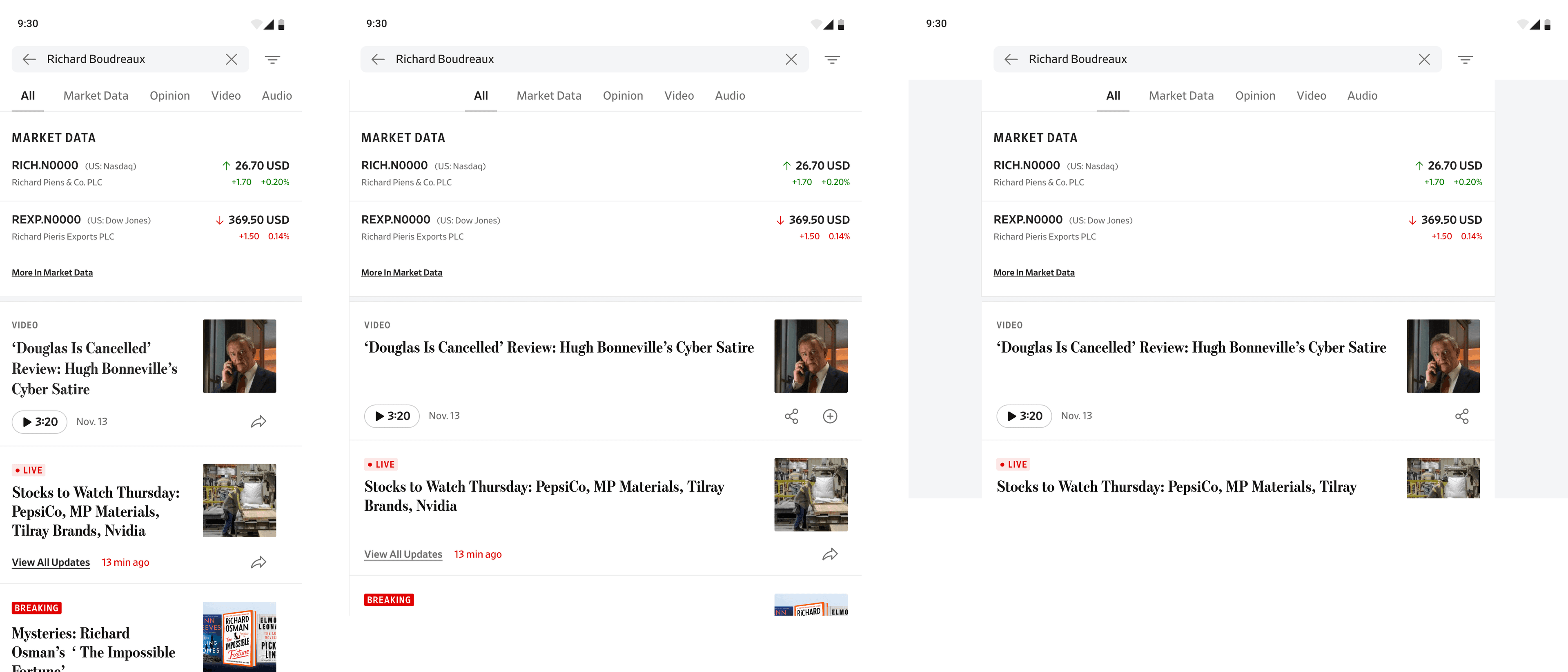
The flat, article-only model became an ecosystem model: a tabbed architecture - All, Market Data, Opinion, Video, Audio - that separates content types while keeping discovery inside a single search session.
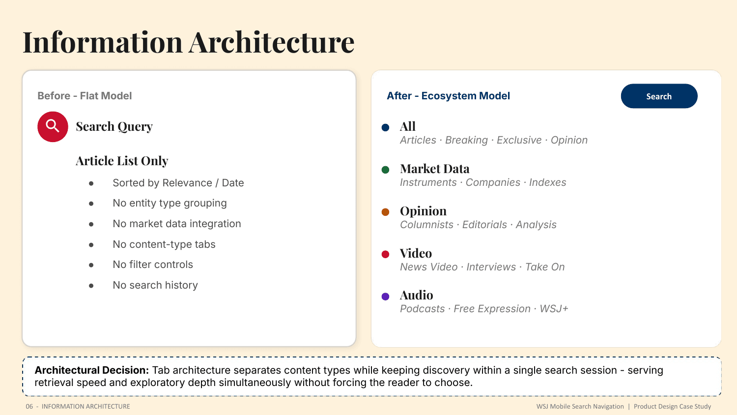
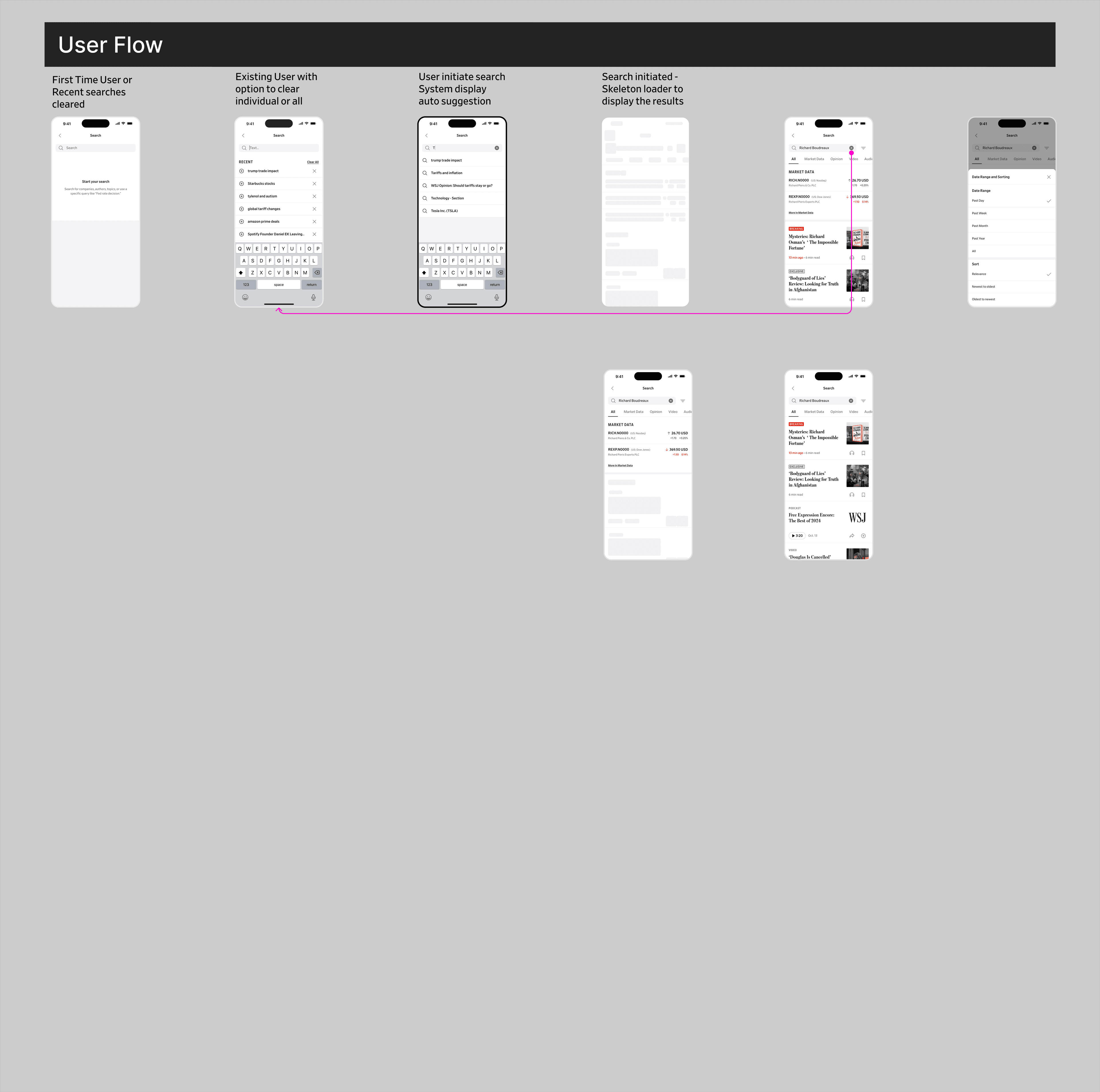
Tab architecture serves retrieval speed and exploratory depth simultaneously, without forcing the reader to choose between them.
A system, not a screen
The experience was built as an extension of the WSJ Index Design System. Existing tokens for color, typography, and spacing were reused, and seven new search-specific components were contributed back to the system.
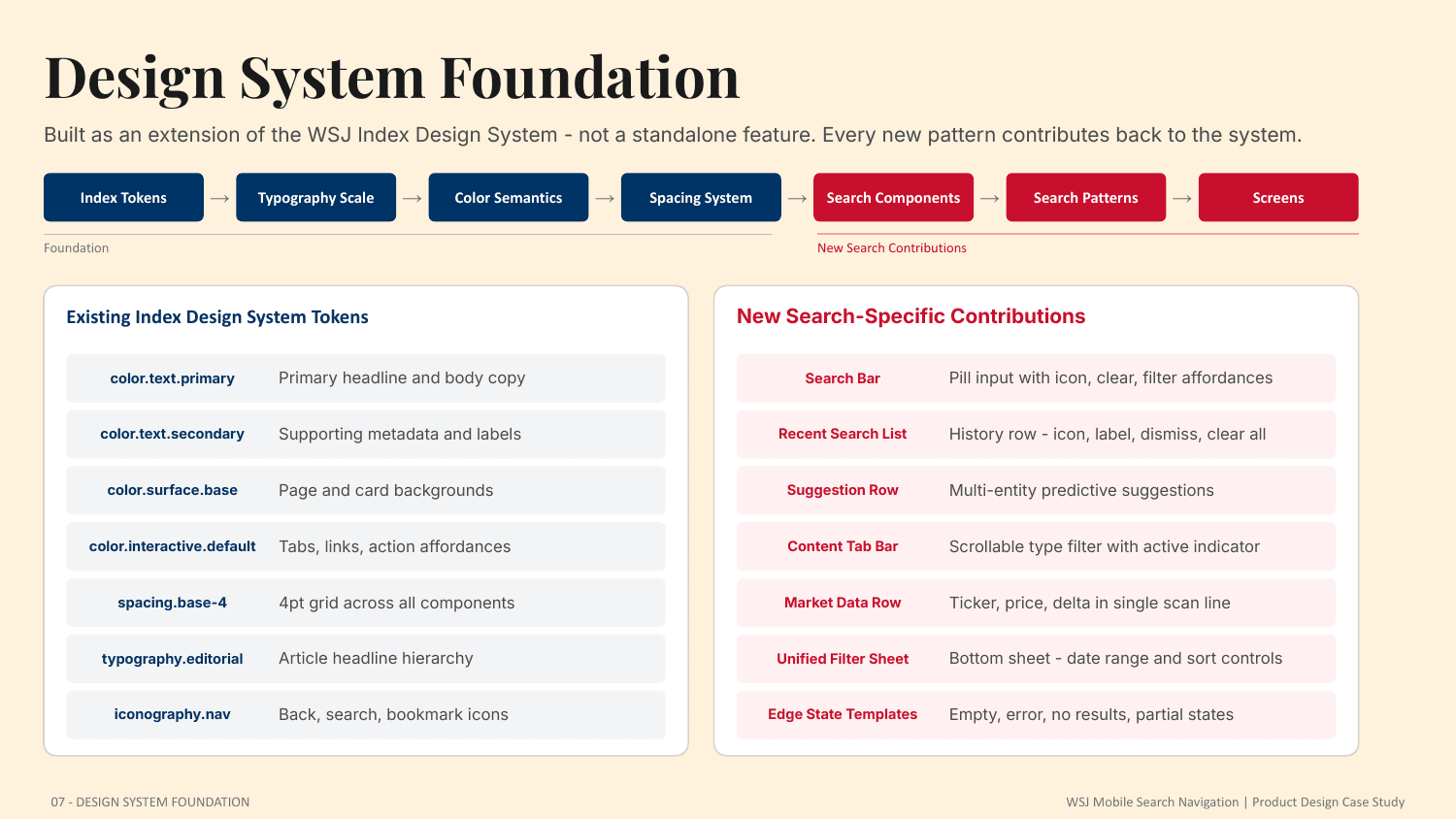
- Search bar, recent-search list, and multi-entity suggestion rows
- Content tab bar with an active-state indicator
- A single-scan market-data row, a unified filter sheet, and edge-state templates for empty, error, no-results, and partial states
Exploration and iteration
Four directions were explored - Editorial First, Market First, Media First, and Ranked Mix - each addressing the tension between density, readability, and discovery. Ranked Mix was selected: the All tab algorithmically surfaces the most relevant entity per query, so financial queries lead with market data and every reader's intent is served first.
[ Protected layer ]
The full case study is available on request.
High-fidelity screens, information architecture and the detailed process for this enterprise project are shared under NDA. Enter the access password, or request access and I will share the full walkthrough.