[ Case study ]
DHL IoT: Data Visualization
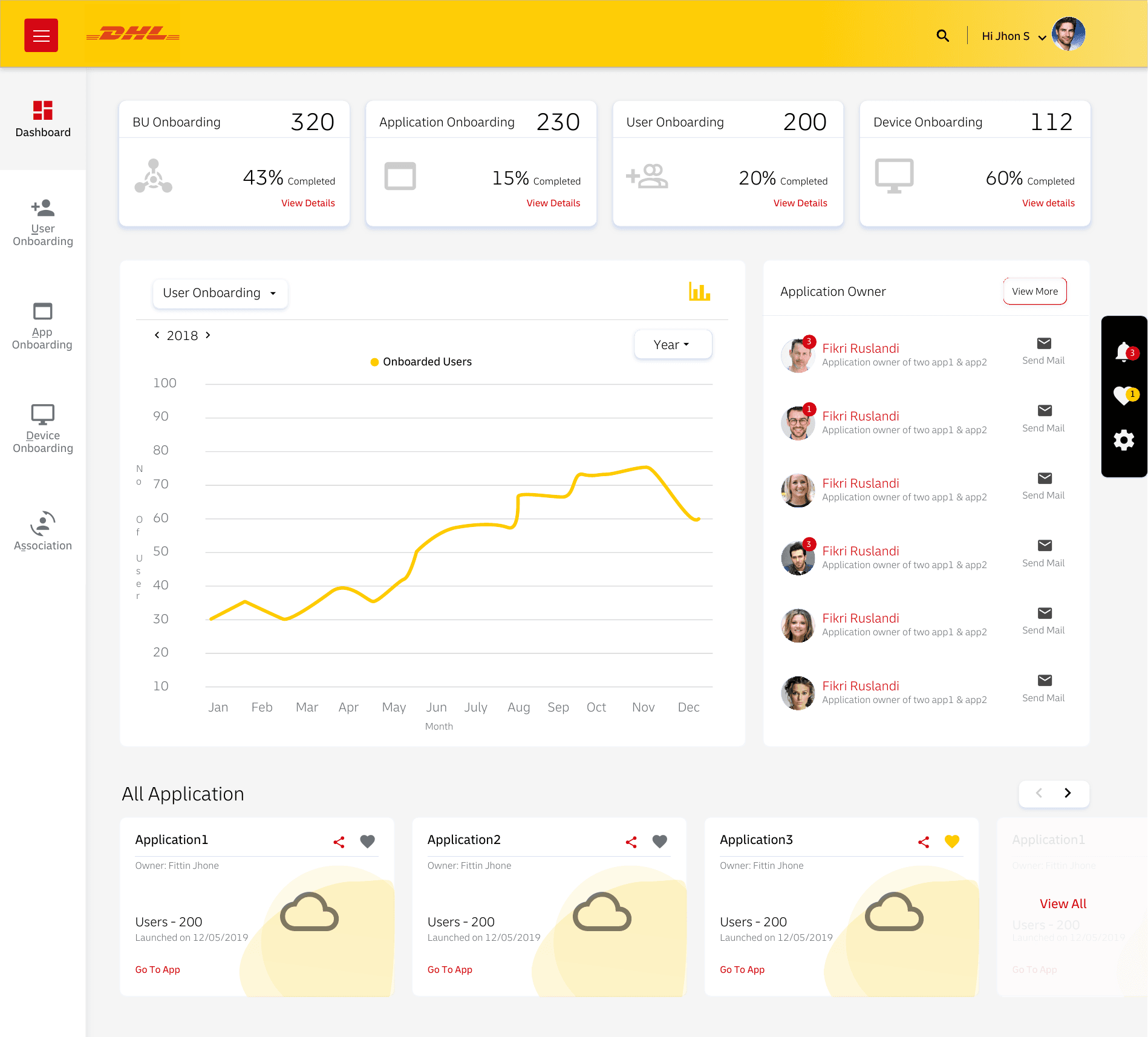
The charting system behind the DHL IoT platform, a consistent visual language of line, bar, and pie charts for device and user metrics, designed so a reader learns it once and reads it everywhere. Shared axes, legends, colour, and interaction across chart types power the admin dashboard, graph options, and individual application views, keeping the platform's many metrics from feeling like many different products.
- Client
- Deutsche Post DHL Group
- Role
- UX Architect · via Wipro
- Year
- 2019
- Disciplines
- Data Visualization, Design Systems, Dashboard Design
[ Impact ]
Real-time
Telemetry visualization for connected devices
[ Information architecture ]
Telemetry
- Live metrics
Charts
- Trends
- Distributions
Filters
- Device
- Time range
Every dashboard on the platform draws from one charting system. This is the visual language for device and user metrics - line, bar, and pie - designed so a reader learns it once and reads it everywhere.
One language for the data
Consistent axes, legends, colour, and interaction across chart types mean the platform's many metrics never feel like many different products. The same patterns power the admin dashboard, graph options, and individual application views.
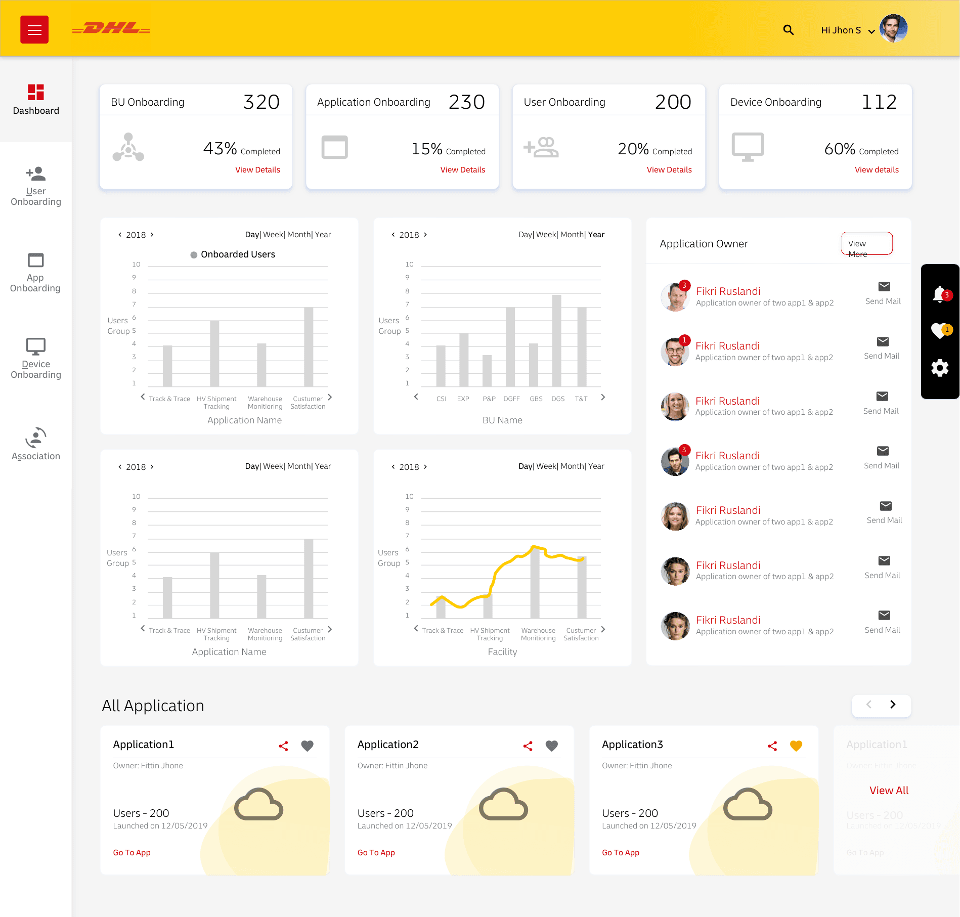
- Shared axis, legend, and colour conventions
- Line, bar, and pie for trends, comparisons, and breakdowns
- Reusable across dashboards and applications
Outcome
A reusable visualization layer that kept the platform's analytics consistent and quick to extend.