[ Case study ]
DHL Warehouse Operations Intelligence
A real-time operations dashboard for DHL Supply Chain that gives warehouse managers one live view of congestion, assets, and available labour across the floor. I led the UX architecture and product design for WOI 1.5, spanning a dashboard, a congestion monitor, and reporting, all unified by a shared status colour language. The result turns scattered, after-the-fact reports into decisions managers can make in the moment.
- Client
- DHL Supply Chain
- Role
- UX Architect · via Wipro
- Year
- 2020
- Disciplines
- Enterprise UX, Dashboard Design, Data Visualization, Design Systems, Web App
[ Impact ]
7
Warehouse zones monitored in real time
3
Core modules: dashboard, congestion, reporting
1
Live source of truth for floor operations
[ Information architecture ]
Operations dashboard
- Zones
- KPIs
Zones
- Real-time status
- Throughput
Alerts
- Exceptions
- Escalations
Warehouse Operations Intelligence (WOI) is a real-time operations dashboard for DHL Supply Chain. It gives warehouse managers a single, live view of congestion, assets, and available labour across the floor - turning scattered, after-the-fact reports into decisions they can make in the moment. I led the UX architecture and product design for WOI 1.5.
Overview
DHL Supply Chain runs high-volume warehouses where congestion, asset availability, and labour capacity change minute to minute. WOI was built to make that state visible and actionable. The product spans three core areas - a real-time Dashboard, a Congestion monitor, and Reporting - unified by a consistent operational visual language built on the DHL brand.
My role
UX architecture, information architecture, interaction design, and high-fidelity visual design, working with product and engineering to turn complex operational data into an interface floor managers could read at a glance.
The challenge
Warehouse leaders were flying blind between reports. Congestion built up in zones before anyone noticed, idle or overloaded assets went untracked, and available labour was hard to see against the work that needed doing.
- No real-time view of where congestion was forming across the floor
- Asset groups and their status were managed outside the system, with no single source of truth
- Available associates and hours were not visible against demand, making balancing reactive
- Alerts arrived too late to prevent slow-downs rather than just record them
Information architecture
WOI is organised around how a shift actually runs. The Dashboard answers 'how are we doing right now?', Congestion answers 'where is it building up?', and Asset Groups and Available Hours answer 'what do I have to work with?'. A persistent top navigation keeps Dashboard, Congestion, and Report one tap apart, and a consistent status colour system carries meaning across every screen.
The dashboard
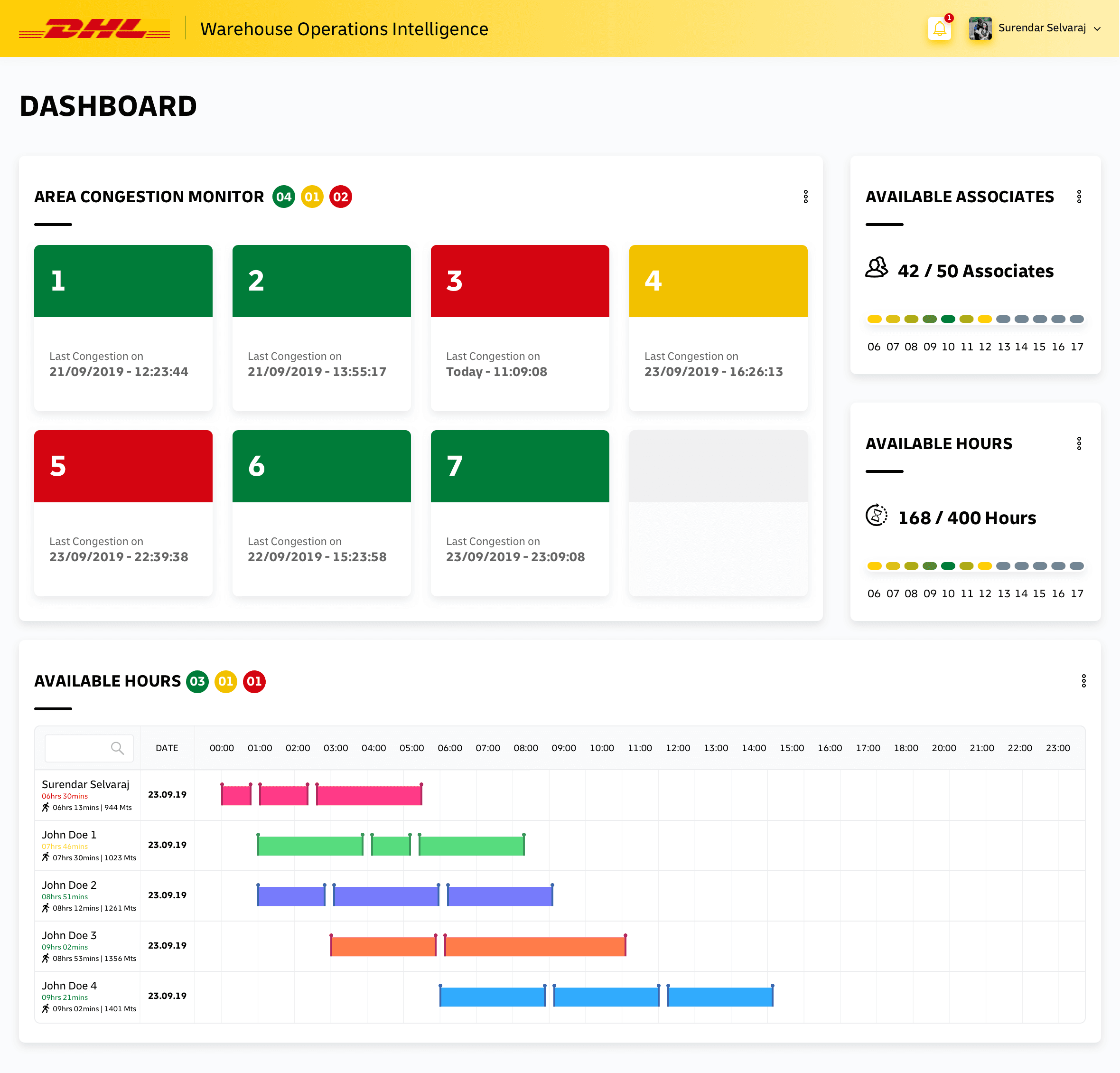
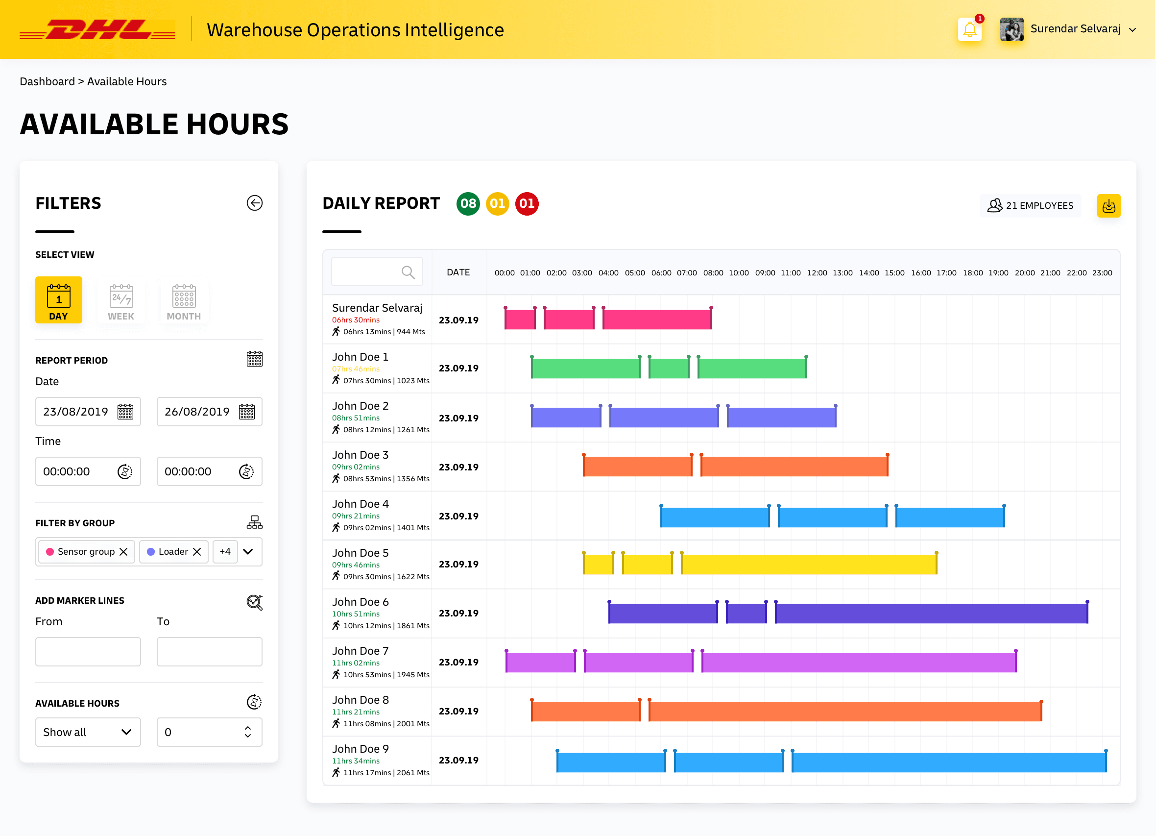
The home screen surfaces the metrics a floor manager checks constantly: an Area Congestion Monitor across seven zones with live status and last-congestion timestamps, available associates and hours against capacity, and a labour timeline showing each associate's allocation through the day. Status is colour-coded - green, amber, red - so the eye lands on the problem first.
Congestion monitor
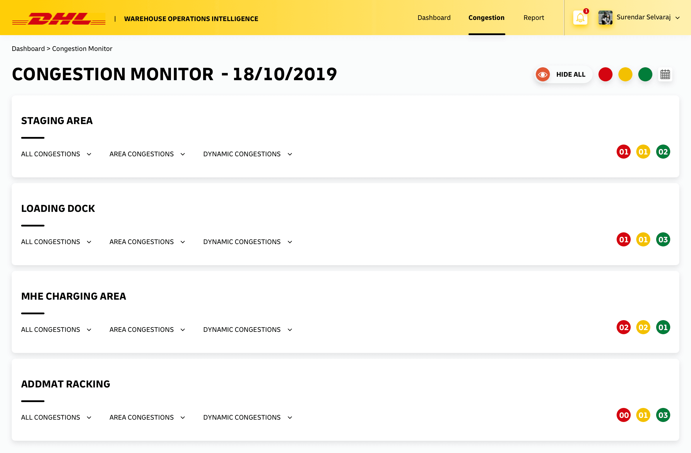
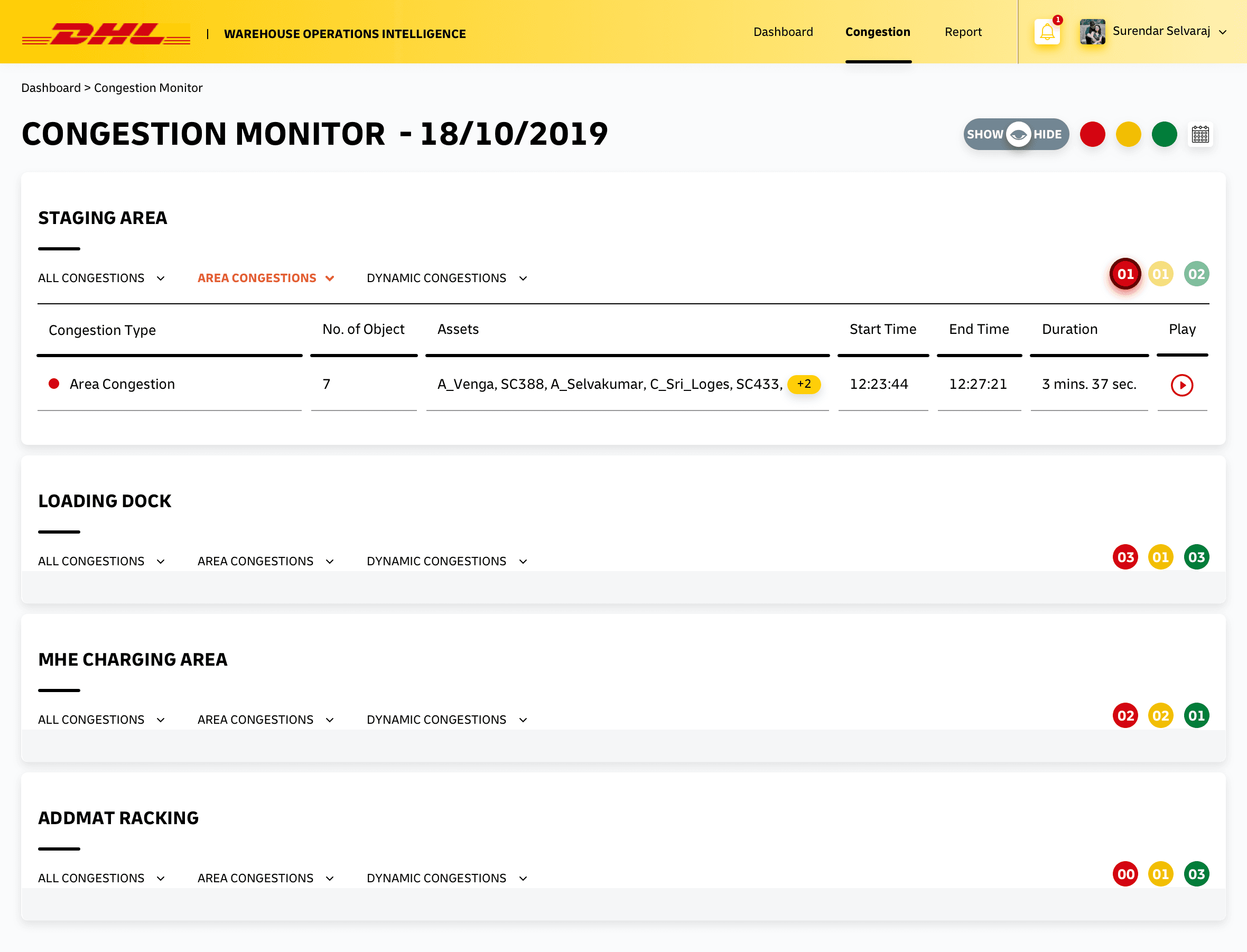
The Congestion monitor breaks the warehouse into operational areas - staging, loading dock, MHE charging, racking - and tracks congestion for each. Managers filter between All, Area, and Dynamic congestion, with alert badges signalling severity so the most critical area is never buried.
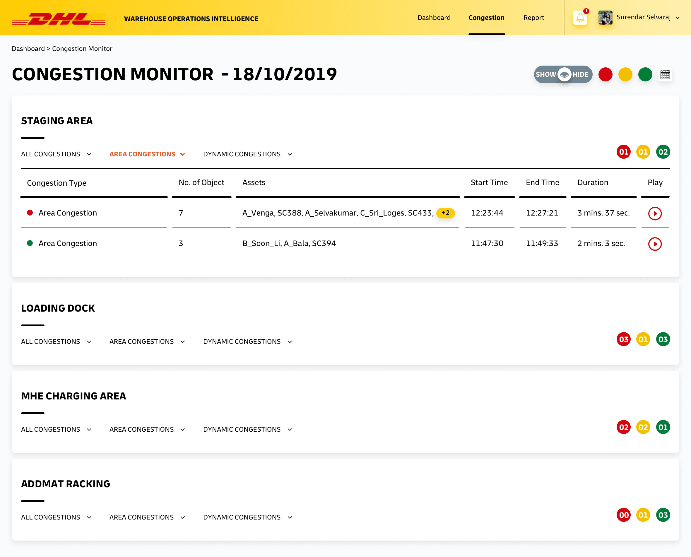
Drilling in, the monitor distinguishes overall congestion from area-specific and dynamic congestion, and escalates high-alert conditions visually so they cannot be missed.
Asset groups
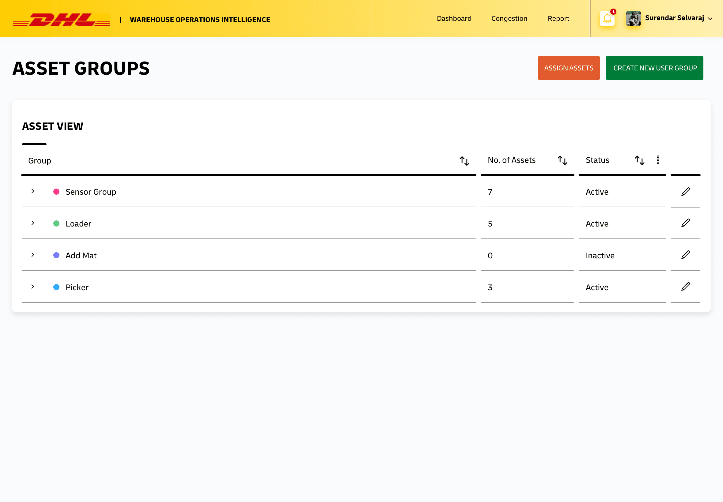
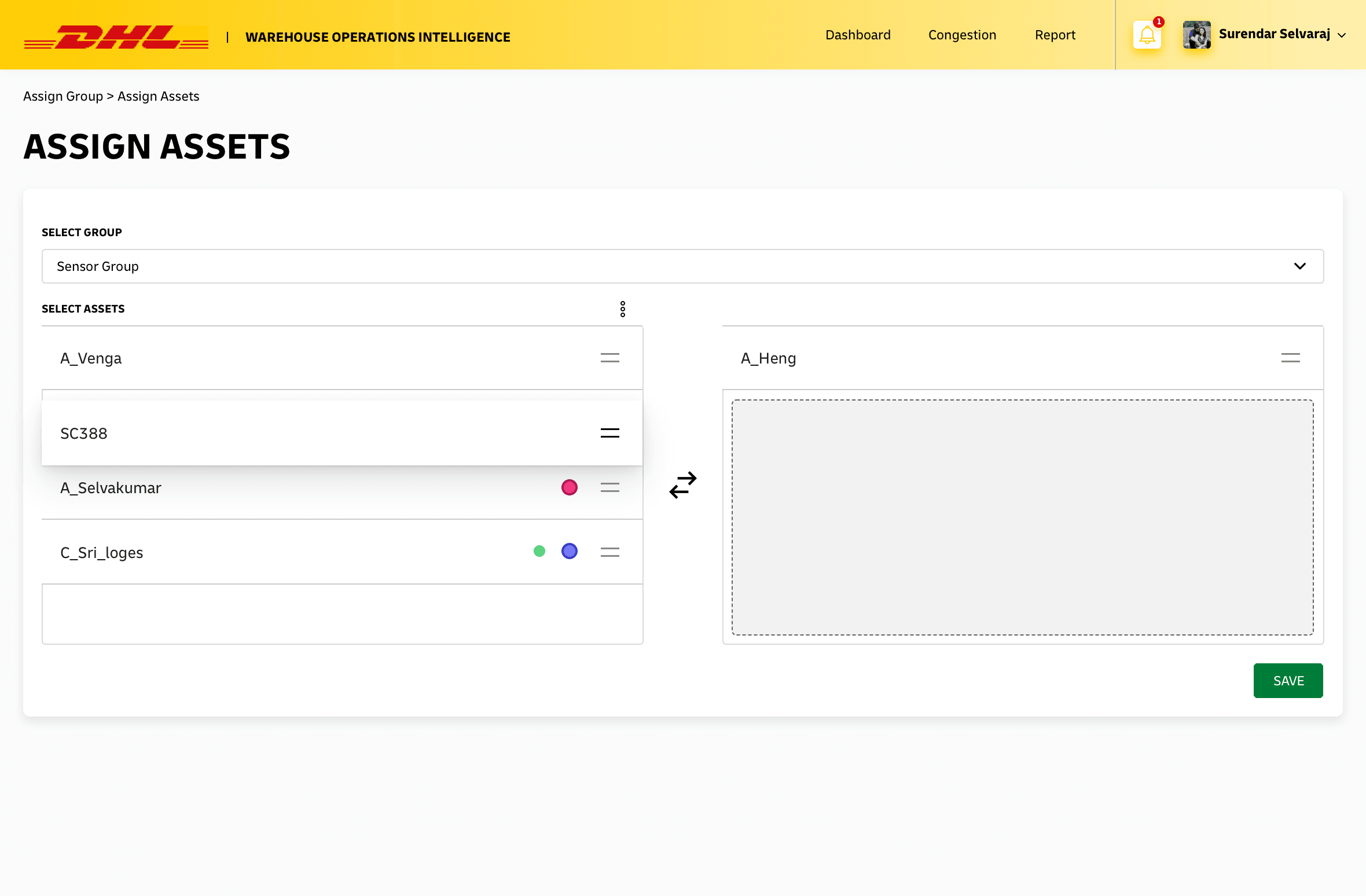
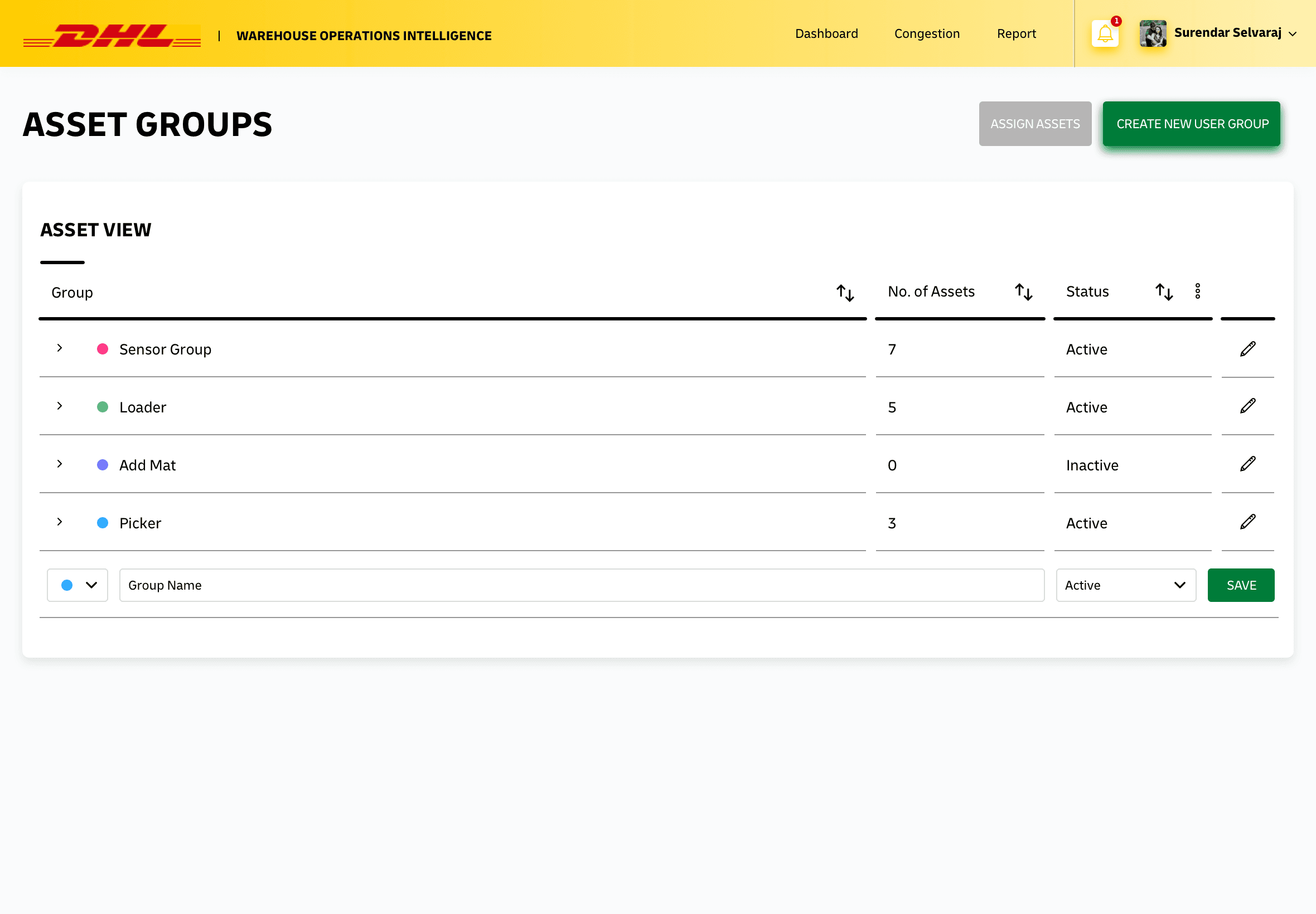
Assets are organised into groups - sensors, loaders, pickers, and more - each with a count and an active or inactive status, sortable and editable inline. Managers can create new groups and assign assets through a focused flow, keeping the floor's equipment model accurate and owned inside the system.
Alerts and configuration
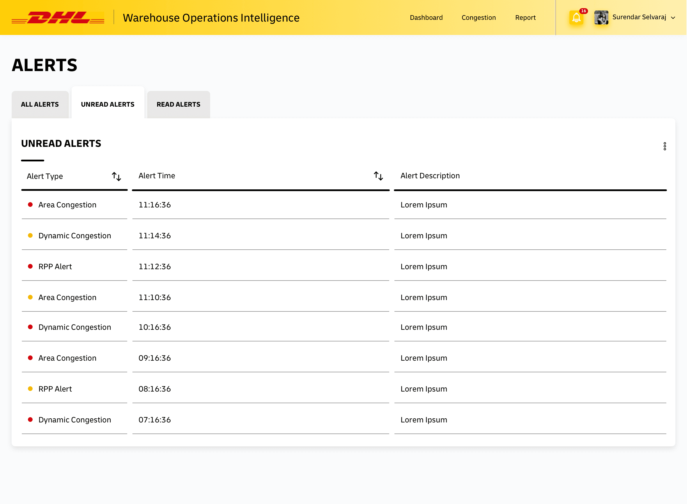
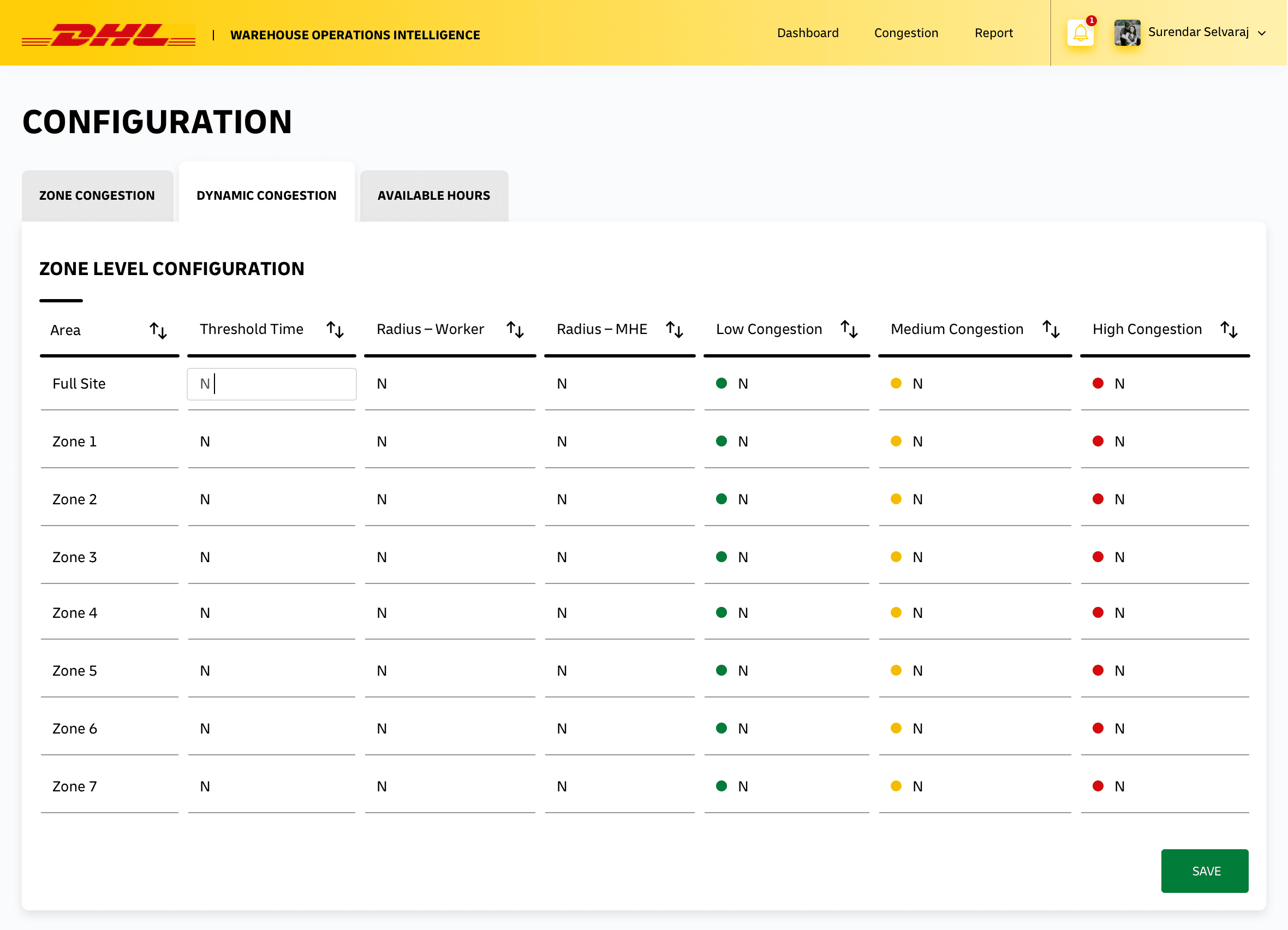
Alerts give managers a running feed of conditions that need attention, while a configuration layer lets operations tune dynamic-congestion thresholds to their site - so the same product adapts to warehouses of different shapes and volumes without code changes.
Design system and visual language
Every screen sits on a consistent system: the DHL red-and-yellow brand header, a calm neutral canvas so operational colour carries meaning, and a shared status language - green for healthy, amber for watch, red for alert - applied identically across congestion tiles, asset status, and alerts. Reusable cards, tables, filters, and modals keep the experience predictable as managers move between modules.
Outcomes and impact
- Real-time visibility replaced after-the-fact reporting, letting managers act on congestion as it formed
- Asset groups and status became owned inside the system, creating a single source of truth for floor equipment
- Available associates and hours were made visible against demand, making labour balancing proactive
- A consistent status colour language and reusable component set sped up both comprehension and delivery
WOI turned a warehouse's scattered, after-the-fact reports into a single live picture - where congestion is building, what assets are free, and who is available - so managers could act in the moment instead of explaining the slow-down later.
What this project taught me
- Operational dashboards live or die on the status glance - colour and hierarchy must point to the problem before any number is read.
- Modelling the product around the rhythm of a shift, not the database, made complex data feel obvious.
- A small, disciplined status language reused everywhere is worth more than any single clever screen.