[ Case study ]
Disney: Workflow Engagement App
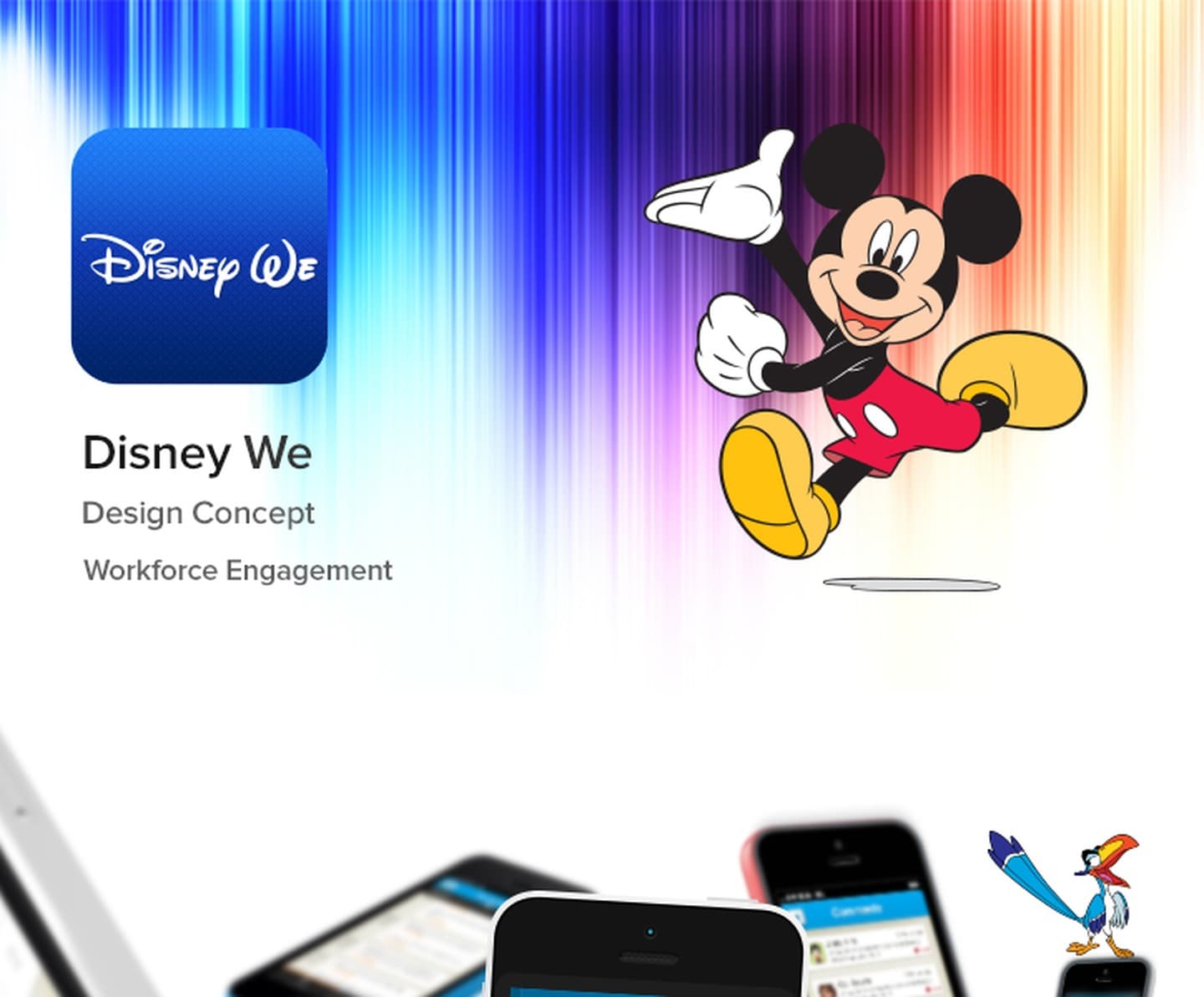
A presale concept for an internal Disney mobile app designed to increase workflow engagement across creative teams. The work explored how a familiar, brand-native experience could turn routine task management into something worth opening, blending Disney's storytelling sensibility with enterprise utility across iOS and Android.
- Client
- Disney
- Role
- UI/UX Designer · via Spur Tree Technologies
- Year
- 2014
- Disciplines
- Mobile UX, Interaction Design, Presale Concept
[ Impact ]
iOS + Android
Platforms designed for
2014
Year
Presale
Project type
[ Information architecture ]
Onboarding
- Splash / brand entry
- Sign in
- Role setup
Home
- My tasks
- Team activity feed
- Quick actions
Workflow
- Project board
- Task detail
- Checklist
- Attachments
Engagement
- Milestone celebrations
- Appreciation
- Progress streaks
Notifications
- Assignments
- Comments
- Deadline alerts
Disney's creative teams work across dozens of concurrent productions, but their internal tooling felt nothing like the brand they were building for. The brief was to imagine a workflow engagement app that felt native to Disney, one that a creative professional would actually want to open.

The challenge
Enterprise task management tools are notoriously joyless. For a company whose entire product is storytelling and delight, the gap between the work and the tools felt especially sharp. The ask was a presale concept that would demonstrate how a brand-native mobile experience could lift daily workflow engagement.
Disney's internal teams span animation, live-action, parks, and licensing, each with its own cadence and review cycle. The challenge was not just building a task app, it was building one flexible enough for wildly different creative workflows while still feeling like a single, coherent product.
Design goals
- Make the app feel unmistakably Disney without being a theme park
- Surface the right tasks at the right moment across iOS and Android
- Build in lightweight engagement mechanics, progress, appreciation, milestones
- Keep it fast: task completion in two taps or fewer
Visual design language
The colour palette drew from Disney's brand rather than its parks: deep navy, warm gold, and clean white. Iconography used rounded, expressive forms. Motion cues, subtle card reveals, confetti on completions, gave the app a sense of life without ever slowing the user down. Typography was set in a display face that echoed Disney's heritage while remaining highly legible at mobile sizes.
Key screens
The onboarding flow established role and team context in three steps, each illustrated with character-inspired spot art. The home dashboard surfaced a prioritised task list, a team activity ring showing colleagues' progress, and a quick-action bar for common one-tap actions. The project board used a horizontal card scroll, with colour-coded status rails and a visual progress indicator at the top. Task detail gave full checklist, attachment, and comment support within a card-style modal, keeping the project board visible behind it. The milestone celebration overlay fired full-screen on major completions, with branded animation and an option to share appreciation with a colleague.
Approach
The concept centred on a task feed that felt more like a story: sequential, with clear protagonists (the people you're working with) and narrative momentum (what's next, what's at risk). Disney's colour palette and motion language gave every state a personality without getting in the way of the work.
Engagement mechanics were lightweight by design. Progress streaks tracked consecutive days of task completion. Appreciation was a single tap, not a form. Milestone celebrations were automatic, not configured. The system rewarded the work that was already happening rather than asking teams to perform engagement for its own sake.
Outcome
Delivered as a presale concept deck covering 12 core screens across iOS and Android. The work demonstrated that enterprise utility and brand personality are not in tension: the constraints of a workflow app become opportunities for the right design language to make friction disappear. The concept positioned Spur Tree Technologies as a partner that could translate a client's own brand into their internal tooling.