[ Case study ]
DSI: Slot
A Figma plugin for building, converting, and auditing slot-ready components on Figma's native Slot feature. Compose paints nested slot regions on a twelve-column grid, Convert migrates existing components through semantic inference with one-click undo, and Suggest scores components 0 to 100 on slot readiness so teams can sequence a migration.
- Client
- Self-directed product
- Role
- Design and build
- Year
- 2026
- Disciplines
- Design Systems, Component Architecture, Product Design, Tooling, Migration
[ Impact ]
~87%
Correct primary slot role inferred, tested across 200 community components
Under 8s
Full contract validation across a 3,000-node component tree
0 to 100
Slot-readiness scoring, so a migration can be sequenced by debt
DSI: Slot is a Figma plugin for building, converting, and auditing slot-ready components using Figma's native Slot feature. It exists because slots changed what a well-built component is, and most existing libraries were built before that was true.
The workarounds slots were meant to end
For years, designers faked flexible components. A card that needed to hold three different things became a component with every variation hidden inside it, toggled by boolean properties, or a stack of instance-swap slots that only the person who built it understood. It worked, and it produced libraries where a single component carried dozens of properties and nobody could safely change anything.
Native slots make that unnecessary. The problem is migration: a team with a mature library now has hundreds of components built around workarounds, and no realistic path to converting them by hand. DSI: Slot is built for that gap, not for greenfield files.
A grid-to-SlotNode compiler
Compose lets you paint slot regions directly onto a twelve-column grid, and nest regions inside other regions. Every painted region, parent and child alike, becomes its own native SlotNode with its own slot property on the generated component. The output is not rectangles with labels, it is a real component created through the Plugin API with typed, named properties attached, dropped live onto the canvas and ready for a library.
The compiler infers names from position: a full-width region anchored to the top reads as hero, a narrow region at mid-height on the left reads as sidebar, a bottom strip reads as footer. Structure gets drawn rather than described.
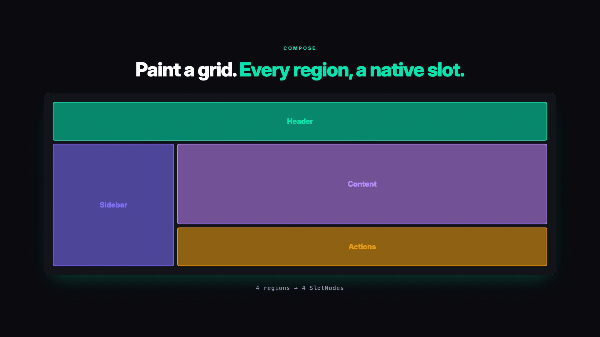
Each slot carries a name, a semantic role from a defined set including header, nav, hero, media, sidebar, content, body, actions, and footer, and a colour tied to that role. Roles are the important part: naming a region as content rather than as a rectangle is what lets the rest of the plugin reason about it later.
Convert: semantic inference for existing components
Convert takes an existing frame or component and wraps its children as real SlotNodes. A semantic inference engine reads signals from the layer tree, names, positions, and sizes, and classifies each child into one of nine semantic roles, with a custom role for anything that does not fit. It is the feature that makes the plugin usable on a real library rather than a demo file.
Tested across two hundred components drawn from community files, the engine assigned the correct primary slot role about 87 percent of the time. I publish that figure rather than a rounder one because the remaining 13 percent is the whole reason the undo behaviour below exists.
Inference will sometimes be wrong, so the design assumes it. A hidden backup of the original is preserved and a single undo restores it. Any tool that rewrites a designer's component has to earn permission to do that, and a reliable one-click reversal is the cost of entry.
Suggest: scoring readiness before touching anything
Suggest scores a component from 0 to 100 on slot readiness. Rather than guessing, it looks for the specific fingerprints of the old workarounds: hidden-layer tricks, boolean property overuse, and instance-swap patterns. It then proposes slot names and roles.
This is the entry point for a migration. A team can scan a library, see which components carry the most workaround debt, and sequence the work instead of converting alphabetically and hoping.
The contract validator
The failure this addresses is real and specific: when slotted content is placed into a parent with fill sizing, Figma can silently reset the child's width constraints and break fill behaviour. Teams have documented the problem and the manual workarounds they use to dodge it. The validator detects the violation, surfaces it, and repairs it automatically.
It runs across a whole file rather than a single component. On a component tree of roughly three thousand nodes, a full validation pass completes in under eight seconds, which is the difference between a check a team runs before every release and one they mean to run and never do.
Templates and filling slots
Six production layouts, Card, Hero, Dashboard, Modal, Feed, and Auth, insert as live components with slot properties already configured, so a team can start from a correct structure rather than assembling one.
After a Compose or Convert, a Preview with Content step appears inline and ranks the other components on the page by how well they fit each slot's role, so a new structure can be filled in a click. Those inserts ship with a fill-fix applied, working around a Figma slot fill-sizing bug. That last detail is unglamorous and it is most of what makes the difference between a demo and a tool people keep using.
The details that decide whether a tool gets adopted
- Sixteen device viewport presets plus a custom width, so structure can be checked where it will actually be used.
- Six interface locales, English, Japanese, Korean, Brazilian Portuguese, European Spanish, and Latin American Spanish, because design system teams are rarely all in one place.
- Local-only operation with no network access and no credentials stored, matching the DSI plugin, so it can be run on confidential work.


What building it taught me
Writing a tool that rewrites components forces a precision that writing about design systems does not. Every assumption I had about what makes a component well-structured had to become a rule explicit enough to execute, and several of them turned out to be preferences rather than principles once I tried to encode them.
The argument underneath the plugin is that design systems are software, not metaphorically but structurally. A component library is a codebase: it has an API surface, it has consumers, it has governance requirements. Software engineering settled the composition problem long ago with typed, named, enforceable interfaces. Slots are that interface for UI components, which makes them a baseline rather than an advanced feature, and it is why the tooling around them is worth building.
Building the tool made the argument testable. A principle you cannot encode is usually a preference you have not examined.