[ Case study ]
SAP: Corporate Profile Website
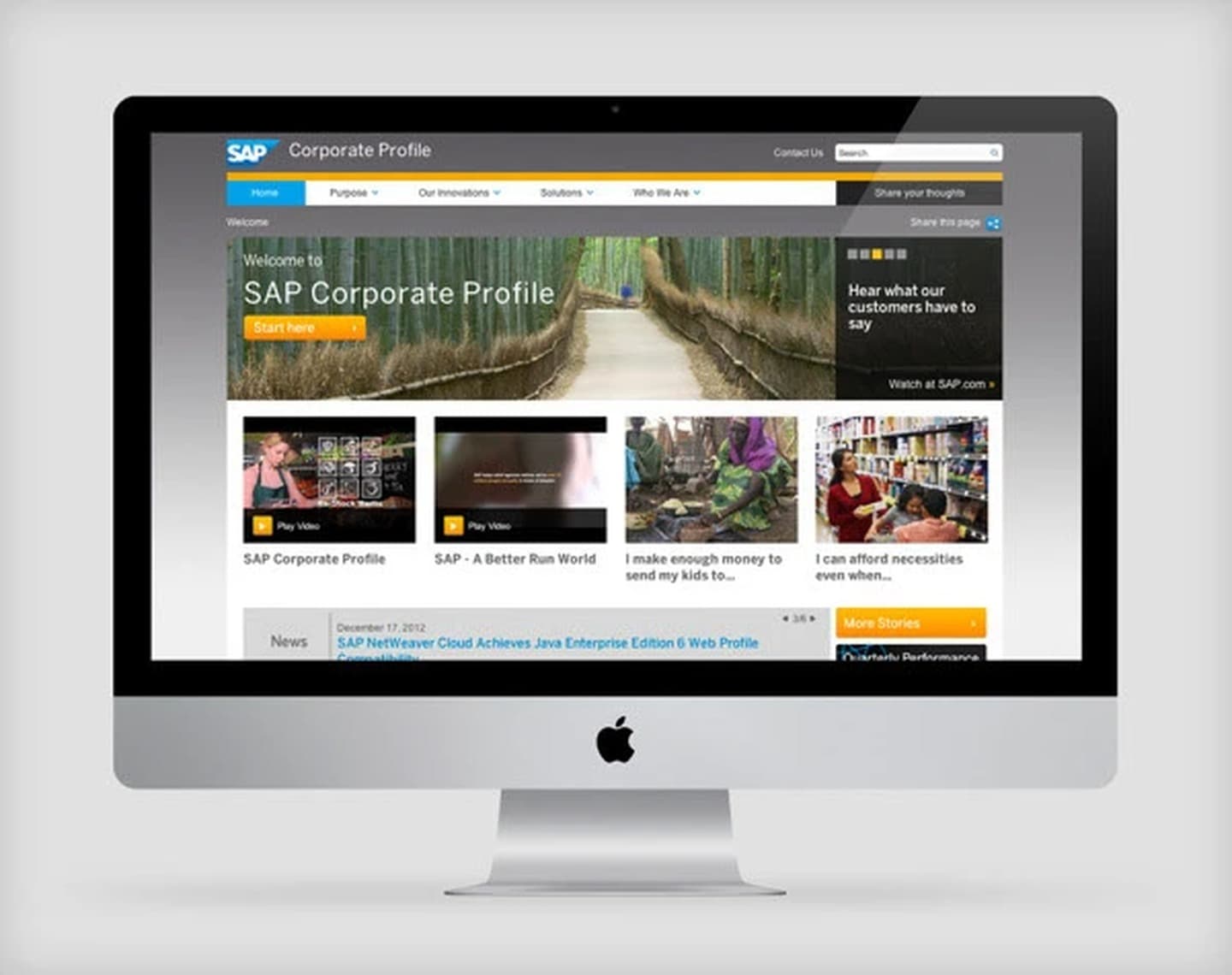
A corporate website design for SAP that showcased the company's global impact, ecosystem, industry verticals, and lines of business. The site served as an entry point to SAP's corporate story, translating a highly complex enterprise portfolio into a clear, navigable experience for executive and analyst audiences.
- Client
- SAP
- Role
- UI/UX & Web Designer
- Year
- 2013
- Disciplines
- Web Design, Enterprise UX, Corporate UX, Information Architecture
[ Impact ]
Enterprise
Audience
2013
Year
Web
Platform
[ Information architecture ]
Overview
- Global impact
- Key facts
- Mission statement
Industries
- Industry verticals
- Industry-specific solutions
- Customer stories
Solutions
- Lines of business
- Product categories
- Solution finder
Ecosystem
- Partners
- Developers
- Customers
- SAP community
Corporate
- Leadership
- Investor relations
- Sustainability
- News
SAP's portfolio spans thousands of products, hundreds of industries, and millions of enterprise users worldwide. The challenge was not describing what SAP does, it was making that description navigable for the executive or analyst who needed to find the relevant part of it in under a minute.
The challenge
Large enterprise companies often suffer from corporate website syndrome: a homepage trying to say everything at once, industry pages that repeat the same content with different keywords, and a navigation so deep that most users give up before they find what they came for. SAP needed a corporate profile that treated the visitor's time as a limited resource.
SAP's audience for this site was not end users or IT administrators: it was C-suite executives, procurement teams, financial analysts, and potential partners. These visitors arrive with a specific question and a short tolerance for irrelevant content. The design had to answer their question before they lost patience.
Design principles
- Lead with impact: global numbers, recognisable customers, concrete scale
- Industry-first navigation: visitors know their industry, not SAP's product names
- Progressive disclosure: top level is a summary, drill-down reveals depth
- Consistent visual language across a very complex content hierarchy
Information architecture
The site was structured around two primary entry points: Industries and Lines of Business. This matched how SAP's own sales teams positioned their portfolio, not by product name, but by the problem they were solving for a given sector. A third axis, the Ecosystem section, addressed the partner and developer audience without pulling them through the primary corporate narrative.
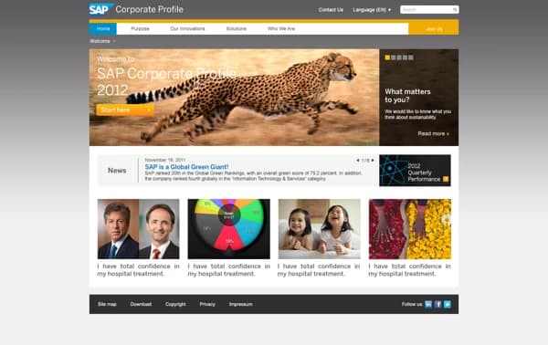
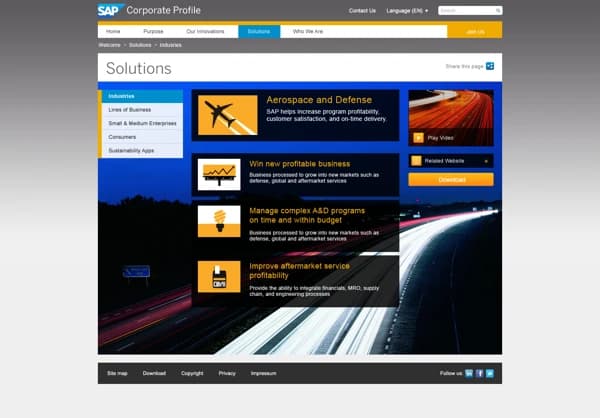
Each industry page followed a consistent template: a headline impact number, three to five key use cases, and a featured customer story. This meant the copywriting and design could scale across twenty-plus industries without the site becoming incoherent.
Homepage and visual design
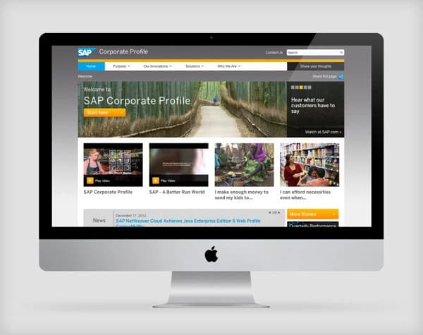
The homepage led with a full-width impact statement and three headline metrics: number of customers, countries served, and employees. Below that, the industry navigation presented as a visual grid rather than a list, letting visitors scan by sector icon and label simultaneously. A featured customer story module gave the homepage social proof without the page needing a dedicated case study section.
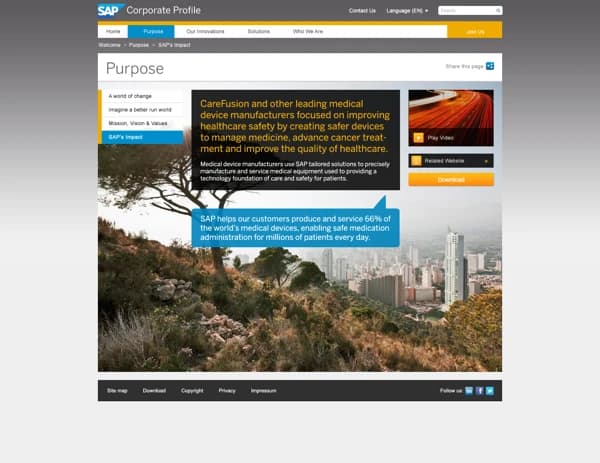
SAP's brand guidelines provided a strong visual foundation: the brand blue was used selectively as an accent on navigation and CTAs, with white and light grey making up the majority of the UI. Data-heavy sections used structured tables and call-out cards rather than flowing prose, matching the reading pattern of an analyst scanning for specific numbers.
Scalability by design
One of the key design decisions was to separate content density from visual complexity. Every section of the site was built on the same underlying grid with the same component set, so SAP's internal teams could add industries, update case studies, and publish press releases without the visual system falling apart. The design system was a tool for content governance as much as for aesthetics.
Outcome
A structured, scalable corporate profile website for SAP, one that used information architecture as the primary design tool. The work demonstrated that even the most complex enterprise portfolio can be made navigable when the IA respects how visitors actually think about their own problems, rather than how the company organises itself internally.