[ Case study ]
DHL IoT: Dashboard Graph Options
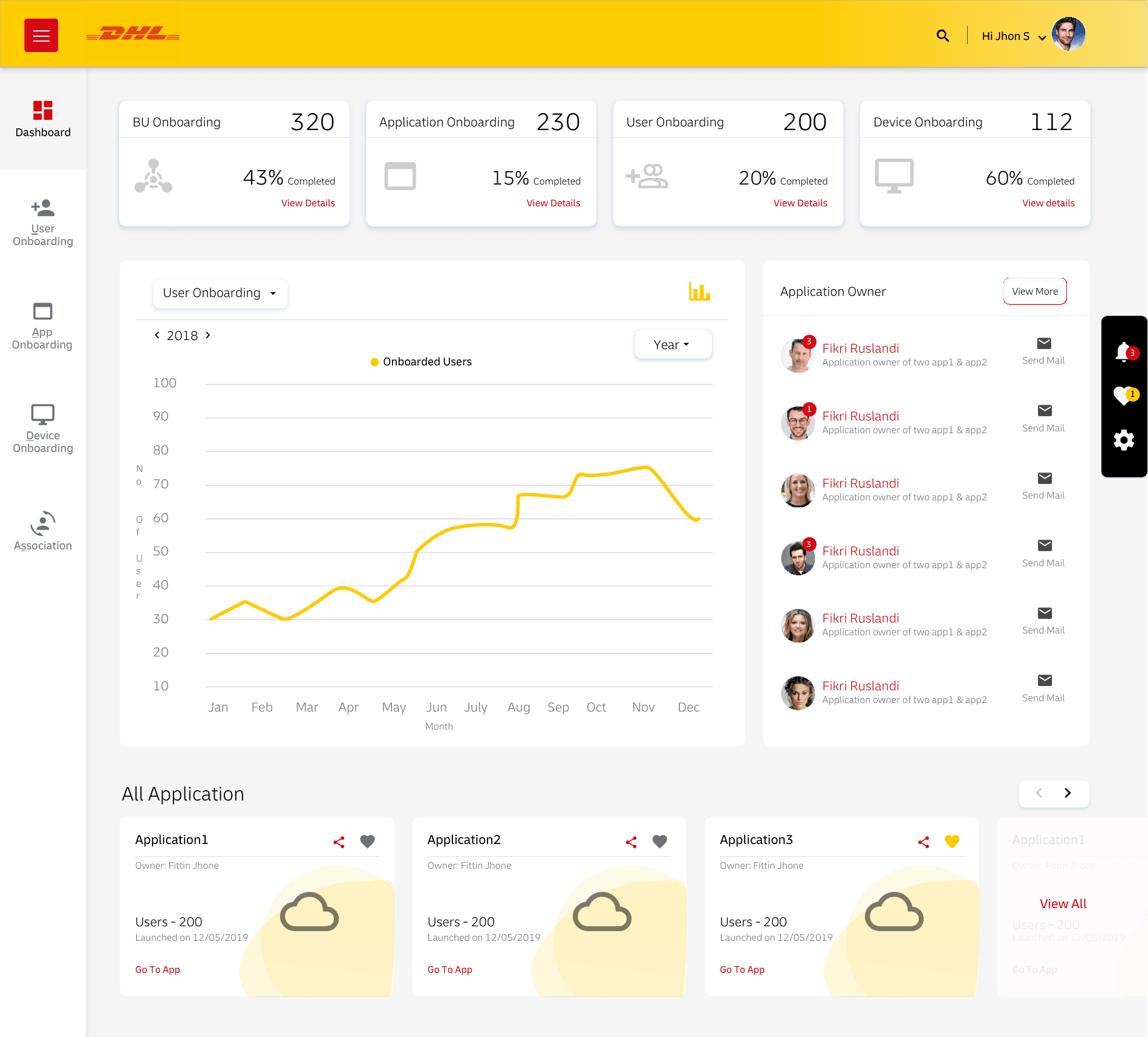
Configurable analytics for the DHL IoT dashboard, letting administrators choose how device and user data is visualised by chart type, metric, and date range, so the dashboard adapts to the question being asked. Rather than fixing one chart per metric, the same data can be read as a trend, a comparison, or a breakdown, with metric and date-range controls kept beside the chart they affect.
- Client
- Deutsche Post DHL Group
- Role
- UX Architect · via Wipro
- Year
- 2019
- Disciplines
- Data Visualization, Dashboard Design, Interaction Design
[ Impact ]
3+
Graph and chart options for dashboard widgets
[ Information architecture ]
Graph types
- Line
- Bar
- Gauge
Configuration
- Metrics
- Ranges
Layout
- Placement
- Sizing
Different administrators read the platform differently. The dashboard graph options let them choose how device and user data is visualised - the chart type, the metric, and the time window - so the dashboard adapts to the question being asked.
Flexible by design
Rather than fixing one chart per metric, the dashboard exposes graph options so the same data can be seen as a trend, a comparison, or a breakdown. Date ranges and metric selectors keep the controls close to the chart they affect.
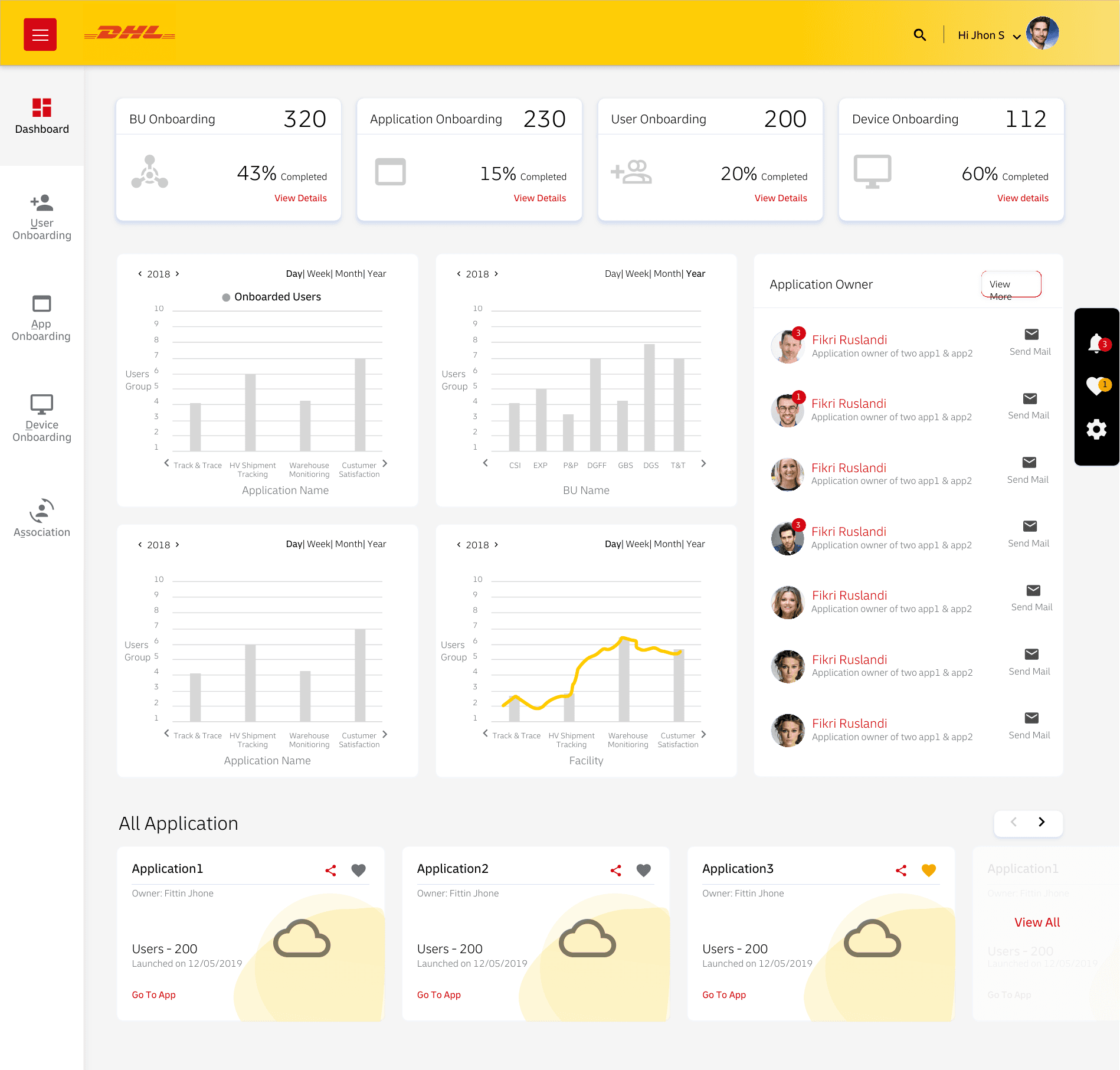
- Selectable chart types for the same underlying data
- Metric and date-range controls beside each chart
- Consistent visual language across every option
Outcome
Analytics that flex to the reader, turning a static dashboard into a configurable lens on device and user activity.