[ Case study ]
Dow Jones Unified Design System
Maturing the Dow Jones Unified Design System (UDS): adapting a B2C news design system (NewsKit) into a themeable, token-driven foundation for B2B enterprise products like Factiva, with a repeatable build-and-handoff process other teams can follow.
- Client
- Dow Jones - Unified Design System
- Role
- Senior UX Architect · Design Systems
- Year
- 2023
- Disciplines
- Design Systems, Design Tokens, Figma, Accessibility, Developer Handoff, Enterprise UX
[ Impact ]
450
Instances from a single button component
B2C → B2B
NewsKit consumer system adapted for enterprise
6+
Token families: color, type, grid, shadow, overlay, motion
[ Information architecture ]
Foundations
- Color palette
- Core tokens
- Shadows
- Overlays
- Grid
Components
- Actions & Inputs
- Feedback & Status
- Layout
- Media
- Navigation
- Text
Structure
- Token
- Element
- Pattern
- Template
Handoff
- Annotation spec
- Status
- Variants & breakpoints
Governance
- Theme Swapper
- Libraries
- Naming conventions
In 2021 our team began building Dow Jones' Unified Design System (UDS). I worked on maturing it: adapting a B2C-focused news design system (NewsKit) for B2B enterprise products like Factiva, and shaping the tools and process for building components, theming, and developer handoff. This is the playbook for how the system is built and how it scales.
What a design system actually is
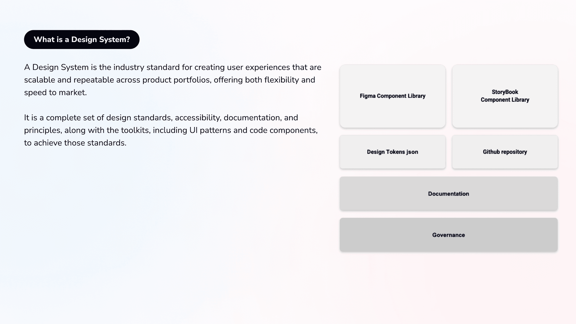
A design system is the industry standard for creating user experiences that are scalable and repeatable across a product portfolio. It is not just a component library: it is the full set of standards, accessibility, documentation, and principles, plus the toolkits, the Figma library, the Storybook library, design tokens, the GitHub repository, and the governance, that make those standards real.
The challenge: a B2C system for a B2B product
NewsKit was built for consumer news. Factiva is a dense, professional B2B product. Adapting the system meant rethinking theming, tokens, and components for enterprise UI while staying compatible with the legacy system, and making the whole process a repeatable template that future teams could follow well beyond the design system itself.
- Adapt a consumer (B2C) system for an enterprise (B2B) product
- Stay compatible with the legacy NewsKit gallery and naming
- Make the build-and-handoff process repeatable for other teams
The detailed system continues behind the gate: the token foundation, component construction, variants, the component taxonomy, and developer handoff.
The token foundation
Every UI color, interaction, and effect in a brand or product is derived from the theme. Design tokens hold all the visual style values needed to construct and maintain the system, colors, typography, grids, effects, sizes, spacing, radii, borders, and motion, so a change at the token level ripples consistently through every component.
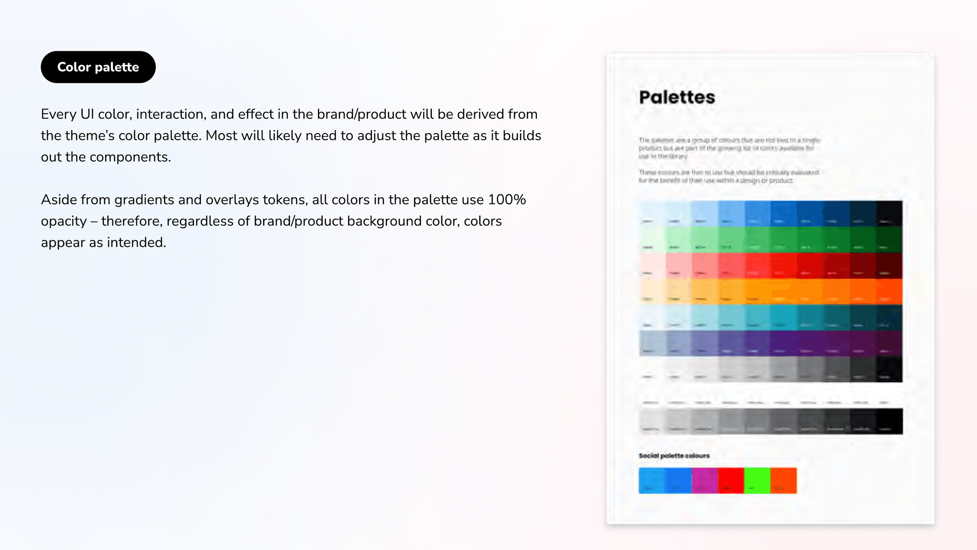
Core colors are organized into a few clear categories: Inks for icons and typography, Interface for static elements like logos, backgrounds, containers and dividers, and Interactive for buttons, inputs, and tags. Keeping interaction colors deliberately limited forces a more holistic, streamlined product UI.
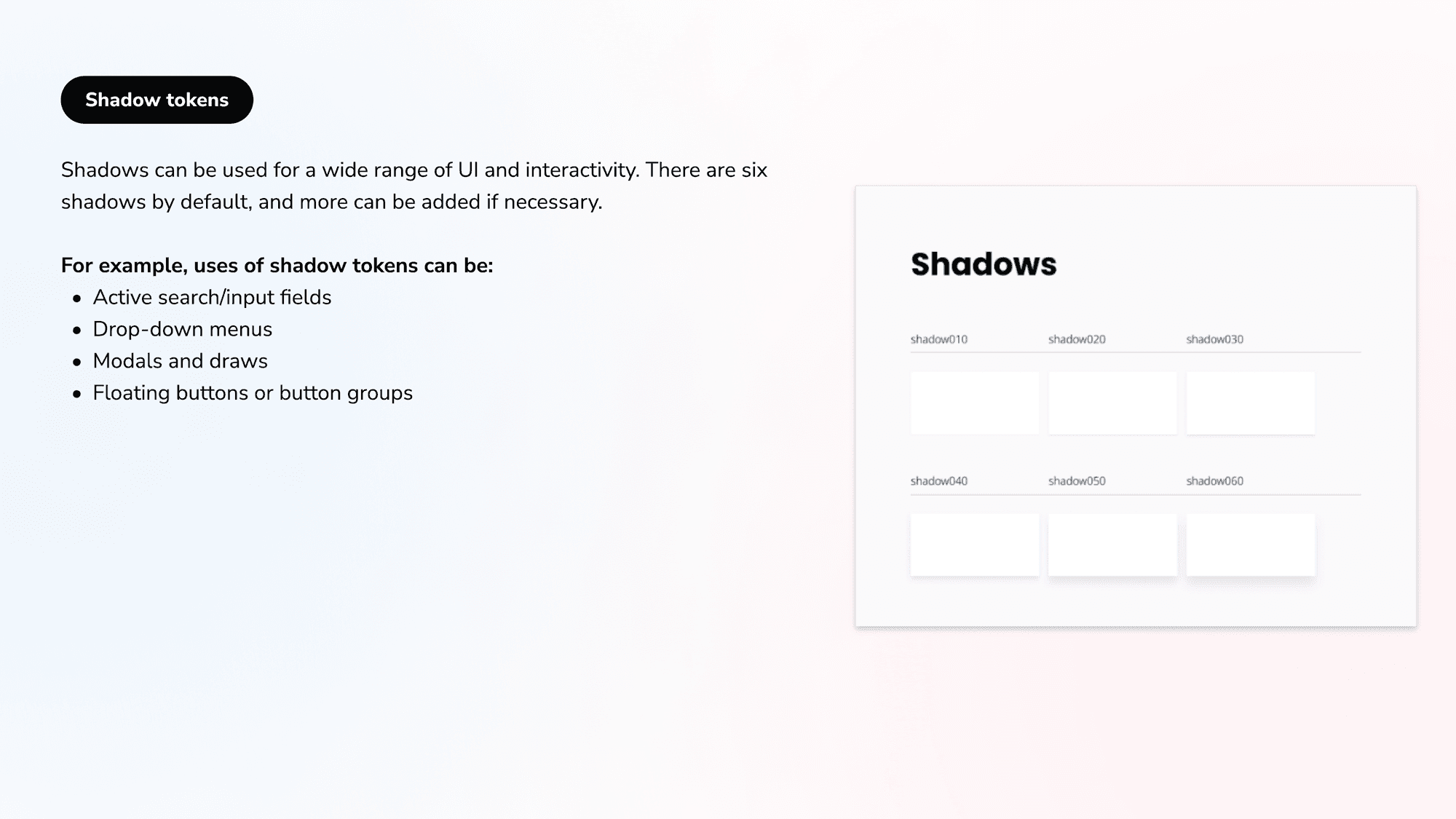
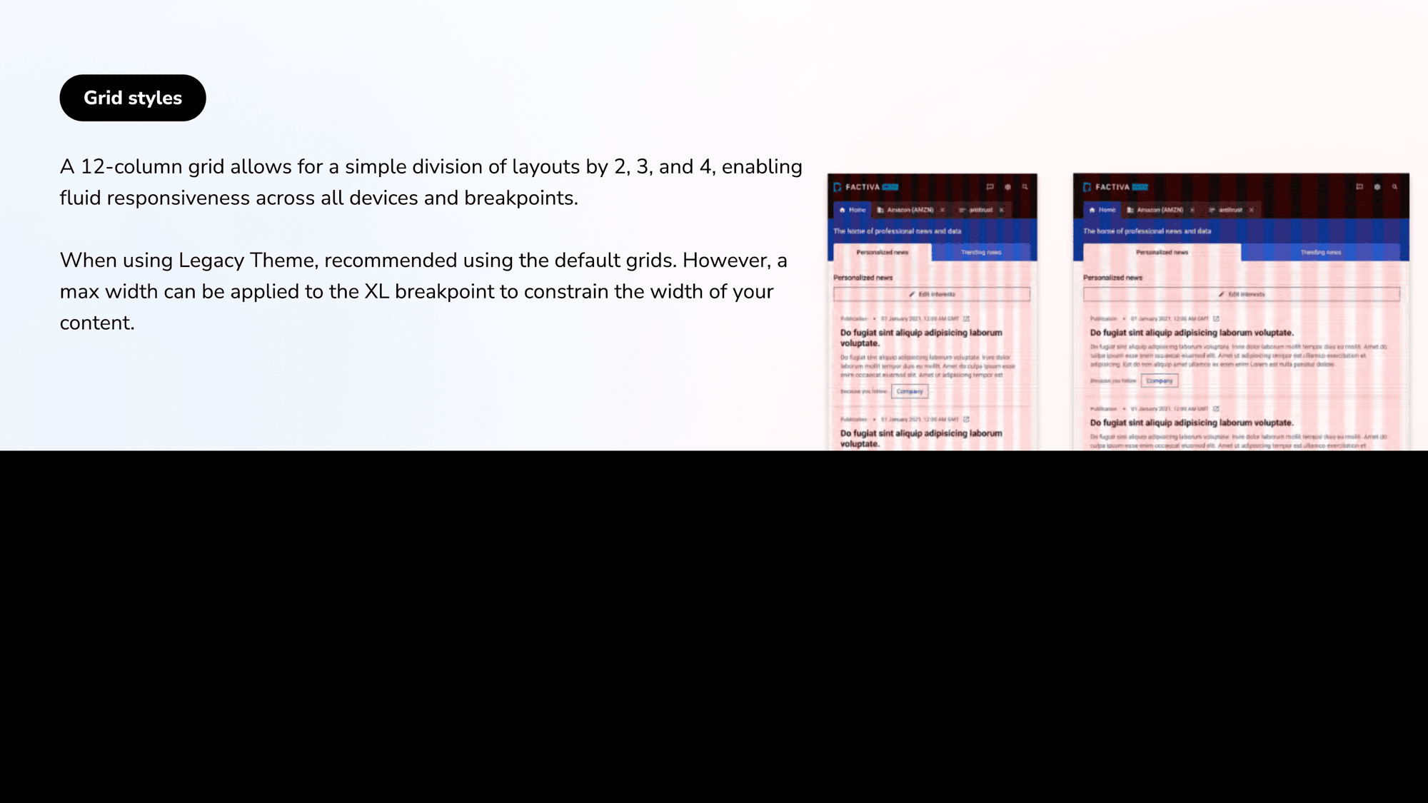
Beyond color, the token set covers shadows, overlays, gradients, and grids. Six default shadows cover most UI and interactivity (active inputs, dropdowns, modals, floating buttons); overlays and gradients use tints from the palette for drawers, modals, and scroll interactions; and a 12-column grid divides cleanly by 2, 3, and 4 for fluid responsiveness across every breakpoint.
Tokens that carry their own documentation
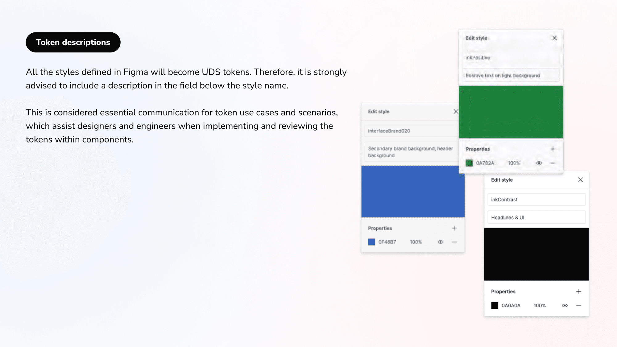
Every style defined in Figma becomes a UDS token, so each one carries a description in the field below its name, inkPositive as 'positive text on light background', interfaceBrand020 as 'secondary brand background'. That description is essential communication for token use cases, helping designers and engineers implement and review tokens correctly inside components.
Building components like an engineer builds HTML
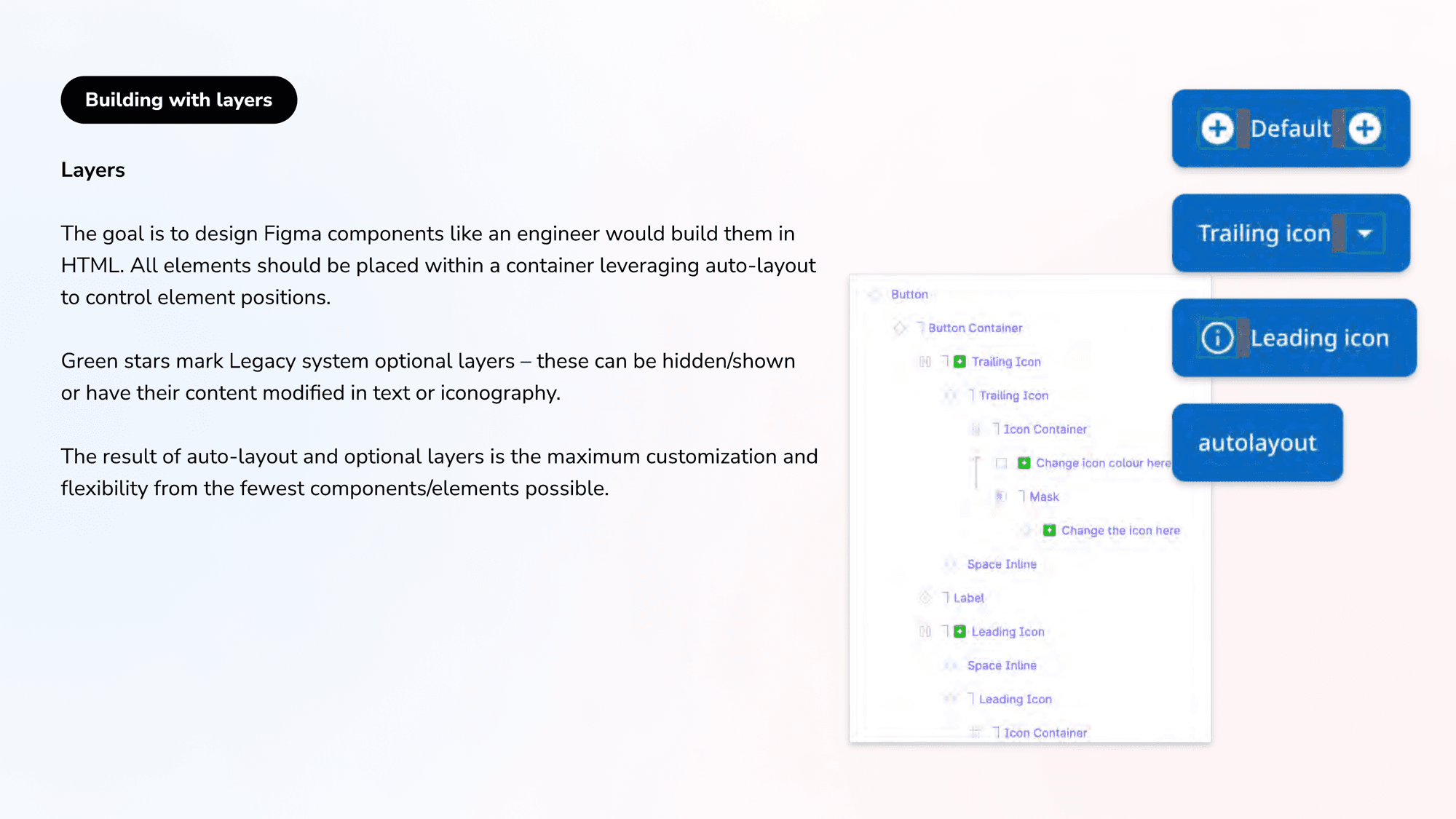
The goal is to design Figma components the way an engineer would build them in HTML: every element inside a container, leveraging auto-layout to control position. Optional layers (marked with green stars in the legacy system) can be shown, hidden, or have their content swapped, so auto-layout plus optional layers produce maximum customization and flexibility from the fewest components possible.
Variants: 450 instances from one button
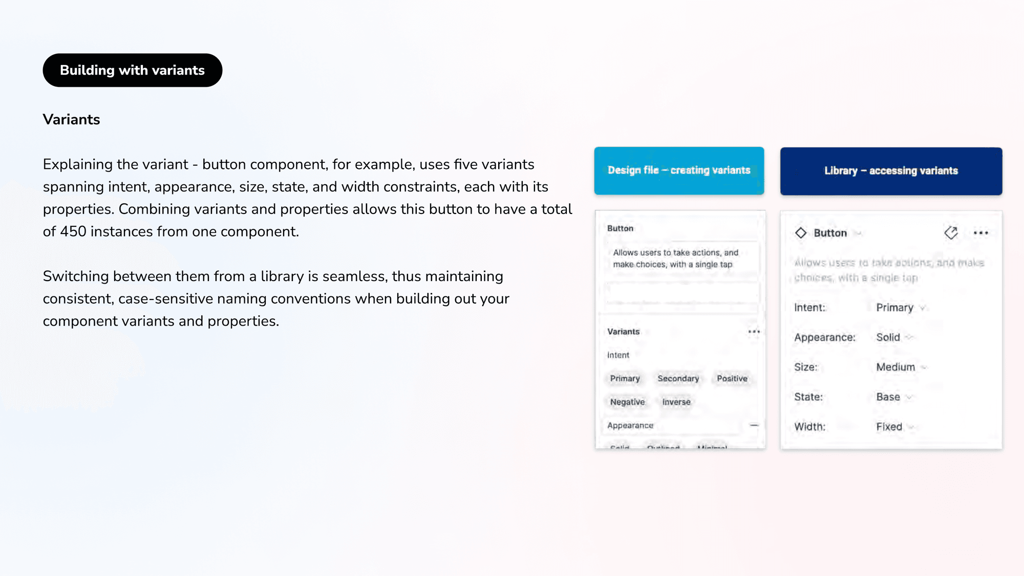
A single button component uses five variant axes, intent, appearance, size, state, and width, each with its own properties. Combining them lets one component produce 450 instances, switchable seamlessly from the library. Consistent, case-sensitive naming across variants and properties is what keeps that scale maintainable rather than chaotic.
The component taxonomy
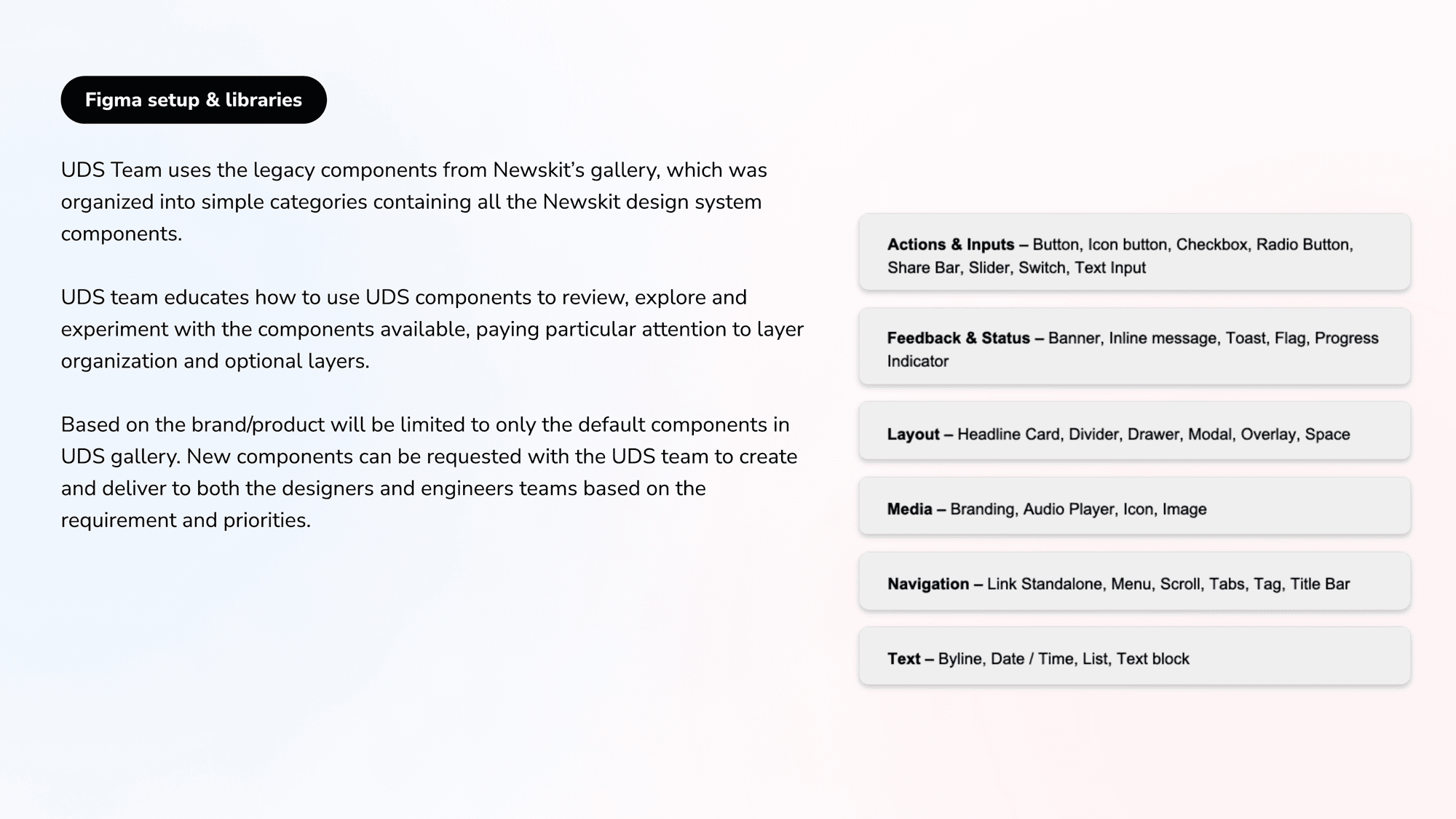
Components build up in a hierarchy, token, element, pattern, template. Base components carry foundational interface elements (links, checkboxes, inputs, buttons, tags); grouped and nested components combine base components and tokens into headline cards, filters, headers, and footers. The legacy gallery organizes everything into clear categories: Actions & Inputs, Feedback & Status, Layout, Media, Navigation, and Text.
Developer handoff: the most critical step
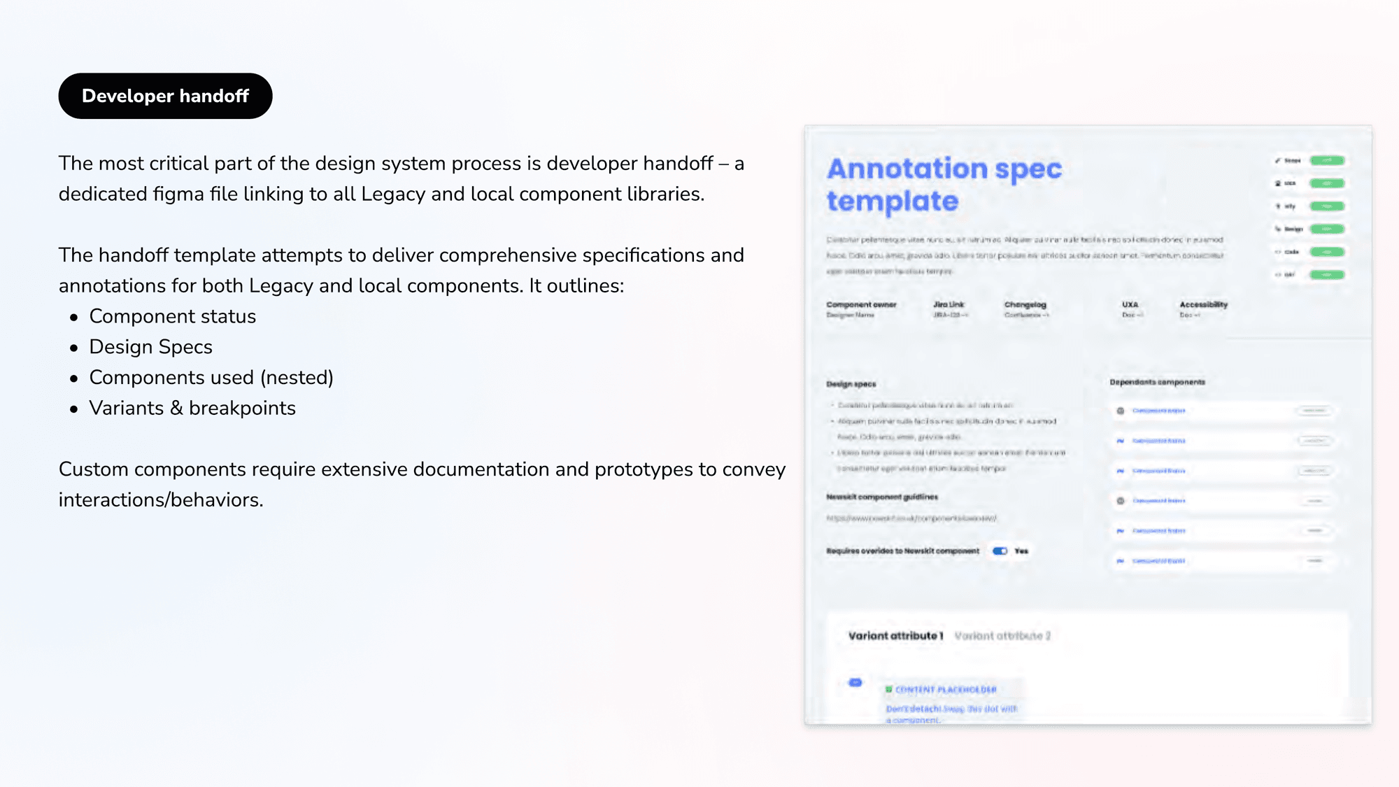
Handoff is the most critical part of the process, a dedicated Figma file linking to every legacy and local component library. The annotation spec template delivers comprehensive specifications: component status, design specs, the nested components used, and variants and breakpoints. Custom components carry extensive documentation and prototypes so their interactions and behaviors survive all the way into code.
Design best practices
The system runs on a small set of disciplines: apply the brand theme with the Theme Swapper plugin, use an 8px or 4px rule for sizing and spacing, apply auto-layout everywhere, use spacer tokens for consistent spacing, and reach for new component variants (intent, appearance, size, state, constraints) before detaching anything.
Outcome
A mature, themeable, token-driven design system that scales across Dow Jones products and gives other teams a repeatable template, from a B2C foundation to enterprise B2B, with documentation and handoff built into the process rather than bolted on. Design systems do not only improve consistency; they create efficient building processes other teams can replicate.
A design system is not a library of screens. It is a set of decisions, encoded as tokens and components, that lets dozens of teams build the same way and ship faster.