[ Case study ]
PlanetTran: Eco-Mobility iPhone App
A full iPhone app UI for PlanetTran, the United States' first all-hybrid chauffeured car service, operating in Boston and San Francisco. The design solved the on-demand booking flow for eco-conscious business travellers: clean, fast, and transparent about their environmental impact.
- Client
- PlanetTran
- Role
- Interaction Designer
- Year
- 2013
- Disciplines
- Mobile UX, iOS Design, Interaction Design, Transportation
[ Impact ]
iOS
Platform
2013
Year
All-hybrid fleet
Client differentiator
[ Information architecture ]
Booking
- Pickup location
- Destination
- Date & time
- Vehicle type
My rides
- Upcoming
- Past trips
- Receipts
Driver
- Driver profile
- Vehicle info
- Live tracking
- ETA
Impact
- CO₂ saved
- Miles in hybrid
- Environmental summary
Account
- Profile
- Payment methods
- Preferences
- Corporate account
PlanetTran launched as the United States' first chauffeured car service with an all-hybrid fleet. Operating in Boston and San Francisco, they catered to environmentally conscious business travellers, but their booking experience hadn't caught up with the quality of their service.
The challenge
On-demand ride booking is a solved problem for speed, but PlanetTran had a second promise to design for: environmental responsibility. Every trip needed to feel premium and purposeful, not just convenient. The app had to communicate the green impact of every ride without making it feel like a guilt trip.
The existing booking experience was web-based and clunky on mobile. Corporate customers, the core of PlanetTran's revenue, needed clean expense receipt trails and the ability to book on behalf of others. Consumer users wanted something as polished as a luxury car service should feel. Both audiences were being underserved by the existing product.
Design goals
- Make booking fast: pickup, destination, time, done in under a minute
- Surface CO₂ savings naturally, as a reward rather than a metric dump
- Match the premium experience of a chauffeured service, not a taxi app
- Support corporate account users who book for others and need clean receipts
Design approach
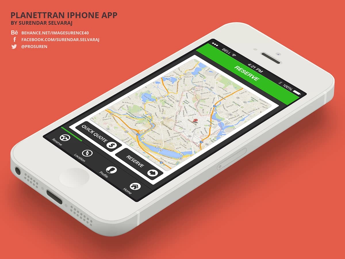
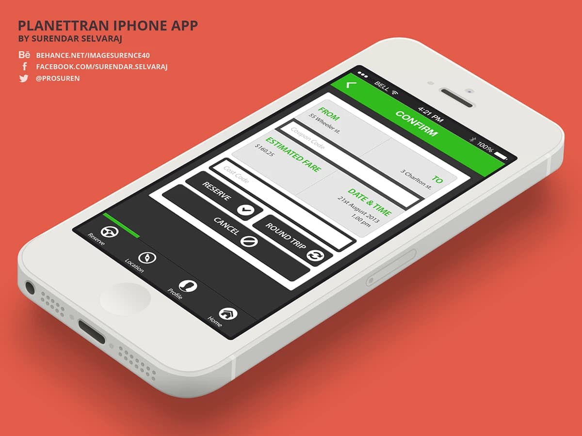
The booking flow used a map-led input: tap your pickup, tap your destination, confirm the time. Vehicle selection was a single horizontal scroll with hybrid badge indicators. The confirmation screen introduced the driver, their vehicle, and a small green impact card showing CO₂ saved vs a standard car for the same journey.
The impact module was persistent but unobtrusive: a small leaf counter on the home screen showed cumulative CO₂ savings across all trips, giving regular users a sense of meaningful progress. For corporate users, a dedicated account switcher let them toggle between personal and company billing in one tap, with receipts automatically formatted for expense submission.
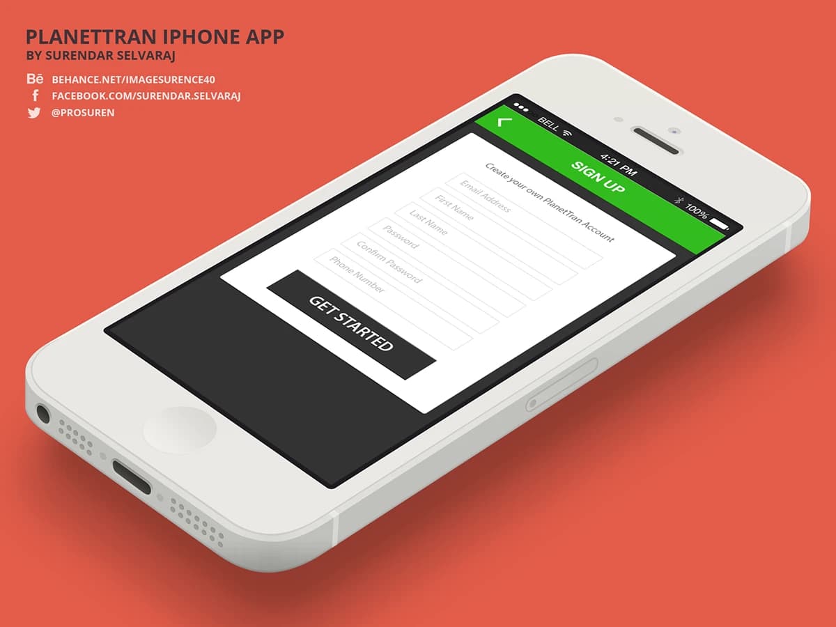
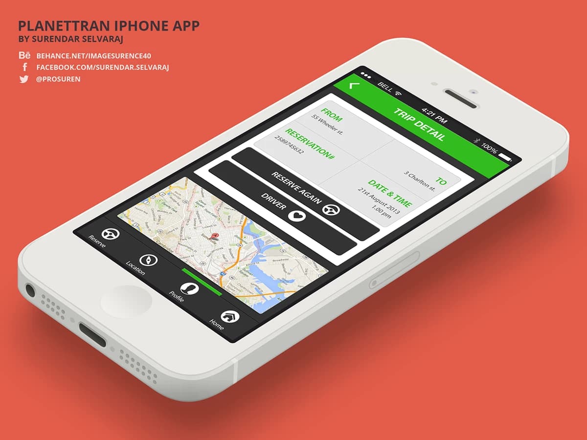
Live tracking used a minimal map view with the driver's hybrid vehicle icon and a plain-language ETA. The driver profile card included the vehicle's make, model, and a fuel-type badge, reinforcing the service's core promise at the moment it mattered most: the few minutes of waiting.
Visual design language
The colour system used deep forest green as the primary brand colour, with warm stone grey for UI surfaces and clean white for cards. Typography was set in a geometric sans that felt premium without being corporate. The leaf motif appeared as a subtle watermark on the home screen counter, not as a repeated icon throughout the interface, keeping it meaningful rather than decorative.
Outcome
A complete iPhone UI for PlanetTran's app, covering the full journey from booking through live tracking, driver profile, trip history, and environmental impact summary. The design made sustainability a feature rather than a footnote, giving PlanetTran a product experience that matched the quality of their fleet.